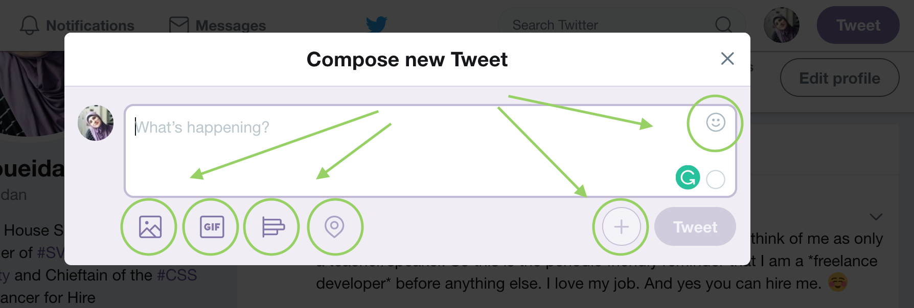
Accessible Icon Buttons
An icon button is an icon that triggers some sort of action on the page. More accurately, technically speaking, an icon button is a button that contains an icon and no (visible) accompanying text. These buttons can be found in the majority of app and user interfaces today. The infamous hamburger menu button is a great example of such buttons when not visually labelled “Menu”.
Putting aside the UX side of the coin and whether or not an icon alone is enough to convey meaning and functionality to users, many implementations of these buttons today lack the proper accessibility that makes them meaningful to users of assistive technologies.
While the seemingly popular aria-label is a perfectly valid way to add an accessible name to a button (and/or other components), it is certainly not the only way, let alone the best. You could always just put text in it, for example. But what if the designer or the UI enforces the absence of visual text next to an icon?
There is a handful of ways that an icon button can be implemented accessibly. This article is an overview of them all.
Accessible Button Names
A button is announced to screen readers as a button when the proper element — the almighty <button> is used, or when an element has a role = "button" on it. Either way, when a button is announced as one, users expect to be able to interact with it in a certain way, which includes being able to activate the button using either the ENTER or SPACE keys.
This means that if you choose not to use the native <button> element, you’ll need to reimplement that native behavior and functionality yourself using JavaScript. But who would want to create a brittle implementation of features that are provided to them by default by the browser when they can save both time and effort using a simple <button> , right? ; )
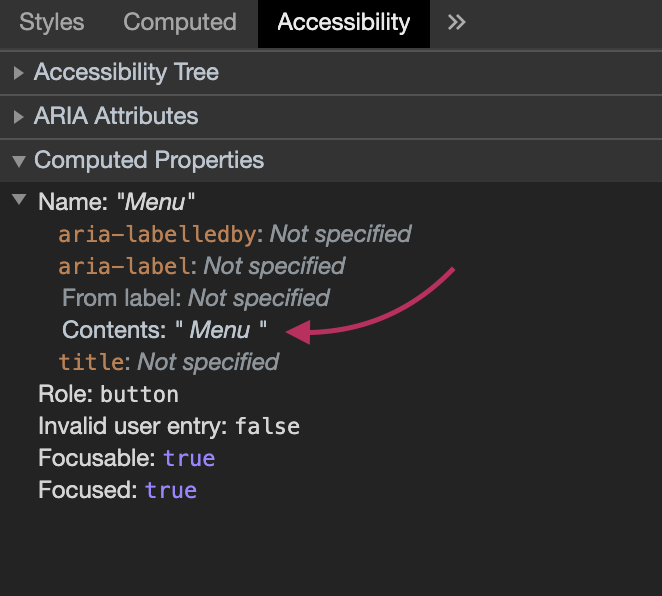
Inspecting the Button Name in Chrome Devtools
To inspect what the accessible name of a button is and, therefore, how it will be announced by a screen reader, you can use the Chrome devtools. Next to the Style tab, you’ll find an “Accessibility“ tab, inside which you will find something that looks like this:
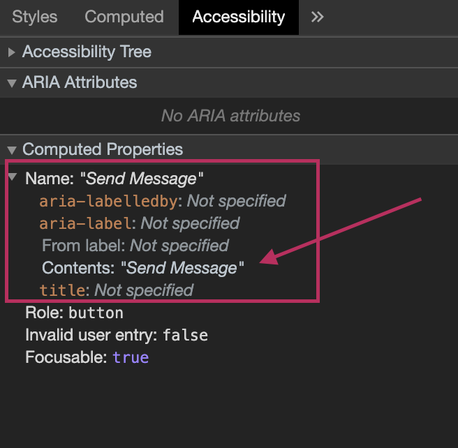
The accessible name for the button can be defined in several ways, as you can see in the image above. When you put plain text inside the button, that text content can then be used as a name for the button, which is then announced: Send Message, Button
by VoiceOver.
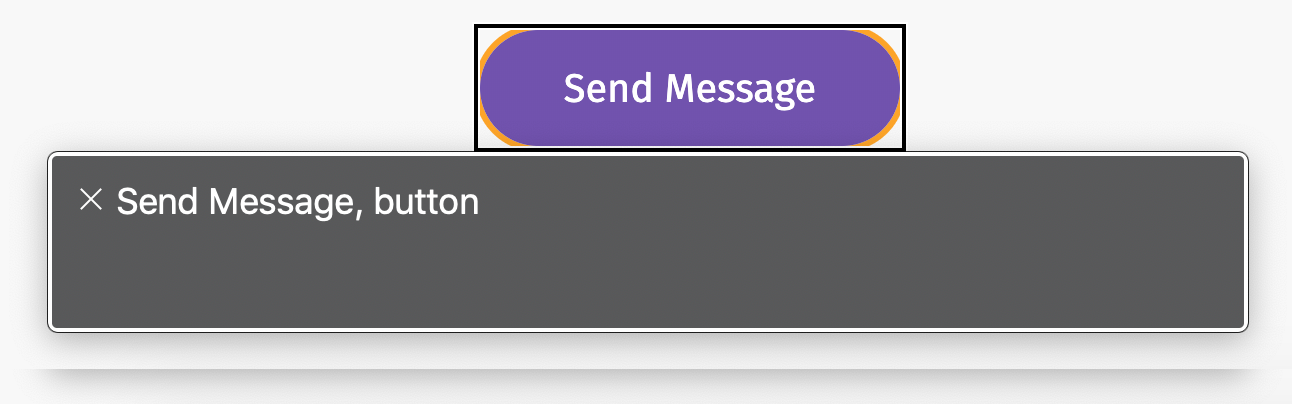
You can inspect the button below yourself and check the accessible name in the devtools, and fire up your screen reader of choice to see how it is announced.
Now, what happens when we have an icon inside the button?
Icon Sitting Next to Text
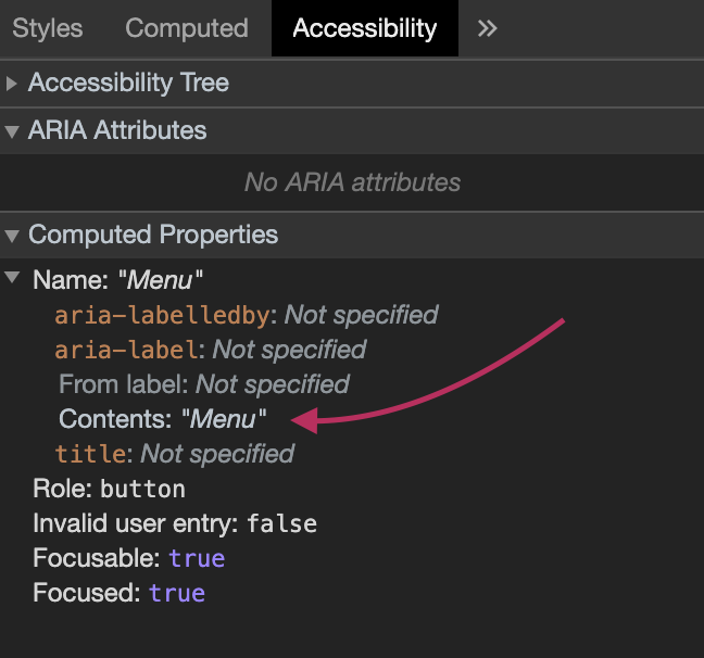
This post is about icon-only buttons. But it’s worth starting with buttons that contain an icon sitting next to some text.
When a button contains text, that text is going to be used to create an accessible name for the button. That text should usually be enough to convey what the button does to screen readers.
As such, the icon itself (an svg image) could become irrelevant to screen reader users, as it does not clarify or add to the accessible name of the button. As such, the common practice is to hide it from screen readers using aria-hidden :
<button aria-expanded="false" id="menu-trigger">
   <svg viewBox="0 0 32 32" width="32px" height="32px" aria-hidden="true" focusable="false">
        <!-- svg content here -->
    </svg>

    Menu
</button>
The aria-hidden attribute is used to indicate whether an element is exposed to screen readers or not. When set to “true”, the element and its contents are hidden from the accessibility API, regardless of whether or not it is visually displayed.
The svg also has a focusable attribute set to false which prevents the icon itself from receiving focus in IE, because otherwise the button will have two Tab stops, which is not the expected or desired behavior.
Further Reading:
- HTML5 Accessibility Chops: hidden and aria-hidden
- Hiding elements from screen readers using aria-hidden
- Know your ARIA: ‘Hidden’ vs ‘None’
Now, if the button does not have any visible text, you’ll still need to provide an accessible name for it somehow. There are a few different ways to do that.
Technique #1: Accessible Visually Hidden Text
If your button isn’t supposed to visually contain any text, you can still provide the text inside the <button> so that it’s picked up and used by screen readers, while hiding it visually using CSS.
There are a few ways to hide content visually. You’ll want to make sure you hide the text but also keep it accessible to screen readers. My friend Scott O’Hara has written a fantastic article that covers how to hide content accessibly that is definitely worth bookmarking and checking out to learn more about the topic.
Our icon button markup might now look like this:
<button>
   <svg viewBox="0 0 32 32" width="32px" height="32px"

           aria-hidden="true" focusable="false">
        <!-- svg content -->
    </svg>
    <span class="visually-hidden">Menu</span>

</button>
Note that we’ll still want to always prevent the svg from receiving focus in IE using the focusable attribute.
Using a utility CSS class that I usually call visually-hidden (short for “screen reader only”), we hide the text visually while making sure it can still be picked up and used by screen readers:
/*
 * Utility class to hide content visually while keeping it screen reader-accessible.
 * Source: https://www.scottohara.me/blog/2017/04/14/inclusively-hidden.html
 */

.visually-hidden:not(:focus):not(:active) {
  clip: rect(0 0 0 0);
  clip-path: inset(100%);
  height: 1px;
  overflow: hidden;
  position: absolute;
  white-space: nowrap;
  width: 1px;
}
I borrowed this class from Scott’s article:
The above “sr-only” class is utilizing various declarations to shrink an element into a 1px square, hiding any overflow, and absolutely positioning the element to remove any trace of it from the normal document flow.
The
:notportions of the selector are allowing a means for any focusable element to become visible when focused/active by a user. So elements that normally can’t receive focus, like paragraphs, will not become visible if a user navigates through content via screen reader controls or the Tab key, but natively focusable elements, or elements with a non-negativetabindexwill have these elements appear in the DOM on focus.
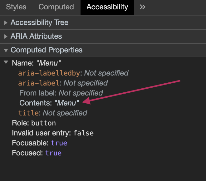
VoiceOver will announce Menu, Button
, and the devtools will confirm that the text inside the button is used to provide an accessible name to it:
You can try it yourself by inspecting the following button:
Further Reading:
- Inclusively Hidden
- ARIA14: Using aria-label to provide an invisible label where a visible label cannot be used
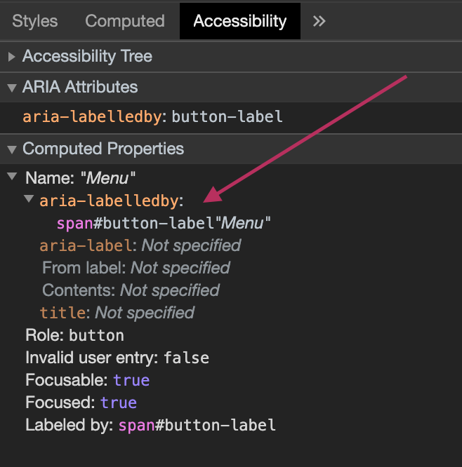
Technique #2: Accessible Visually Hidden Text with hidden and aria-labelledby
This technique is similar to Technique #1 with one advantage over it: you don’t need to use a CSS utility class to hide the text visually. This technique uses the hidden attribute to hide the button text:
<button class="menu-trigger" aria-labelledby="button-label">

    <span id="button-label" hidden>Menu</span>

    <svg aria-hidden="true" focusable="false" width="24" height="28" viewBox="0 0 24 28">
        <!-- svg content -->
    </svg>

</button>
The hidden attribute is a boolean attribute. When specified on an element, it hides that element both visually and from assistive tech. It is the HTML5 markup equivalent of the CSS display: none and visibility: hidden declarations, both of which also hide elements inaccessibly.
That said, the ARIA specification allows the aria-describedby and aria-labelledby attributes to reference hidden elements. This means that those hidden elements can and will then be discoverable and used by screen readers. Great!
Using aria-labelledby , we can use our hidden piece of text as a label for our button.
The aria-labelledby attribute establishes relationships between an element and its label(s). It takes one (or more) ID as a value, which refers to the element that will be used as a label to the element it is used on. This idea is similar to how the for attribute is used to link a <label> to an <input> .
Using this markup, VoiceOver will announce Menu, Button
, and the devtools will now indicate that the accessible name of the button was provided by a <span> containing a piece of text that is referenced via an aria-labelled attribute:
You can try it yourself by inspecting the following button:
One final note: the hidden attribute has very, very good cross-broswer support. But if you still need to support older IEs (I am so, so sorry!), you’ll want to “polyfill” it in the CSS by explicitly hiding any and all elements that have a hidden attribute set on them:
[hidden] {

    display: none;

}
Further Reading:
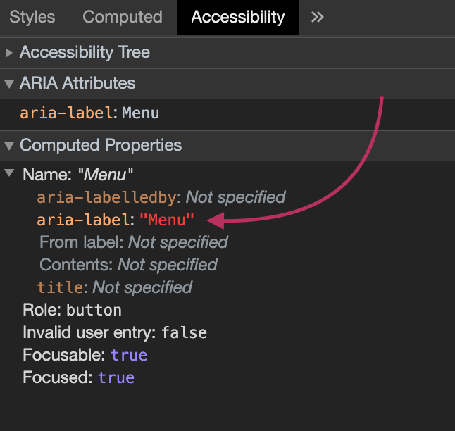
Technique #3: Using aria-label
aria-label is another attribute which can be used to provide an accessible label to an element. Unlike aria-labelledby which references another element to use as a label, aria-label takes a string of text as a value, and that string will be used as the accessible name for the element it is used on.
<button class="menu-trigger" aria-label="Menu">
<svg focusable="false" width="24" height="28" viewBox="0 0 24 28">
<!-- svg content -->
</svg>
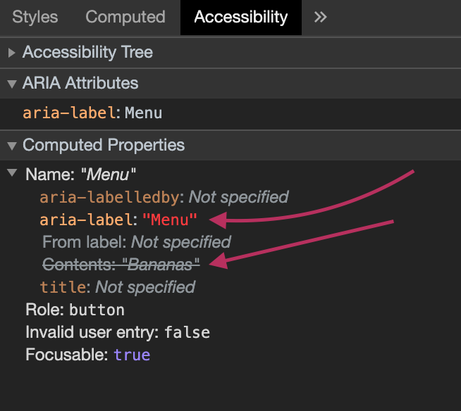
</button>When aria-label is used on a button, the contents of the attribute will override the contents inside the button as the accessible name. This means that, if you have an icon or even other text content inside your <button> , that content will no longer be announced as part of the button’s name. VoiceOver will announce Menu, Button
, and the devtools will now indicate that the accessible name of the button was provided by the aria-label attribute:
The devtools will also show when the inner text content of the button was overridden by another accessible name:
You can try it yourself by inspecting the following button:
It is important to note here that you do not want to have an accessible label in aria-label that is different from the visual text label. I’ve used different labels here for demonstration purposes only. Always make sure the visual text matches what screen reader users will hear; this is a WCAG 2.1 requirement. Also worth noting here is that not all screen reader users are blind, so you’ll want to make sure that what they see matches what the screen reader is announcing to them.
Further Reading
Technique #4: aria-label on the <svg> Icon
In all of the previous techniques, we avoided using the icon to provide an accessible name to the button. But we don’t have to do that. The icon itself can be used to create a label to the button, by making sure that the icon itself has an accessible label.
The quickest way to add a label to an <svg> icon is by, once again, using aria-label .
<button class="menu-trigger" >

    <svg focusable="false" width="24" height="28" viewBox="0 0 24 28"
            aria-label="Menu">
        <!-- svg content -->
    </svg>

</button>
Since the button doesn’t have any text content in it, nor does it have a label defined using any ARIA attributes, the icon itself will now be used as a name. Since the icon has a clear label, that label will be used as the accessible name for the button. This is why it’s important to keep in mind that the name you provide to the icon should describe what the button does, not what the icon is. For example, you wouldn’t want to label it ”hamburger icon”.
Note that since we are making use of the icon in this technique, we are no longer hiding it using aria-hidden , but we do want to prevent it from receiving unwanted focus with focusable = "false" .
VoiceOver will announce Menu, Button
, and the devtools will now indicate that the accessible name of the button was provided by its content (the icon’s label):
You can try it yourself by inspecting the following button:
Please note that I do not recommend using this technique as it fails in some browser / screen reader combinations. Consult the “There is No One Way to Rule Them All” section below for details.
Technique #5: aria-labelledby on the svg Icon
This technique is conceptually similar to Technique #4 above. But instead of using aria-label to provide a label to our svg icon, we will use aria-labelledby . It is worth noting that this is also is one of the best ways to make an inline svg image(s) accessible.
In this technique, aria-labelledby will reference the <title> of the SVG as the accessible label:
<button class="menu-trigger" >

    <svg focusable="false" width="24" height="28" viewBox="0 0 24 28"
            role="img" aria-labelledby="svg-title">
        <title id="svg-title">Menu </title>
        <!-- svg content -->
    </svg>

</button>
VoiceOver will announce Menu, Button
, and the devtools will once again indicate that the accessible name of the button was provided by its content (the icon’s label inside the <title> element):
You can try it yourself by inspecting the following button:
Further Reading:
Please note that I do not recommend using this technique as it fails in some browser / screen reader combinations. Consult the “There is No One Way to Rule Them All” section below for details.
Use SVG
You’ve already noticed that I used SVG to embed the icon in the buttons in this article. It is my personal belief that using SVG should be the first requirement to making icons accessible. There are there a myriad of reasons why SVG is better suited for icons than icon fonts. If you’re using icon fonts and are not sure what it takes or how to make the switch, I have an article that covers that, and that will help you make the switch in no time.
Making an element accessible does not only mean making it accessible to screen readers. It means making it universally accessible, regardless of what the user is using to interact with that element or what environment they’re in.
In addition to the many benefits you get from using SVG, doing so makes it easier to make your icons accessible in user-controlled environments, such as Windows High Contrast Mode. I’ll be sharing more about that in a separate article.
There is no One Way to Rule Them All
Scott O’Hara and I synced together to publish two complementary articles today that hopefully provide you with everything you need to know about this topic.
In his article, Scott dives into the technical intricacies of the markup patterns used to implement accessible images and svgs, and (generously) shares his extensive tests and findings on how those patterns work in different browser / screen reader pairings, or if they’re used within a button or a link. If you’ve made it this far, Scott’s article is the next logical stop.
Scott’s test findings are extremely important as you will learn that treating the icon as decorative and providing an accessible name to the button using one of the first three techniques is often the better way to go. Either that or you will need to pick the svg pattern that has the test with the least amount of failures, and use that. In other words, both Technique #4 and Technique #5 come with their failures in some browser / screen reader combinations.
Personally, I’d not use the SVG icon itself to provide a label for the button when I can provide one on the button itself directly. As Scott states, there’s just no good way to use an SVG as the sole means to provide an accessible name to a link or button. Every test had failures.
Thankfully, Scott has saved us hours of testing, so if you need to provide a label to the button using the svg itsef, you can choose the pattern you need based on his findings.
Final Words
I hope this article has given you a clear overview of many possible ways to provide an accessible label to an icon button.
It is important to note, though, that we only covered providing an accessible label to the buttons. There are many more things to take into consideration when combining labels with additional descriptions (using aria-describedby , for example), so please beware of those, and make sure you properly test your buttons before pushing them to production.
If you’d like to learn more about creating accessible UI patterns, I’ve got a full-day workshop that you can sign up for. I’m running this workshop:
- at the Frozen Rockets academy in The Hague, The Netherlands, on June 10th, and
- at SmashingConf in Freiburg, Germany, next September.
You can register for the Frozen Rockets workshop in The Hague today. Tickets are also on sale for the SmashingConf workshop in September.I would love for you to come join me!
Many thanks to my friend Scott O’Hara for proofreading this article, his feedback, and for following up with his own findings and test results.