Accessible notifications with ARIA Live Regions (Part 1)
In this chapter, we’re going to learn about ARIA live regions — the accessible notifications system that enables us to make dynamic web content more accessible to screen reader users.
Without live regions, some rich web applications would be more challenging to use for screen reader users. So if you’re building web applications such as Single Page Applications (SPAs), you need to understand live regions so that you can utilize them where appropriate.
This chapter is split into two parts. In this first part, we’re going to learn about why ARIA live regions are important, and the different ARIA attributes and roles that you can use to create them. We’re going to get an overview of these attributes, as well as learn about their current support landscape and limitations.
In the second part, we’re going to get more practical and discuss why you should not use live regions as much as you might think that you do, and we’ll talk about alternative approaches you should use instead when you create some common UI patterns. And then we’ll discuss best practices for implementing more robust live regions when you need them today.
But first, in order to understand why live regions are important, we must first understand how a screen reader parses web content and presents it to the user. We won’t get into much detail (not at all, really!), just enough to get a good understanding of what problem live regions solve.
How screen readers parse web content
The way screen readers parse and present web content to their users is very different to how sighted users see that content.
Screen readers work by linearizing web content. Linearizing a page’s content means converting the page’s two-dimensional content into a one-dimensional string (that is then either spoken to the user using text-to-speech, or delivered to them via a refreshable braille display).
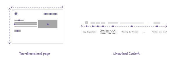
When content is linearized, it is presented to the user one item at a time. You can think of it like listening to a cassette tape
, says Web accessibility specialist Ugi Kutluoglu, which you can rewind, fast forward, pause and play.
This means that a screen reader user can skip to items or sections they want, and they can tab through interactive elements and Shift-tab their way back. But at the end of the day, they can only move forwards or backwards, one item at a time, because what they are presented with is a one-dimensional version of the page.
Why we need an accessible notification system for screen reader users
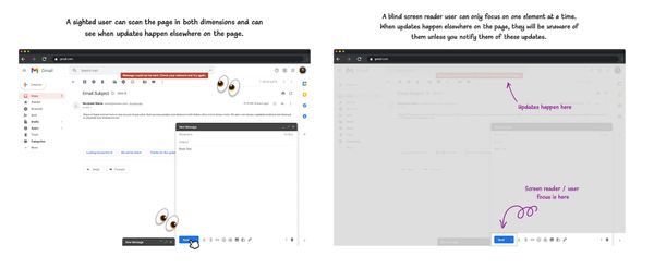
Reading content linearly works well for static webpages, but it doesn’t work so well for pages where content is altered and updated dynamically or asynchronously using JavaScript. If the user can only move in one dimension, and focus on one item at a time, how would they know when content is added, removed, or modified somewhere else on the page?
For example, when a user sends an email in most email web apps, a status message is shown at the top of the screen, or a “toast” message pops up (typically at the bottom of the screen) to notify them of the status of their interaction — for example that the email is sending, has been sent, or maybe that the email could not be sent. Some of these messages are urgent (like an error message), and some of them are not (like a success message, or a Draft Saved notification).
When these status messages appear, they are intended to be communicated to all users. But while these messages may be perceivable by a sighted user, they’re not preceivable by a blind screen reader user. When the status message is shown, it is not communicated to screen reader users by default because the screen reader focus is on another element at that moment (on the ‘Send Email’ button in this case).
Here is what happens when I use NVDA and activate the Send Email button and show a status message in a dummy email app demo I created. NVDA does not announce the status message when it is shown.
Here is a dummy email app demo you can try for yourself.
See the Pen Live region status message in email web app by Sara Soueidan (@SaraSoueidan) on CodePen.
If you activate the Send Email button in the debug version of the dummy email app, the screen reader will not announce the status message that is shown.
A screen reader can only focus on one element or part of the page at a time. This means that if the user presses a button and that button triggers an update somewhere else on the page, there’s a good chance they will be oblivious to it. So they need a way to be notified of these updates when they happen.
There are two primary ways you make a screen reader announce an update when it happens:
- By moving focus to where the update has happened, (like we did with the summary of error messages in the accessible form validation chapter);
- By notifying the screen reader of these updates when they happen.
When you move the user’s focus to an element, screen readers typically announce the element to the user. But when an update happens and you don’t move the user’s focus to it, you must notify screen readers in some other way.
Status messages in WCAG
WCAG Success Criterion 4.1.3 Status Messages (Level AA) states that:
In content implemented using markup languages, status messages can be programmatically determined through role or properties such that they can be presented to the user by assistive technologies without receiving focus.
A status message is defined in the specification as change in content that is not a change of context, and that provides information to the user on the success or results of an action, on the waiting state of an application, on the progress of a process, or on the existence of errors.
From the Understanding Status Messages page:
This Success Criterion specifically addresses scenarios where new content is added to the page without changing the user’s context. Changes of context, by their nature, interrupt the user by taking focus. They are already surfaced by assistive technologies, and so have already met the goal to alert the user to new content. As such, messages that involve changes of context do not need to be considered and are not within the scope of this Success Criterion.
In other words, this success criterion aims to ensure that, unless you move the user’s focus or cause another change of context like a page refresh, you must ensure that status messages are communicated to screen reader users using the appropriate roles and properties. To do that, you currently need ARIA live regions.
What are ARIA live regions?
ARIA live regions are a specific type of notification system primarily surfaced for screen reader users. Using live regions, you can communicate content updates down to the accessibility layer so that screen readers are made aware of these updates when they happen.
On an implementation level, a live region (not to be confused with the region landmark) is an element on the page that has been designated as being “live”. When an element is designated as a live region, a screen reader is notified when any updates take place within the element (and its children), wherever its focus is at the time.
Think of live regions as something like a livestream
says Web accessibility specialist Ugi Kutluoglu, everything happening inside will be announced live like a news channel you’re listening to in the background.
Using live regions, you can mark up status messages and other similar updates so that they are communicated to screen reader users.
Here is our email notification example again with ARIA live regions working. Notice how when the ‘Send Email’ button is activated, NVDA announces the contents of the status message that is shown:
The screen reader announces the contents of the message because I’ve designated the message container as a live region (we’re going to learn how to do that shortly). So now the element is monitored for updates and the screen reader is notified of these updates when they happen. Then, when the button is activated, I inserted the contents of the message into the message container. And when I did, the screen reader was notified and it announced the update to the user.
When an update happens in a live region, the screen reader announces that update, and it only announces it once.
Toast messages and other similar status messages are the closest visual equivalent of a live region announcement. (Though not all toast messages are a good candidate for live regions. We’ll talk more about this later.)
A toast message is used to present timely information — including confirmation of actions, statuses, and alerts. By nature, toast messages are auto-expiring — they disappear on their own after a few seconds. And once they disappear, they’re gone. The user cannot review the message again.
Like toasts, live region notifications are transient. Once an announcement is made, it disappears forever. They cannot be reviewed, replayed, or revealed later. If the user misses an announcement, they miss it. It’s gone. That is, unless you provide them with a way to review it (like collecting all notifications in a notifications center, for example).
Because of their transient nature, live regions have specific and limited use cases and should not be used as an alternative to other more persistent approaches. In fact, if you can use another more persistent approach, you almost definitely should. We’ll talk more about how to use live regions and when not to use live regions later in the chapter.
Creating a live region
Using ARIA, almost any element can be designated as a live region. It doesn’t need to be a structural element; and it doesn’t need to have any implicit semantics by default.
You can designate an element as a live region using:
- The
aria-liveattribute. - ARIA live region roles.
HTML also provides one native element that has implicit live region semantics: the <output> element. We’re going to talk more about it in another section.
1. Using the aria-live attribute
aria-live is the primary attribute used to designate an element as a live region. When used on an element, it indicates that this element may be updated, and those updates should be communicated to screen readers.
The value of aria-live describes the types of updates that can be expected from the region. It accepts three values: assertive, polite, and off (which is equivalent to removing the property altogether).
<!-- this div is now a live region! It's as simple as that. -->
<div aria-live="[ polite | assertive ]">
    ...
</div>
The value of aria-live you choose will depend on the type, urgency and priority of the update.
- If the update is important enough that it requires the user’s immediate attention,
assertivewill tell the screen reader to immediately notify the user, interrupting whatever the user’s currently doing. Assertive notifications are good for when users need to immediately know something and act on it, like when there’s an error in submitting information in a form, or something more serious like a session timeout or a security alert.
Assertive notifications are very disruptive and should be limited to a few use cases where the messages are critical to the user and require their immediate attention. Otherwise, they may disorient users or cause them not to complete their current task.
politeon the other hand, is more… polite. It indicates that the screen reader should wait until the user is idle (such as when the screen reader has finished reading the current sentence, or when the user pauses typing) before presenting updates to them. Polite regions do not interrupt the user’s current task. They are more suitable for things like success messages, feeds, chat logs, and loading indicators, for example.
aria-live="off" is the assumed default value for all elements. It indicates that updates to the element should not be presented to the user unless the user is currently focused on that region.
So creating a live region is literally as simple as declaring the aria-live on an element.
Here is an example where I have a <div> with no aria-live set on it. When you activate the button, the <div> will get populated with a message via JavaScript; but the screen reader will not announce the update. So the user will not be aware that any content has been added to the <div> at this point.
Try adding aria-live="polite" or aria-live="assertive" to it and then activate the button again. The screen reader will announce the contents of the message even though focus is not moved to the message:
See the Pen Untitled by Sara Soueidan (@SaraSoueidan) on CodePen.
This is pretty powerful!
The live region works even if it is visually-hidden, as long as it is not hidden in a way that removes it from the accessibility tree. (We’ve learned all about choosing an appropriate hiding technique for your content in the hiding techniques chapter.)
There are some valid use cases for visually-hidden live regions, but the general rule of thumb is that if the update or message is visible to all users and the conveyed text is equivalent to the visible text (as is the case for most status messages), then you might as well use the same element for screen reader users that you are using for everyone else, and designate it as a live region so that all users get the same update.
For example, consider the dummy email example from the previous section again. To convey the same status message to screen reader users, all you would need to do is designate the message container as a live region using the aria-live property. Error notifications are urgent and require the user’s immediate attention, and you want the user to know that an error has occured as soon as possible. As such, the value of aria-live should be assertive.
<div aria-live="assertive"></div>By default, any padding, margin, and border on an element will take up space in the page’s layout even if the element is empty. Since the message container is placed in the DOM before the notification is shown, you will probably want to prevent it from taking up any visual space on the page when it is empty. To do that, you can use the :not(:empty) CSS selector to only apply the visual styles to it when it is not empty (i.e. when the notification is shown).
[aria-live="assertive"]:not(:empty) {
    padding: .25em 1em;
	background: maroon;
    ...
}Here is a live demonstration of this implementation:
See the Pen Live region status message in email web app by Sara Soueidan (@SaraSoueidan) on CodePen.
Fire up a screen reader on the debug version of this demo and then activate the ‘Send’ button.
Try removing the :not(:empty) selector from the live region’s ruleset in the to see how it affects the visibility of notification container when it is empty.
A live region does not need to be initially empty.
Here’s another example where I have a list and I’m adding items to the list. I’ve designated the list as a assertive live region using aria-live. So now every time an item is added, the screen reader makes an announcement.
See the Pen #PracticalA11y: Basic live region by Sara Soueidan (@SaraSoueidan) on CodePen.
This means that you can use live regions to communicate different types of updates to an element, such as when content is added to the element or existing content is modified.
Live region configuration
ARIA provides three attributes that enable you to ‘configure’ when the screen reader should make an announcement, and what that announcement should contain:
aria-relevant,aria-atomic, andaria-busy.
These attributes are very useful and would enable you to use live regions to communicate different kinds of content updates when they are needed, but unfortunately current browser and screen reader support is inconsistent, so you can’t rely on them in your projects just yet. But we’re still going to get a quick overview of what they do because it will help you better understand the current limitations with ARIA live regions.
aria-relevant: when should an announcement be made?
The aria-relevant attribute is used to specify what type of changes in the live region should trigger an announcement.
For example, should the screen reader make an announcement when a node is added to the region? or when a node is removed? or when the text within an element changes? or maybe when any of these updates happen?
aria-relevant accepts a space-separated list of the following values: additions, removals, text, and a single catch-all value: all.
additionswill trigger a notification when a DOM node is added to the region.removalswill trigger a notification when a DOM node is removed from the region.textwill trigger when text changes happen inside the region, such as changing a text node inside the region or changing a text alternative for an image inside the region.allis a shorthand for all three options.
The default value is additions text, which means that a live region will trigger an announcement when content is added or text is changed within the region.
The removals and all values should be used sparingly. Screen reader users only need to be informed of content removal when its removal represents an important change, such as when a user is removed from the list of active users in a chat room, for example.
aria-atomic: what is contained in an announcement?
The aria-atomic attribute determines what is contained in the announcement. It indicates whether the screen reader should present all or only parts of the changed element based on the change notifications defined by the aria-relevant attribute.
For example, if a piece of text changes inside an element, should the screen reader announce only the changed text? or the entire contents of the live region? If text is added to a live region, should only the newly added text be announced? or should the entire region’s content be announced every time?
aria-atomic accepts two values: true, and false.
- When
aria-atomicisfalse, a screen reader should only announce the parts of the element that have changed. This is the default value. - When
aria-atomicistrue, the screen reader should announce the entire contents of the live region when a change happens inside of it. It doesn’t matter what has changed. It’s going to read everything — the entire content of the live region, plus the region’s accessible name, if it has one.
aria-atomic="true" is useful for when a part of the region changes but you want the entire content to be read because otherwise the updated content may not make much sense on its own. A practical example is a “Now Playing” indicator.
<p>
    <span>Now Playing:</span>
    <span>[ movie/soundtrack title ]</span>
</p>
If a playlist of movies or soundtracks is playing while the user performs other tasks on the page, and the name of the soundtrack that is currently playing changes, you can utilize live regions to announce that a new soundtrack is playing.
When the soundtrack changes, the only part of the indicator that gets updated is the soundtrack’s name. But you want the entire sentence to be announced so that the user gets the context they need. You can do that by designating the indicator as an atomic live region (using aria-atomic="true"):
<p aria-live="polite" aria-atomic="true"><span>Now Playing:</span><span>[ movie/soundtrack title ]</span></p>Now every time the title of the soundtrack or movie changes, the screen reader should announce “Now playing” followed by the name of the soundtrack.
Here is a live demo:
See the Pen Untitled by Sara Soueidan (@SaraSoueidan) on CodePen.
Start a screen reader and try out the debug version of the playing indicator
aria-busy: please wait until the changes are complete
The aria-busy attribute is used to indicate that an element (typically an entire section on the page) is undergoing changes (such as a section loading new content), and that screen readers should therefore wait until the changes are complete before exposing the content to the user.
By default, all elements have an aria-busy value of false. Meaning that they are not undergoing changes and screen readers can, therefore, expose their content when the user navigates to them.
To use aria-busy, you would set it to true on an element while the element is undergoing changes, and then flip its value to false when the changes are complete and ready to be exposed or announced to the user.
aria-busy can be used on any element that is undergoing changes, even if that element is not a live region.
If you use aria-busy on a live region, the contents of the live region will be announced after aria-busy is set to false. If multiple changes have been made to the element while it was busy, they are announced as a single unit of speech when aria-busy is turned off.
‘Skeleton screens’ in Single Page Applications (SPA) are a practical use case for the aria-busy attribute.
A skeleton screen is a specific type of loading indicator that is shown in lieu of the content of a section being loaded until the content of that section loads. They often provide a wireframe-like visual that mimics the layout of the page and helps users build a mental model of what will be on the page when the content loads.
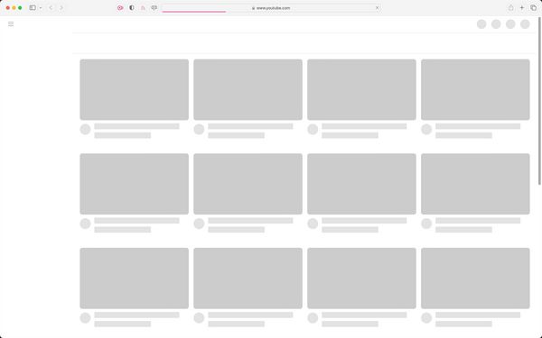
aria-busy can be used to tell screen readers to ignore the section that is currently loading content until the content finishes loading. In that sense, it has a similar effect to aria-hidden — it ‘hides’ the contents of a busy region while it is undergoing changes.
<!-- This section is updating... -->
<section aria-busy="true">
    <h2>..</h2>
    <p>..</p>
    <article>..</article>
    ..
    <!-- more content is loading -->
</section>
Since the busy section is effectively hidden from screen reader users, you will want to communicate the state of the loading content to screen reader users.
You can do that by using a separate, visually-hidden live region. Using this region, you can communicate to the user that a screen has started loading, and then let them know when the loading is complete. So, when the content is loading, your markup would at a certain moment look like this:
<div aria-live="polite" class="visually-hidden">Loading content...</div>
<section aria-busy="true">
    <h2>..</h2>
    <p>..</p>
    <article>..</article>
    ..
    <!-- more content is loading -->
</section>
and then when the content is loaded, flip the value of aria-busy to false, and update the content of the live region:
<div aria-live="polite" class="visually-hidden">Content loaded.</div>
<section aria-busy="false">
    <h2>..</h2>
    <p>..</p>
    <article>..</article>
    ..
    <!-- more content is loading -->
</section>Unfortunately, because aria-busy is currently not well-supported across screen reader and browser pairings, most screen readers (except JAWS) will read the contents of the busy region even before it’s done loading, which would result in a sub-optimal experience.
You currently need to work your way around that by hiding the busy region using aria-hidden, and un-hiding it when its contents are done loading.
For a detailed writeup about implementing accessible skeleton screens, check out Adrian Roselli’s article “More Accessible Skeletons”. Adrian provides a solution that doesn’t even require you to use live regions at all, and his article includes a live demo that you can tinker with and try for yourself.
Summary and support landscape
| Value | Description |
|---|---|
aria-atomic |
What is announced? When you update a live region, should it read all the content again or just the added content? If If |
aria-relevant |
When is an announcement made? What types of changes to a live region should trigger the announcement? additions? removals? or all? If If If If If |
aria-busy |
Indicates that an entire section on the page is undergoing changes (such as a section loading new content), and you're telling screen readers to wait until the changes are complete before notifying the user
If If |
As we mentioned earlier, support for the aria-relevant, aria-atomic, and aria-busy attributes is currently inconsistent across browsers and screen reader pairings.
Paul J. Adam has created a test page that includes test cases for aria-atomic and aria-relevant when used on live regions, and has documented support gaps across platforms and screen readers.
So, unfortunately, you can’t rely on these properties in your projects just yet. If you do, many of your content updates may be announced in ways that you did not intend them to be announced, which could result in a sub-optimal user experience.
2. Using live region roles
When you use aria-live to create a live region, the element’s implicit semantics (if it has any) are retained. This means that you can use the appropriate element to represent the component you’re creating, and if the component is getting updated you can then designate it as a live region with the aria-live attribute.
<!-- this list will be treated like any list on the page would be; since it is also designated as being live, any changes that happen to it should be communicated to screen readers and announced to the user -->
<ul aria-live="polite">
  <li>My list semantics are important.</li>
  <li>But I want you to know when new list items are added.</li>
</ul>
But what if you’re creating a notification or status message that has no semantic HTML element to represent it? For example, there are no semantic elements to represent (and distinguish between) different types of notifications (such as an alert notification or a status message, for example).
While it is fine to use a <div aria-live=""> for these notifications, it would be ideal if we exposed the nature or type of a notification to the user using appropriate semantics.
ARIA provides five live regions roles that semantically represent five different types of updates:
- The
alertrole: represents a live region with important, and usually time-sensitive information, such as error notifications. - The
statusrole: represents a live region whose content is advisory information for the user but is not important enough to justify an alert, often but not necessarily presented as a status bar (such as a status or success message). - The
logrole: represents a live region where new information is added in meaningful order, and old information may disappear. Examples of logs are chat logs, messaging history, a game log, or an error log. In contrast to other live regions, in this role there is a relationship between the arrival of new items in the log and the reading order. The log contains a meaningful sequence and new information is added only to the end of the log, not at arbitrary points. - The
marqueerole: represents a live region where non-essential information changes frequently, such as stock tickers. The primary difference between a marquee and a log is that logs usually have a meaningful order or sequence of important content changes. - The
timerrole: represents a live region containing a numerical counter which indicates an amount of elapsed time from a start point, or the time remaining until an end point.
Live region roles are pre-configured. They come with implicit aria-live and aria-atomic values.
| Role | aria-live value |
aria-atomic value |
|---|---|---|
alert |
assertive |
true |
status |
polite |
true |
log |
polite |
|
marquee |
off |
|
timer |
off |
alert and status are the most commonly used live regions roles and have generally good support. The others have specialized uses and have poor or no support, and marquee and timer are even in danger of being deprecated and removed from the ARIA specification.
Difference between using aria-live and live region roles
The primary difference between using live region roles and using aria-live on its own is that live region roles have semantic meaning. They add explicit semantics to an element (This is an alert
, This is a status message
, etc.), so some screen readers may announce “alert” before announcing the content of the message.
For example, here is the dummy email app example again. Instead of using aria-live="assertive" on the notification container, I’m using role="alert. Here’s a video comparing how NVDA announces the notification, first when it is designated as a live region using aria-live="assertive", and the when it is designated as a live region using role="alert".
NVDA announces the word “Alert” before announcing the content of the notification when role="alert" is used. You can try it for yourself in the debug version of the demo using the role attribute.
Here is another example that implements a form success message using role="status":
See the Pen #PracticalA11y: role status success message by Sara Soueidan (@SaraSoueidan) on CodePen.
Another advantage to using a live region role over aria-live is that live region roles accept an accessible name.
If you use aria-live to create a live region, the implicit semantics of the element you’re using it on will determine whether or not it can have an accessible name. As we learned in the accessible names and descriptions chapter, some elements are name-prohibited. For instance, a <div> will not consistently expose an accessible name unless you give it a meaningful role. ARIA live region roles provide meaningful roles to the elements they are used on and can therefore accept an accessible name.
When a live region has an accessible name, screen readers include the name of the region in the announcement.
See the Pen #PracticalA11y: shopping cart by Sara Soueidan (@SaraSoueidan) on CodePen.
In this example I have a polite live region that contains the number of items in the user’s shopping cart. When the ‘Add to cart’ button is activated, the number of items is updated and the screen reader announces that number. But anouncing the number of items alone doesn’t provide the user with the same context that sighted users get when the shopping cart is visually updated. Ideally, you’d want the screen reader to announce “Shopping cart, 5 items”.
Using aria-labelledby, you can provide an accessible name to the live region (namely: “Shopping Cart”). So now when the number of items is announced, the screen reader announces ‘Shopping cart’ before announcing the number of items it contains.
You can try the live example out for yourself in the debug version of the shopping cart example.
Providing an accessible name to a live region is useful for when you may have multiple updating regions on the page and you want to communicate which region the updates are coming from. A region’s name thus provides the necessary context for each announcement.
3. Using the HTML output element
HTML provides one native live region element: <output>.
By definition, <output> represents an element into which you can inject the results of a calculation or the outcome of a user action. The second part of the definition can be interpreted to mean that the <output> element can be used to display a feedback message as a result of user interaction (like a toast or status message!).
The <output> element has implicit live region semantics. It maps to the ARIA status role, which means that it represents a polite live region.
<output> is also a labelable element, which means that you can give it an accessible name using the <label> element.
<label for="[ outputID ]">..</label>
<output id="[ outputID ]"> .. </output>

<!-- or -->

<label for="[ outputID ]">
    ..
    <output id="[ outputID ]">  </output>
</label>
A practical use case for the <output> element is using it to represent the total price of products in a cart on an e-commerce website.
<label for="result">Your total is:</label>
<output id="result"> </output>

<!-- or -->

<label for="result">
    Your total is:
    <output id="result">  </output>
</label>
When the user updates the number of items in their cart, the total price is updated to reflect the new total price. Wrapping the price in an <output> element allows it to be announced by the screen reader when it is updated.
Here is a dummy example where the total price is updated based on how many items are chosen in the select dropdown:
See the Pen #PracticalA11y: The <output> live region element by Sara Soueidan (@SaraSoueidan) on CodePen.
You have probably also noticed that VO with Safari announces the initial total value before it announces the updated total value every time it makes an announcement.
The <output> element is currently not consistently announced across browser and screen reader pairings. And not all screen readers announce the accessible name of the <output> when its content is updated. For example, VoiceOver with Safari announces the content of the <output> element in the example above but it does not announce its accessible name. NVDA with Firefox does not announce the accessible name either. Whereas paired with Chrome, VoiceOver announces the contents of <output> with its accessible name as it is intended.
There are also other quirks and some inconsistencies in the way <output> is currently announced across browser and screen reader pairings. Accessibility engineer Scott O’Hara has written a great article about the <output> element that I recommend reading if you want to learn more details about <output> and its quirks. Scott shares the current state of support, as well as suggestions for working around some of the support gaps.
Summary and outro
So, to quickly sum up:
- ARIA live regions are a specific type of notification system primarily surfaced for screen reader users.
- You can create a live region using the
aria-liveattribute. The value of the attribute depends on the type and urgency of the updates you’re communicating. - The
aria-relevant,aria-atomic, andaria-busyattributes allow you to configure when an announcement should be made and what the announcement should contain. But support for these attributes is currently poor. - ARIA provides five roles that represent five different types of updates. Of these five roles,
alertandstatushave the best support and can be used to represent status messages in web applications. - The
<output>element is currently the only native HTML live region. The<output>element has a few quirks and some support gaps that, depending on your use case, you may be able to work around today.
As you might imagine, the current state of support for live region features and properties limits your uses of live regions quite a bit. Furthermore, the inherent behavior of live regions also makes them unsuitable for certain types of updates. We’re going to elaborate more on this in the second part of this chapter.
Fortunately, for many (if not most!) common UI patterns, there’s often a more robust way to make users aware of content updates when they happen. And for the few instances when you do need to use live regions, you can make them work by following a few implementation best practices. We will discuss all of that in more detail in the second part of this chapter.