Accessible notifications with ARIA Live Regions (Part 2)
In the first part of this chapter we discussed what we might need live regions for, and how to create them using HTML and ARIA.
In this part, we’re going to discuss what live regions are not suitable for and why, and we’re going to discuss more robust ways to implement some common UI patterns that you might otherwise consider using live regions for. After that, we’re going to go over some best practices for implementing live regions for when you do need to use them to represent things like status messages in your web applications.
Live regions are easy to misuse and to overuse. Aside from inconsistent browser and screen reader support, live regions’ inherent capabilities are limited by design, which makes them unsuitable for certain types of content updates.
Live regions don’t handle rich text
Live regions don’t handle rich text. This means that the semantics of elements like headings, lists, links, buttons, and other structural or interactive elements are not conveyed when the contents of a live region are announced. If a live region contains a button, for example, the screen reader will announce the text of the button when it is injected into the live region without any mention of the button’s role:
<div aria-live="polite">
    <!-- The semantics of this button are not conveyed in the live region announcement -->
    <button>You'll have to guess what I represent!</button>
</div>
The fact that the text represents the label of a button will not be communicated by the screen reader in the live region announcement. (Example borrowed from Scott O’hara’s article)
Here is how VoiceOver with Safari announces a button when I add the button to a live region using JavaScript:
The screen reader will announce the entire contents of a live region as one long string of text, without any of the structure.
This is why you should not wrap entire sections of content in a live region. Otherwise the entire section’s content will be announced as one long string of text, which would result in a bad user experience.
When content updates happen in large sections of content, there is often a better way to communicate these updates to screen reader users.
For example, say you’re building a filtering component for an e-commerce website or any website that offers the ability to filter content within a main section of the site.
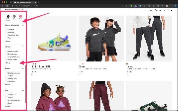
In most web applications, the content in the main section will filter dynamically as soon as the user selects one of the available filters. But just because the content within the section gets updated does not mean that the section should be a live region.
So, how do you let the user know that the content in the section is updating?
Providing simple instructional cues that set the user’s expectation of what will happen when they interact with an element is sometimes more than sufficient to let the user know of content updates even before they happen.
For the filtering component, what this means is that you can include an instructional cue at the top of the group of filters to let the user know that changing the filters will change the content in the main area. This way you’re setting the user’s expectation of what will happen when they select a filter, so you no longer need to make any announcements when the content updates. The user knows that they can just navigate to the main area and start exploring the filtered content.
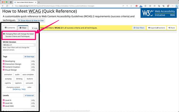
The WCAG Quick Reference website provides a live implementation of this approach.
Another very common UI component that can benefit from a similar implementation approach is a dynamic search component — particularly one where you have a search field that filters and displays results as you type into the field, like the search component you can find on the Smashing Magazine website.
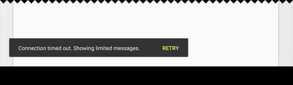
What many developers will do when they build a similar component (and, admittedly, it’s a mistake I also made early in my career) is they will designate the search results container as a live region (like Smashing Magazine currently does) just because the content in the container is dynamically updated while the user is typing in the field. This results in a very noisy user experience. Here’s how VoiceOver on macOS starts announcing the contents of the results container after I type a search keyword in it:
A simpler, more robust, and much more user-friendly approach to implementing this pattern is to provide an instructional cue (i.e. an accessible description for the input field) that tells the user what will happen when they start typing in the field. The description might say “Results will [ filter / display / etc. ] as you type”. For example, the search component on the a11ysupport.io website provides a live implementation of this approach. The accessible description of the search field lets you know that “Features will be filtered as you type”.
The cue must be associated with the search field using aria-describedby so that screen readers announce it to their users.
Providing instructional cues is helpful for all users. But if you don’t want the description to be visible, you can visually hide it using the visually-hidden utility class. Just make sure it is properly associated with the input field using aria-describedby.
By letting the screen reader user know that results will be shown as they type, you no longer need to announce when results are shown, and the user knows that they can navigate to the search results once they’re done typing their keyword in the field.
That being said, you do still want to use an assertive live region to inform the user when no results are found.
While we don’t want to constantly interrupt people while typing, we need to interrupt when things go afoul
, says accessibility engineer Scott O’Hara in his article Considering dynamic search results and content. Specifically, let someone know immediately when they have entered a query that returns no results. Delaying such an announcement would result in wasted time, and potential uncertainty about “when” someone’s query stopped working. […] People who can see the UI are likely going to notice right away when the dynamic content dries up. They can then immediately correct for this by adjusting their query. This same affordance must be provided to people with disabilities.
In his article, Scott elaborates more on all the usability considerations you should keep in mind when you’re implementing a dynamic search component. He then proposes a solution for how you might go about implementing it in a more robust and inclusive manner. I highly recommend checking the article out and following his implementation pattern if you can.
In addition to using an accessible description for the search field, and a live region to announce when no results are found, Scott also suggests moving the user’s keyboard focus to the heading that introduces the results when the Enter key is pressed. Of course, if your search component doesn’t provide a heading, you wouldn’t need to do that. But it is a nice addition that improves the user experience for keyboard users, and screen readers will announce the number of results found when focus is moved to the heading.
Here is how Scott’s demo works with NVDA on Firefox:
Here’s an embed of Scott’s demo:
See the Pen quick demo of showing / informing about dynamic results by Scott (@scottohara) on CodePen.
Live regions are not suitable for notifications with interactive elements
Live regions should not be used for messages or notifications that contain interactive elements, particularly if the user may need to act on those notifications.
As we mentioned earlier, when a screen reader announces the contents of a live region, it will announce the raw text content within the region without any of the structure or semantics. This means that the semantics of any interactive elements will not be conveyed.
Furthermore, when an update happens in a live region, screen readers will only announce the contents of a live region, but the user’s focus does not move to the region. And there is no mechanism available to allow the user to easily navigate to a live region to interact with any content that might be in it.
So unless you provide a clear path for screen reader and keyboard users to get to the notification that contains interactive elements (like a well-documented keyboard shortcut, for example), then, depending on the position of the live region in the DOM, it can be difficult—if not impossible—for the user to get to the interactive content in the notification, especially if the notification dismisses itself after a short timeout.
This is why toast messages that contain interactive elements are problematic. Unfortunately, toast messages that contain interactive elements are pretty common. You can see examples of them documented in Google’s Material Design system.
But these messages come with usability and accessibility problems for screen reader users, as well as other users of assistive technologies like users browsing the web using a magnifier, and keyboard users as well.
Adrian Roselli has documented and listed the most relevant WCAG failures that toast messages will typically be in violation of, particularly if they contain interactive elements. I highly recommend pausing here and taking a couple of minutes to read Adrian’s article, especially if you’re considering using toasts in your applications.
If a notification contains an interactive element, you need to ensure that the user can easily navigate to it. And the best way to do that is to move the user’s focus to it.
The alert and status live region roles are meant to represent short messages that do not require moving the user’s focus to (i.e. that do not contain interactive children).
Authors SHOULD ensure an element with role
statusdoes not receive focus as a result of change in status.[…]
Neither authors nor user agents are required to set or manage focus to an alert in order for it to be processed. Since alerts are not required to receive focus, authors SHOULD NOT require users to close an alert. If an author desires focus to move to a message when it is conveyed, the author SHOULD use
alertdialoginstead of alert.
If a notification contains an interactive element, it should not be a live region. And it should also not be a toast. You should move the user’s focus to it instead, and make it persistent.
For interactive alert notifications, instead of using a toast message, consider using an alert dialog. The ARIA alertdialog role is used to represent a type of dialog that contains an alert message.
As the name implies, alertdialog is a mashup of the dialog and alert roles. This means that it also expects similar keyboard interactions as modal dialogs do. Implementing an alert dialog is outside the scope of this chapter, but you can find the semantic and keyboard interaction requirements for implementing accessible alert dialogs documented on the APG website.
For status type notifications that contain interactive elements, you may use a modal or non-modal dialog instead, and manage focus within these dialogs when they appear, as documented on the APG modal dialog example page.
Keep in mind that moving focus should be done as an immediate response to the user’s action. If something happens async or after a delay like if a toast appears that the user hasn’t called up, then you shouldn’t move their focus to it, otherwise it would be disruptive to the user experience. Decide if you should move focus or not based on what users are expecting.
Live regions are not a substitute for ARIA state properties
Don’t use live regions to convey state changes when there’s an ARIA attribute to do that.
For example, if a button toggles the visibility of some content on a page (like a ‘dropdown’), use the aria-expanded attribute to communicate the state of the content (whether it’s expanded or collapsed) to the user. You don’t need a live region to announce that the content has been expanded or collapsed.
<!-- The aria-expanded attribute communicates the state of the disclosure widget to the user. No live region is needed to do that. -->
<button aria-expanded="[ true | false ]">Terms of use</button>
Similarly, if you’re building a dark theme switcher using a toggle button, for example, use the aria-pressed attribute to communicate to screen readers that the dark theme is currently ‘On’ or ‘Off’.
<!-- The aria-pressed attribute communicates whether or not the [Dark Theme] is On or Off. No live region is needed to announce when the dark theme is applied. -->
<button aria-pressed="[ true | false ]">Dark theme</button>
When aria-pressed is declared on a <button>, the button’s ARIA role mapping will change in most accessibility APIs, and it will be exposed as a toggle button (not just a regular button), indicating that this <button> toggles a certain functionality On and Off. When the value of aria-pressed is true, it communicates to screen readers that the functionality is currently ‘On’. Combined with the button’s accessible name, the state attribute lets the user know what will happen when they activate the button. You don’t need a live region to announce that the dark theme has been applied to the page.
Here’s a live demo of a simple theme switcher using two toggle buttons that you can try using a screen reader:
See the Pen Untitled by Sara Soueidan (@SaraSoueidan) on CodePen.
When a toggle button is activated, the screen reader announces the state of the button (whether it’s pressed or not) when it announces the button’s role and accessible name. The state of the button is sufficient to communicate when a theme is ‘On’ or ‘Off’. You can try it for yourself in the debug version of this theme switcher.
State property changes may not be announced to the user the same way live regions are, but not every change needs to be announced. Using appropriate semantics, providing meaningful accessible names, and using the appropriate state attributes is sometimes sufficient for screen reader users to understand what will happen when they interact with an element.
So before considering using a live region, ask yourself if there is a state attribute that does what you need. And if there is, use that attribute.
Best practices for implementing (more robust) status messages with live regions
Live regions are most suited for implementing short, non-interactive status messages that do not cause a change of context (like moving focus) and that cannot be communicated to screen reader users in another way. Live regions are currently the primary way to conform with Success Criterion 4.1.3 Status Messages (Level AA).
If you’re implementing status messages in your web application(s), there are some best practices that most accessibility professionals agree on that can help you achieve maximum compatibility across browser and screen reader pairings:
Make sure the live region container is in the DOM as early as possible
The element that is designated as a live region must exist on the page when the browser parses the contents and creates the accessibility tree of the page. This ensures that the element will be monitored for changes when they happen and that these changes are communicated to the screen reader and the user.
So when you create a live region, insert it into the DOM as soon as possible (ideally, when the page loads), before you push any updates to it. If you insert a live region into the DOM or convert a container into a live region when you need it, there’s a high chance that it won’t work.
Choose an appropriate hiding technique if the live region isn’t visible
If the status message is not visible to all users, hide it visually using the visually-hidden utility class.
Don’t hide the live region using using display: none; or aria-hidden="true", or any other hiding technique that removes it from the accessibility tree. Hidden live regions are not announced.
Limit the number of live regions on the page
While there is no rule as to how many live regions you can have on a page, you should limit the number of live regions you create.
As accessibility engineer Scott O’Hara says in his article “Are we live?”:
please do keep in mind that something just as bad as live regions being injected into a web page and then making no announcements, is a web page with a bunch of live regions that all start barking at assistive technology users at the same time.
A good practice is to have only two live regions on the page: one assertive region and one polite region that get inserted to the page on page load. Then you insert updates into these two regions and manage the message queue in them via JavaScript.
If you have multiple live regions on a page, they may interfere with each other, and some messages might not be announced at all.
According to the specification:
Items which are assertive will be presented immediately, followed by polite items. User agents or assistive technologies MAY choose to clear queued changes when an assertive change occurs. (e.g., changes in an assertive region may remove all currently queued changes)
What this means is that the politeness level indicated by the aria-live attribute works as an ordering mechanism for updates. In instances when you have multiple live regions on a page, polite updates take a lower priority; and assertive updates take a higher priority and could even potentially clear or cancel other updates that are queued for announcement. This causes some messages to get lost, or just partially announced.
Carefully choreographing the sequence of events in a couple of live regions on the page will be your best approach to achieve maximum compatibility.
Compose and insert your message into the live region in one go
You should pre-compose the notification message’s content and insert it into the region in one go. Don’t make multiple DOM insertions to create one message, otherwise the screen reader may make multiple separate message announcements, which is not what you want.
Keep the content short and succinct and avoid rich content
Keep the message content concise. And keep it as short as possible. There is no character limit on the notification message, but remember that live region announcements are transient and can’t be re-played. So make sure the message is easy to understand when it is announced the first time. Keeping it short also ensures it is less disruptive to the user flow.
Avoid rich content, interactive elements, and non-text elements like images as these are also not conveyed to screen reader users.
Empty the live region and wait a bit in between updates
If the status message is not visible to everyone or it is removed after a short timeout, set a timeout (e.g. 350ms–500ms) to remove the notification text from the live region. You are not required to empty a live region after its contents have been announced because announcements are triggered on content additions by default, but emptying the live region between updates ensures that you don’t end up with weird or duplicate announcements.
/* set a timeout to empty the live region */
setTimeout(() => {
    //empty live region
}, 350);
Emptying the live region when it’s no longer visible also ensures that screen reader users will not be able to navigate to it when they are not intended to.
So make sure the live regions are cleared up in between updates, and wait a little bit before inserting new updates to them. And when you do insert a new update, insert the new message in one go.
Debugging Live Regions
If you use live regions, you’re going to want to debug them when they don’t work as expected, like when the screen reader announces something unexpectedly. Part of debugging live regions is seeing what goes inside in them and when.
To debug live regions on a page, you can use the NerdeRegion browser extension.
NerdeRegion is a developer tools extension for debugging live regions on a Web Page. When activated, it lists all active ARIA live regions, and keeps a record of all mutations that has happened on the region.
You can use NerdeRegion to:
- Check if a live region is being updated properly,
- Check if accessible name computation (beta) is done correctly,
- Check if live region is being re-used correctly.
To use the extension, open your browser’s Developer Tools, and navigate to the NerdeRegion tab. There, you can keep track of timestamped announcements and the source element they originate from.
Since there can be bugs and inconsistencies with how ARIA live regions are announced with different screen readers, you should constantly be reviewing your live regions to ensure they are continuing to work as necessary.
As we mentioned earlier, you should try to limit the number of live regions you use ideally to two or less. But if you absolutely have to use more than that, NerdeRegion can help you figure out if an issue is potentially caused by your code or by the device combination.
Avoid live regions if you can
I know this isn’t the advice you’d expect at the end of a whole chapter about live regions. But hear me out.
Live regions are inconsistent and unpreditcable. It’s easy for their implementations to go wrong. There’s a lot of manual work involved to get them working properly.
Furthermore, the design of live regions is intended to give maximum flexibility to screen readers to implement an experience that is best for their users.
What this means is that ARIA live region properties are only strong suggestions as to how you want live region announcements to be made, but the value of these properties (and by extension: the behavior of live regions) may be overridden by browsers, assistive technologies, or by the user. This along with current bugs and implementation gaps means that you can’t guarantee that a live region will always work the way you designed it to. This is one of the reasons why you should try to rely on live regions as little as possible, and use alternative and more robust approaches whenever you can.
Remember that live region announcements are transient. If the user misses an announcement, they miss it. Depending on the importance and urgency of the announcement, this can easily degrade the usability of your web application and result in a frustrating user experience.
So if you can make your users aware of updates using other more persistent methods like moving focus or providing instructional cues, then you should consider doing so.
Not everything that updates in the background needs to be a live region. For example, chat interfaces are typically a great candidate for live regions and would be implemented using the log ARIA role, but they don’t always need to be implemented as live regions. Unless the chat is the main interface on the page, then it probably shouldn’t even be a live region.
For your day-to-day work, you’ll need live regions less often than you think, even if you’re building dynamic web applications like SPAs.
For example, let’s say you’re building the navigation for a SPA. In most SPA navigations, activating a link will load a new page without causing a page refresh.
Normally when the user activates a link and the link takes them to a new page, screen readers will announce the title of the new page first, which lets the user know where they have landed. But this doesn’t happen in SPAs. So what many developers will do is they will use live regions to announce when new content has been loaded. But this is not only unnecessary, but you can even let the user know that new content has loaded in a more efficient way.
Instead of relying on a live region to announce the page change, you could send keyboard focus to the main <h1> of the page which, as we mentioned in the heading structure chapter, should describe the primary topic of the contents of the page and ideally be identical to the page’s <title>.
By moving the user’s focus to the heading, the screen reader announces the heading’s content to the user, which gives them the same context that the page’s <title> would have given them if it had been announced after a page refresh. (But don’t forget to change the page’s <title> when a new page is loaded, too.)
Moving focus to the primary heading of the page is also helpful for keyboard users. Usually when the page refreshes and the user starts tabbing through the page, a skip link should be the first element they focus on, and they can use that link to skip directly to the main content of the page. But if the page doesn’t refresh, they may have to tab their way through many elements before they reach the new content. So moving their focus to the main heading makes their navigating through the page more efficient.
Live regions have their (limited) use cases — particularly for status messages as described in WCAG. But as accessibility engineer Scott O’Hara says:
if you can create an interface that can limit the number of live regions necessary - none being the ideal - then that’d be for the better.
Your main purpose as a designer or developer is to make users aware of new content updates when they happen. But for most UI patterns, there are other ways you can achieve that, and those ways are often more robust and more reliable than live regions, and result in an overall better experience for your users.
Another example that could use live regions but that can also be implemented in a more robust manner is a shopping cart on an e-commerce website. A common pattern on many websites today is to show an overlay of the full cart when a new item is added to the cart.
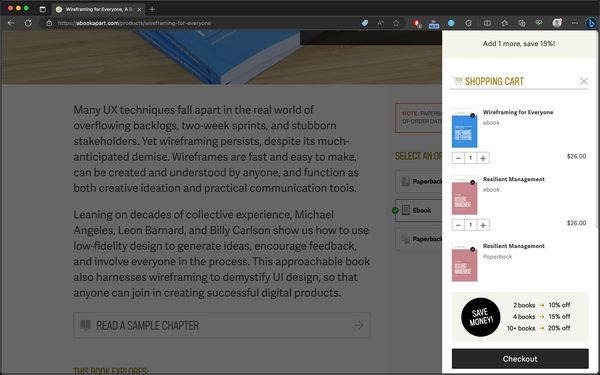
Instead of using live regions to announce that a new item has been added to cart, you can use this pattern and move the user’s keyboard focus to the cart when it is shown. This approach has a couple of benefits, one of them is that it makes it easier for keyboard users to get to the cart, see and/or edit what’s in it, and continue to checkout if this is what they want to do.
Keep in mind that you must treat the cart as a modal dialog in this case and manage focus accordingly, particularly when the contents of the page are dimmed after the cart is shown. You can find the requirements for keyboard focus management for modal dialogs in the Modal Dialog page on the APG website.
As a general rule of thumb: if you can achieve the same result without using live regions, then probably do so. The less ARIA you use, the better. Remember: No ARIA is better than bad ARIA.
If you do use live regions in your web applications, make sure you thoroughly test across all browsers and screen reader pairings. And don’t forget to test with Braille displays, too. And perform usability tests with screen reader users. Not only will usability testing give you insights into what your users are expecting from the application and what they aren’t, but it will also help you understand the different ways screen reader users are using your application and how that will affect the announcements you’re trying to make with live regions.
References, resources and recommended reading
- The Many Lives of a Notification
- Designing for Screen Reader Compatibility
- output: HTML’s native live region element
- Are we live?
- We’re ARIA Live
- Live Region Playground
- (Test case demo) aria-atomic and aria-relevant on aria-live regions
- Accessibility (ARIA) Notification API
- More accessible skeletons
- Defining ‘Toast’ Messages
- A toast to an accessible toast…