Component-level art direction with CSS Container Queries
Container Queries (CQ) allow us to change the styles of a component so it responds to the size of its nearest container. With CQ, we can change how an element looks based on where on a page it is placed and how much horizontal space it occupies.
A lot about a design pattern could change based on how much space it’s got. So Container Queries can be used to do more than just shift elements around in a layout. (Have you seen Jhey’s demo yet?!) But we can only take full advantage of the potential Container Queries offer us if we can use them everywhere a typical viewport media query can be used.
Now that we got Container Queries in CSS, I want them in HTML, too. More specifically, I can see them coming in more handy if they were available in HTML to change an image’s source inside <picture>, just like viewport-based media queries currently are. This would enable us to art-direct images instead of cropping them to fit in a layout.
Images are typically designed to adapt to layout changes much like other UI elements are. It’s possibly even more relevant for images to change with a layout than other UI elements because of their nature as replaced elements.
Take the typical card component for example. Assuming the card’s layout doesn’t change, and assuming the image will always be stacked on top of the content, then it’s usually a good idea to change the aspect ratio and orientation of the image between narrow and wide layouts. A landscape photo might look good in a wide layout, but a portrait photo would suit a narrower layout better.
Using a combination of object-fit and aspect-ratio today, we can fit any image inside a container with an aspect ratio that we specify in our CSS. And with container queries at hand, we can create a more flexible implementation, where the image adapts to the size of the card itself, independent of the size of the viewport. This is already a big improvement to the viewport-based implementation.
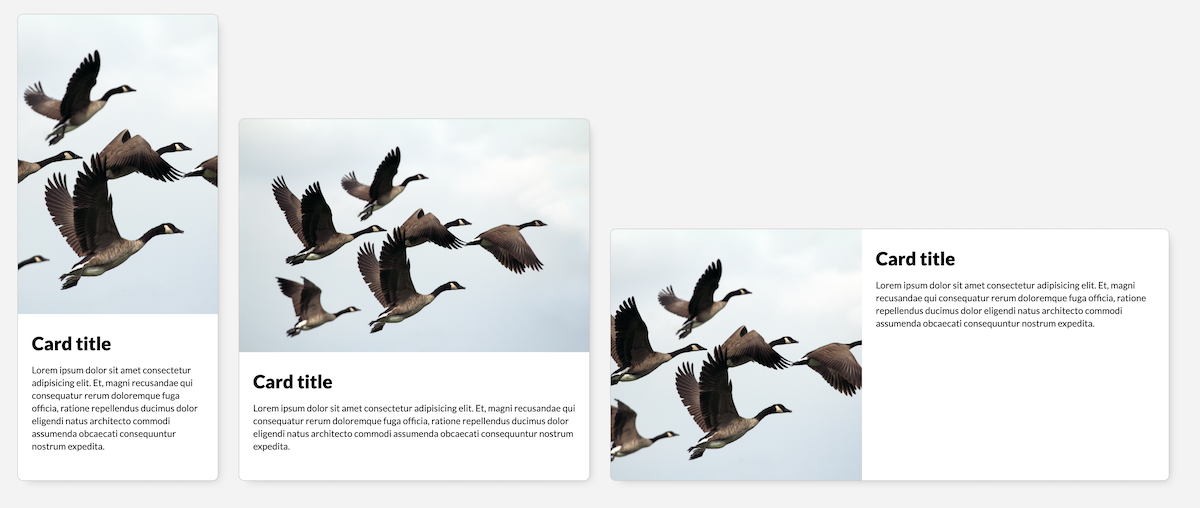
Using the aspect-ratio property in the following demo I have changed the aspect ratio of the image based on the width of the card component. And object-fit is used to crop and scale the image to fit within the bounds of its container in all three cases (because the default aspect ratio of the image doesn’t match any of the aspect ratios I’ve specified in the CSS).
See the Pen MWpwvbB by Sara Soueidan (@SaraSoueidan) on CodePen.
Since the demo is using Container Queries which are currently only supported in Chrome Canary behind a flag, you may only see one aspect ratio on all three card variations. Here is a screenshot of what the image looks like for 3 different card widths:
This is a pretty flexible approach for adapting images in card (or other) components. It is particularly useful when we’re dealing with images that a user might upload via a CMS and whose aspect ratios we don’t know. Specifying an aspect ratio in CSS and cropping and scaling an image to fit within it is a solid approach to handle such images.
But cropping and scaling an image is not always the best approach, though, because not all images can or should be cropped. Sometimes cropping an image straight-up ruins it.
Take a portrait of a person, for example. Cropping it to any aspect ratio other than the one it was taken in would ruin it. And yet on the other hand, keeping the default aspect ratio might not be possible because of design and layout requirements (e.g. the image needs to be one in landscape mode in wider layouts otherwise it would be too tall).
So if we have control over what image(s) to use, the better alternative is to use is to change the image entirely in this case. If I were using a portrait of a person on the site, I might want to use two different shots of that person—one for landscape and another for portrait layouts.
To switch between different images we can use the HTML <picture> element. There are many ways <picture> can be used to serve responsive images. For art direction, the syntax might look like this:
<picture>
<source
media="(min-width: 1024px)"
srcset="desk--wide.jpg">
<img
src="desk--portrait.jpg" alt="My desk setup">
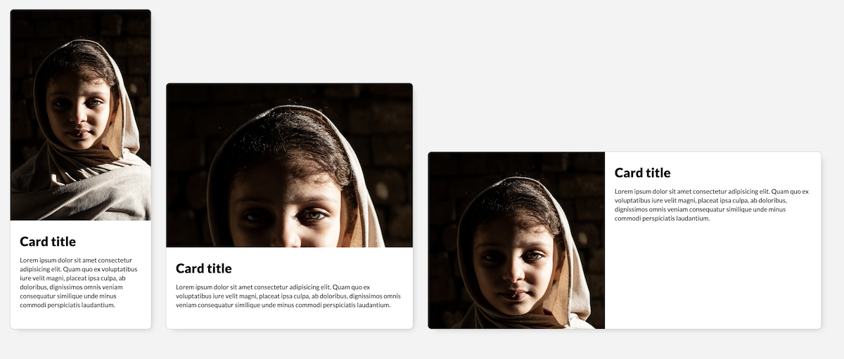
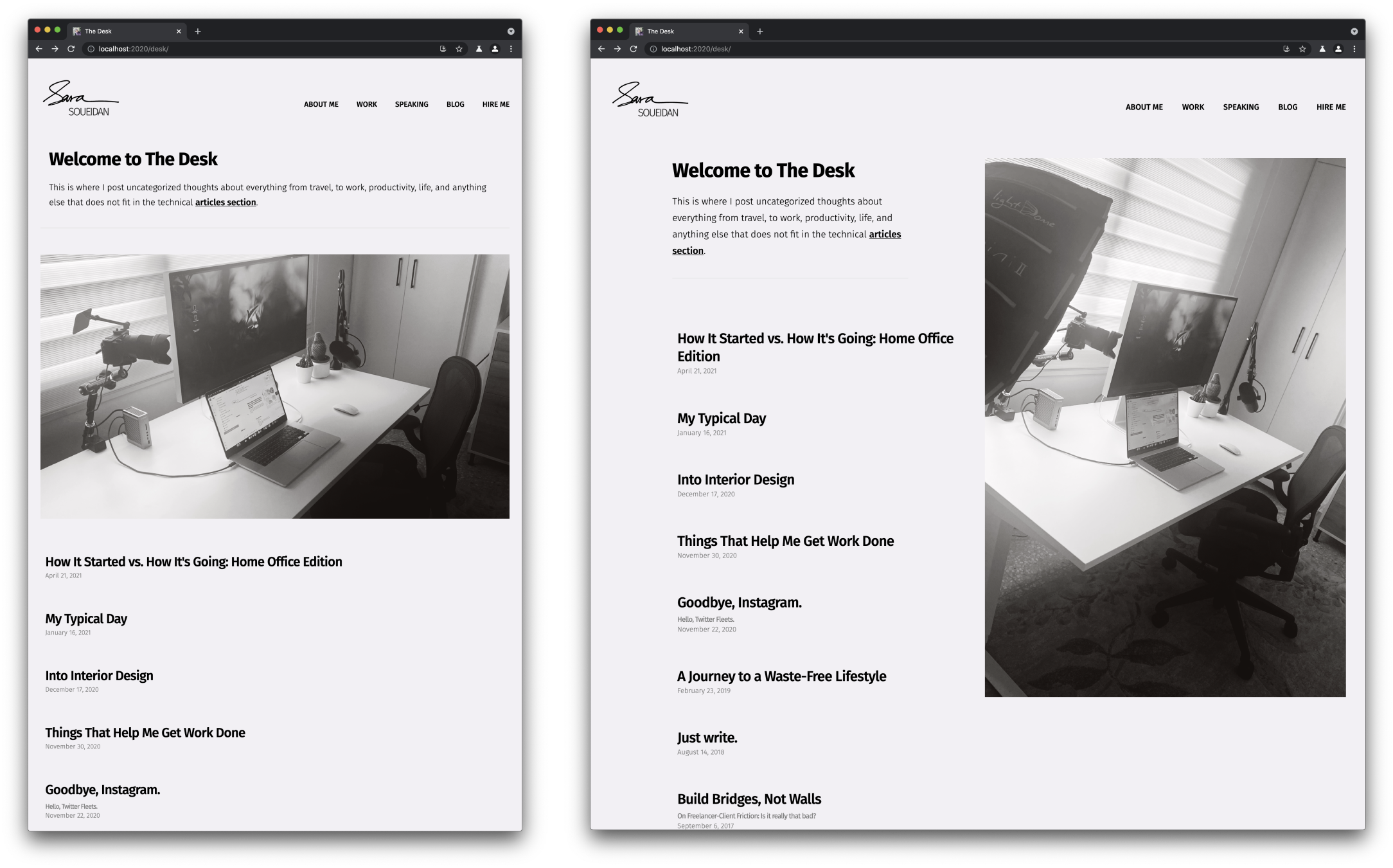
</picture>You can see the above code in action on my Desk page. And here is a screenshot of the Desk page showing two different photos of my desk setup on narrower and wider screens:
alt attribute when the image source changes. Or, if we look at it differently, we don't have a separate alt attribute for every image source we define in our alt atribute anymore.But here’s the thing: the images you specify in <picture> respond to the size of the viewport, not the component they are embedded in. The image on my Desk page changes when the size of the viewport hits 1024px. And that’s fine for this particular use case. But if we’re art-directing images inside components, we’ll want them to respond to the component’s size, not the viewport. After all, this is the kind of responsive behavior that we’ve needed for so long and that Container Queries now provides us with. The next step is, hopefully, Container Queries in HTML.
There is a way we can currently use Container Queries to art direct images in a component, but those images would need to be embedded in the CSS, as background images.
.card__media {
aspect-ratio: 2 / 3;
background-image: url("https://assets.codepen.io/9674/desk--portrait.jpg");
background-size: 100% auto;
}
.container {
container-type: inline-size;
}
@container (min-width: 480px) {
.card__media {
aspect-ratio: 16 / 9;
background-image: url("https://assets.codepen.io/9674/desk--wide.jpg");
}
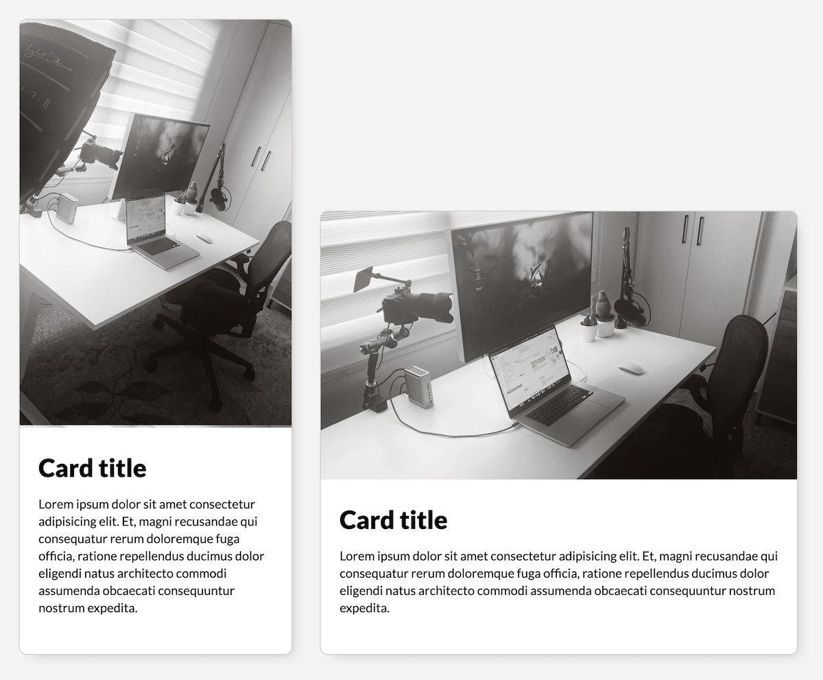
}In other words, the images need to be non-semantic, decoration images. If your image is part of your semantic content, it can’t respond to the container query just yet. And of course, since the image is a background image, we’ll need to use the aspet-ratio on the element that image is applied to, otherwise it would collapse. Here’s a live demo again using Container Queries, so it will only currently work in Canary:
See the Pen Component-level art-direction using CSS Container Queries by Sara Soueidan (@SaraSoueidan) on CodePen.
And a screenshot of the result:
Final Thoughts
We’re only scratching the surface of what Container Queries make possible. I can imagine Container Queries coming handy even in quick prototyping-in-the-browser work, as well as more specific use cases. And I’m sure more smart people will come up with even more use cases as they push the limits of what’s currently possible.
Let’s continue pushing the Web forward.