Are 'CSS Carousels' accessible?
|
“CSS Carousels” were formally introduced a few weeks ago in an article on the Chrome for developers blog, and quite a few people have shared the excitement since then.
When I first heard of them I was very reluctant to jump on the bandwagon of excitement. I will also admit that there was even a small part inside of me that was terrified by the idea. Not only does creating interactive widgets using CSS violate the principle of Separation of Concerns (of which I am an advocate), but also because pretty much every implementation of a CSS-only widget I have seen before has had at least moderate to major accessibility issues.
But because the introductory article mentioned that carousel best practices are handled by the browser
, and that it’d be very difficult to make a more accessible carousel than this
, I was curious to learn more about them so that I could form a more objective and informed opinion on them. (After all, I’m also a developer and convenience sounds appealing to me too.)
So I did. I read the CSS specification and inspected the examples.
In this post, I want to share my findings from examining the accessibility and usability of “CSS Carousels”.
All the examples of CSS Carousels I’ve seen on the wild are based on the same reference—namely the CSS Carousels gallery. So we will be examining a few examples from the gallery to better understand how the new features work and how they affect the accessibility of HTML.
As I mentioned earlier, this stuff is still highly experimental. At the time of making of this post, it is only supported in Chrome Canary behind a flag. I will include video recordings of the examples that I am going to examine, so you don’t need to have Chrome Canary installed unless you want to try the examples out for yourself.
Let’s start by first defining what CSS Carousels are.
What are CSS Carousels?
“CSS Carousels” is an umbrella name for a collection of JavaScript-free, CSS-only implementations of common scrolling UI patterns—mainly patterns like sliders and carousels—that are implemented using new features defined in the CSS Overflow Module 5 specification.
You can find examples of these implementations in the “CSS Carousel gallery” that we will be examining in this post.
The CSS Overflow specification Module (Level 4) specifies CSS features for handling scrollable overflow. When an element has “too much” content for its size, the content “overflows”, and CSS provides features that allow you to handle this overflow—by making the element scroll in either or both directions, for example, or by clipping the overflow, truncating it, and so on and so forth.
The Level 5 of this specification (which is currently still a Working Draft) defines a set of pseudo-elements that are designed to provide specific visual and interactive affordances for scroll containers.
More specifically, according to the specification, this module:
“defines the ability to associate scroll markers with elements in a scroller (or generate them automatically as
::scroll-markerpseudo-elements, with automatic user behavior and accessible labels), which can be activated to scroll to the associated elements and reflect the scroller’s relative scroll progress via the :target-current` pseudo-class.”
Let’s break this down a little bit.
The specification “defines the ability to associate scroll markers with elements in a scroller”…
A scroll marker is any element or pseudo-element with a scroll target.
The HTML
<a>element and SVG<a>element are scroll markers… […] While these navigational links can be created today, there is little feedback to the user regarding the current content being viewed…
For example, think of a sticky Table of Content (TOC), where a link is highlighted when the link’s target section scrolls to the top of the viewport. You can see an example of such a TOC on the web.dev blog, and on MDN guides as well. The active link changes based on which section is scrolled into the viewport.
The links in these tables of content are scroll markers. They mark the scroll position of their target sections. When a link’s target section scrolls to the top of the page, the link is styled to reflect the current scroll position of the section, and to indicate that the section is currently “active”.
We’ve always resorted to using JavaScript to style these links when their respective sections are scrolled into view.
If you inspect the active links on the web.dev blog in the Chrome DevTools, you can see that a specific class name is added to a link when it becomes “active”. This class name is used to apply active styles to the link in CSS.
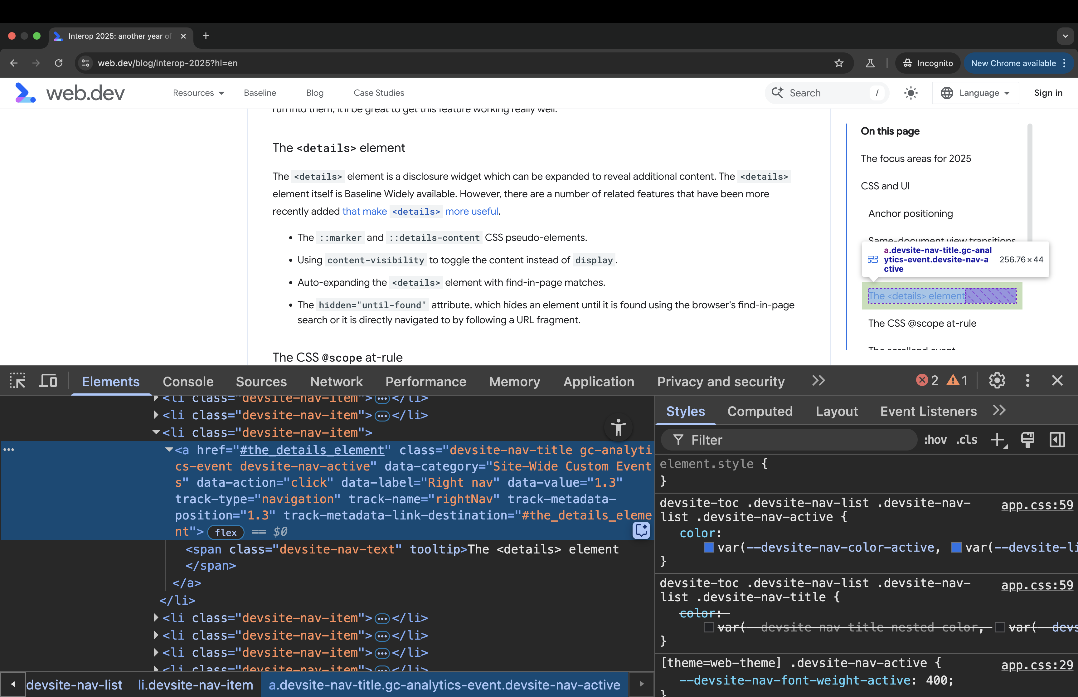
devsite-nav-active class name to the links when their corresponding target sections scroll to the top of the viewport. This class name is added via JavaScript.So, the premise of not requiring JavaScript to style these links and instead take advantage of CSS’s new pseudo-selectors sounds really great! (The :target-current selector in particular is supposed to enable this. More on this later.)
Next, the specification specifies that it adds a mechanism for creating groups of scroll markers, and for automatically creating
, and that ::scroll-marker pseudo-elementswithin each group, the active marker reflects the current scroll position, and can be styled to give the user an indication of which section they are in.
In other words, this specification defines a mechanism that allows you to (1) create a group of scroll markers for a scroll container, where each of the individual scroll markers in the group corresponds to an item in the scroll container, and (2) these markers can be styled to indicate the scroll position within the container.
But scroll markers, by nature, are interactive elements. So the purpose of this specification is to enable CSS to create interactive pseudo-elements (not real elements because CSS can’t do that, nor is it intended to).
This is where things start to become concerning.
Before we discuss why, let’s first get a quick overview of how the scroll markers are created.
A (very quick) overview of how to create scroll markers in CSS
This post is not a tutorial. Since the announcement of CSS Carousels, a few tutorials have been written about the topic, including an MDN guide for Creating CSS Carousels.
But for the purposes of completeness of this post, here’s a high-level, bird’s eye view of how it works:
Say you have a scroller element containing a series of items. For example, say you have a list of images in a horizontally-scrolling container. And say you want to create a list of “dots” for this container that provide a visual indicator of how many images there are in the list and that indicate which item in the list is currently “active”. These dots are also interactive and can be used to scroll their target images into view.
And say that, for some reason, you don’t want to create these indicators in HTML but rather want to create them using CSS instead. (I won’t judge. Yet.) This is the kind of thing that this level of the Overflow specification aims to enable.
You can use the new scroll-marker-group property defined in the specification to instruct the browser to create a grouping container for these dots:
ul.scroller {
    scroll-marker-group: after;
}
The property accepts three values: none, before, and after.
The before and after values indicate whether you want to show the scroll markers before or after the items in the scroll container. If you want the dots to appear before the list of items in the scroller, you use the before value.
The scroll marker group is created inside the list in the form of a pseudo-element: ::scroll-marker-group.
The ::scroll-marker-group pseudo-element is a fully-styleable element (i.e. you can use any CSS property to style it), and it implicitly behaves as a single focusable component, establishing a focusgroup. This means that the group takes up only one tab stop on the page. To navigate through the scroll markers inside the group, you can use the Arrow keys.
The ::scroll-marker-group pseudo-element is a container for its contained ::scroll-marker pseudo-elements (these would be the “dots” corresponding to the images in the list).
To create a scroll marker for the items in the list, you can use the ::scroll-marker pseudo-element on the list items. Like other pseudo-elements, this element will not be rendered if the content property is not declared:
ul.scroller {
  scroll-marker-group: after;

  > li::scroll-marker {
    content: ... / ...;
  }
}
Even though the scroll markers are prepended to the list items in the markup, they are (according to the specification) “collected into the ::scroll-marker-group” so that they can be exposed as a group to assistive technologies.
Now, the ::scroll-markers that the browser creates are interactive elements. Activating a scroll marker will scroll its corresponding item into view.
And the :target-current selector can be used to style the currently-active :scroll-marker when its corresponding target is shown. For example:
ul.scroller {
  scroll-marker-group: after;

  > li::scroll-marker {
    content: ... / ...;
  }

  > li::scroll-marker:target-current {
    /* style active marker */
  }
}
Unlike native scroll markers, though, these are not links. These are interactive pseudo-elements. More on this later.
The specification also defines the ::scroll-button() pseudo-element, which you can use on the scroll container to add (you guessed it!) scroll buttons.
ul.scroller {
  ...

  &::scroll-button(left) {
    content: ...;
  }

  &::scroll-button(right) {
    content: ...;
  }
}
These pseudo-buttons are also fully styleable elements: there is no restriction on what properties you can apply to them. And you can even use the :disabled pseudo-class to apply disabled state styles to the ::scroll-button()s when they are disabled.
ul.scroller {
    ...

    &::scroll-button(left) {
        content: ...;
    }

    &::scroll-button(right) {
        content: ...;
    }

    /* focus styles */
    &::scroll-button(*):focus-visible {
        /* focus styles here */
    }

    /* disabled state styles */
    &::scroll-button(*):disabled {
        /* disabled state styles here */
    }
}
As we mentioned earlier, unlike the ::before and ::after pseudo-elements which are static text elements, the ::scroll-markers and ::scroll-button()s are interactive elements.
Interactive elements have specific accessibility requirements. They should have meaningful roles and descriptive names that identify their purpose, so that the user knows what to expect when they interact with them.
So, at this point there are quite a few questions we should be asking:
- Do these scroll markers meet the accessibility requirements for interactive elements?
- How are the scroll markers exposed to assistive technology users like screen reader users?
- What roles is the browser exposing for these interactive pseudo-elements?
- Do they provide meaningful semantics to the user to help them understand what they are interacting with?
- Does the browser give them accessible names? The specification states that it “defines the ability to associate scroll markers… or generate them automatically as
::scroll-markerpseudo-elements, with automatic user behavior and accessible labels” (emphasis mine). So how are these markers labelled?
We can only find the answer to these questions in the HTML markup, which the browser uses to create the accessibility tree.
Scroll markers: From CSS to HTML to the accessibility tree
Semantic HTML is the foundation of accessibility on the Web.
Semantic HTML carries meaning. Assistive technologies (AT) like screen readers (SR) rely on the meaningful semantics in HTML to present Web content to their users and to create an interface for navigating that content.
But HTML is only as accessible as you write it. Even semantic HTML can be “inaccessible” if you don’t write it as it is intended.
For example, many elements are only meaningful when they are children of other elements, or when they are associated with other elements. If you don’t use these elements as intended, then they will lose their meaning and they won’t be as useful to screen reader users anymore.
So there are certain “rules” that you should follow to ensure that you get the most out of HTML’s inherent accessibility.
HTML provides many meaningful, semantic elements that represent various types of content & interactive controls. And using those elements is critical for describing the purpose of your content to assistive technology users.
But there are still some more complex components that don’t yet have meaningful elements in HTML to represent them. Until these elements exist, we can use ARIA to create them.
Think of ARIA as a polyfill for HTML semantics. It provides additional attributes—roles, states, and properties—that allow us to create complex, interactive components that do not yet have native equivalents in HTML. Using ARIA attributes we can describe these UI components to assistive technologies like screen readers.
So, together, HTML and ARIA provide important accessibility information to screen readers, without which the content of the page would not be perceivable, operable, or understandable by their users.
This is why it is always critical to understand how a CSS feature may affect the accessibility information created in HTML.
The CSS Overflow Module aims to define a set of features that provide visual affordances to scrollable containers by creating and appending new interactive elements (the scroll markers) into the HTML markup of the page. As such, we must expect these elements to affect the accessibility information exposed to assistive technologies like screen readers.
The ::before and ::after pseudo-elements already do affect the accessibility information of an element because the contents of these elements are exposed to screen readers, and they contribute to the accessible name computation of the element they are created on.
Scroll markers will affect the accessibility information differently because they are also interactive, which means that they are expected to expose roles, states, and other properties, depending on the type of element that they are exposed as.
Now, to check the accessibility information of the page, we can inspect the page’s accessibility tree.
The accessibility tree (“accTree”) is a tree of objects (similar to the DOM tree), each object containing accessibility information about an element on the page. Not all elements are represented in the accTree because not all elements are relevant for accessibility. Only a meaningful element that is not hidden (using HTML or CSS) is exposed in the accessibility tree.
The information the browser exposes about an element depends on the nature of the element (like whether it’s interactive or not).
Typically, there are four main pieces of information that the browser exposes about an element in the accTree:
- The element’s role (What kind of thing is it?). The role of an element identifies its purpose. It lets a screen reader user know what something is, which is also an indication of how that thing is to be used.
- The element’s name (a.k.a the accessible name, “accName”). The names identifies an element within an interface and in some cases helps indicate what an element does.
- The element’s description if it has one. For example, a text input field may have a short description of what the expected input looks like.
- The element’s state when it has one. For example, is the button pressed? is the checkbox checked, unchecked, or undetermined?
The accessibility tree also exposes any properties that the element may have (such as if a button is focusable or disabled), as well as any relationships with other elements (like if the element is part of a group, or if is it labelled by or described by another element).
The information exposed in the accessibility tree is very useful to us as developers because it gives us insights into how our content will be exposed to and presented by screen readers.
Knowing how the browser exposes scroll markers to the user allows you to check whether the information being exposed is hepful to the user’s understanding of the page or not, and it allows you to test whether your component meets the expectations the user has based on that information.
Importantly, how scroll markers are exposed in the context they are used in will be critical to determining how they affect the accessibility and the usability of your components.
Quick refresher: Inspecting CSS scroll markers’ accessibility information in the browser DevTools
We can inspect how the browser is exposing an element in the accTree using the browser DevTools.
When you open the Chrome DevTools, you can find the accessibility information of an element under Accessibility panel. You will find the Accessibility panel on the right side of the CSS Styles panel.
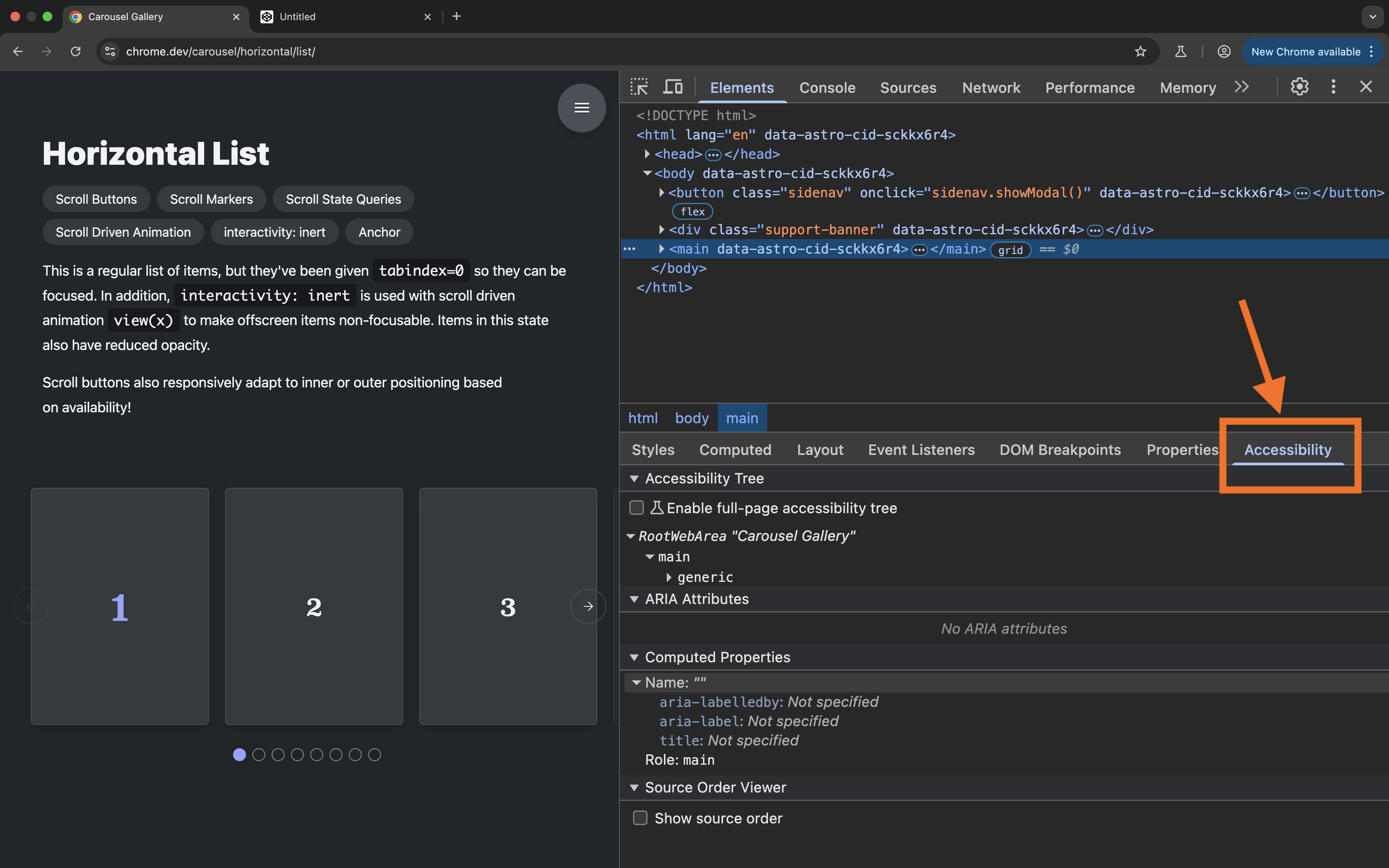
In addition to inspecting the accessibility object for each element in the Accessibility Panel, Chrome also provide a full-page accessibility tree view. To use it, in the Accessibility tab, check the “Enable full-page accessibility tree” option.
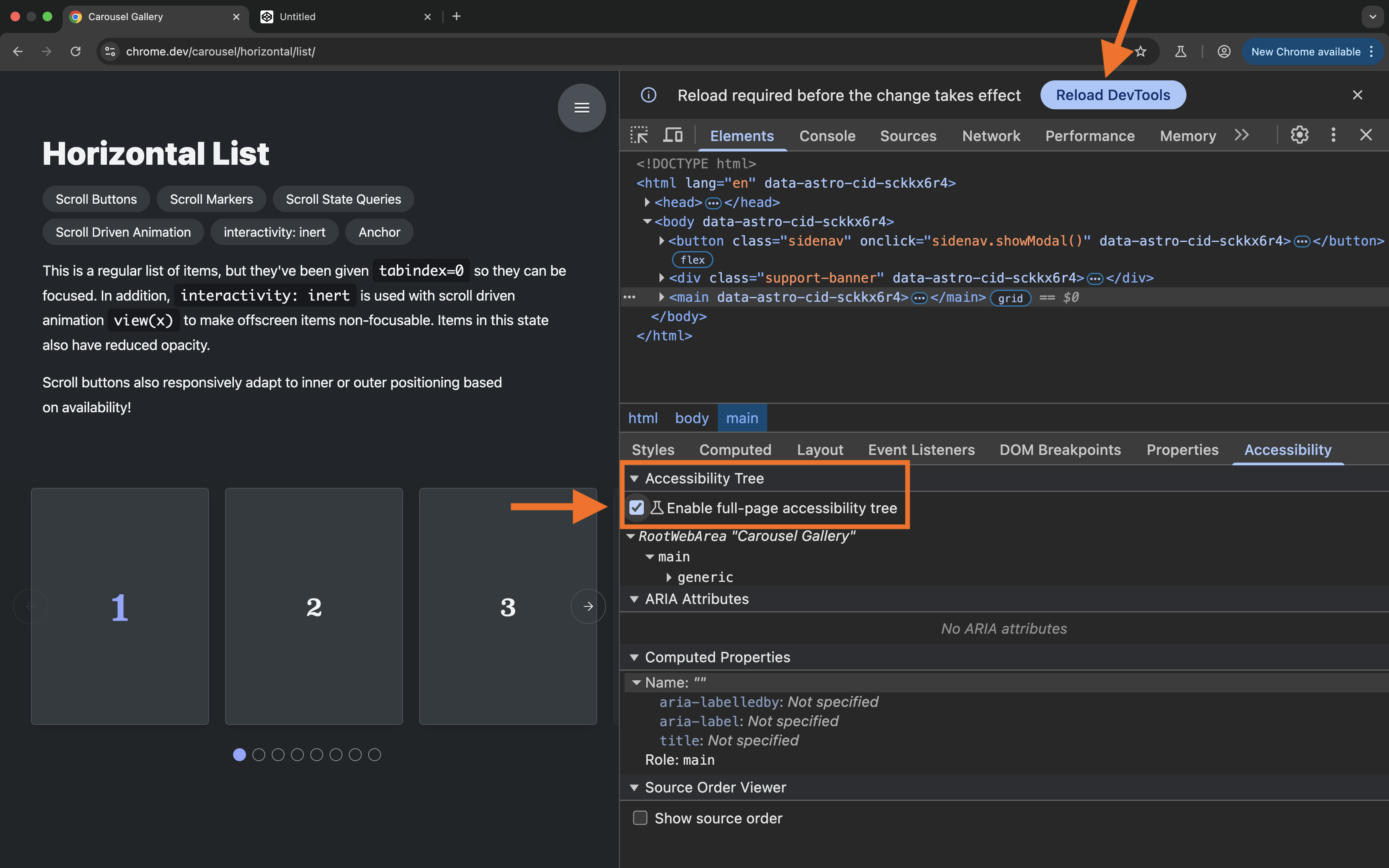
(First-time only) click the “Reload devtools to enable feature” button at the top of the DevTools.
Then, in the Elements tab, click “Switch to accessibility tree view” button in the top right corner.
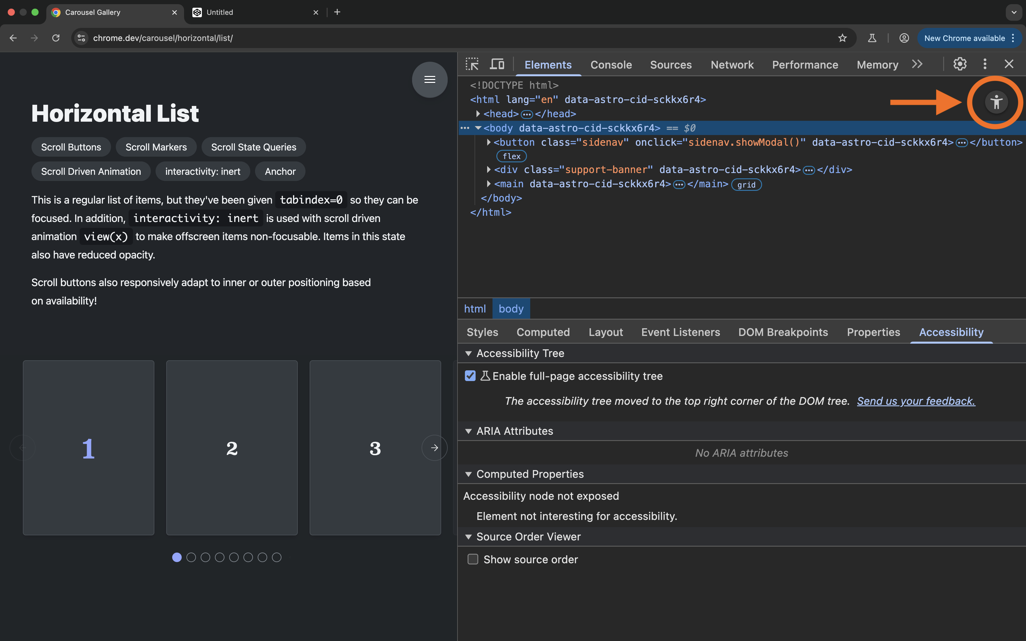
Now, the full-page accessibility tree replaces the DOM tree in the panel, and element names, roles, values and states are shown in an easy-to-read, and very practical hierarchal tree view.
This view gives you an overview of how the contents of the entire page are exposed. We’re going to use this tree view to understand the CSS Carousel examples better.
So what we’re going to do next is we’re going to go over a few of the examples in the CSS Carousel gallery and we’re going to inspect the accessibility information for these examples, use a screen reader to navigate them, operate them using a keyboard, and generally examine the usability of these examples. After all, the gallery’s homepage encourages us to inspect the CSS, review the DOM, and check the accessibility tree
. So, let’s do just that.
Examining the accessibility of CSS Carousels
Before going through each example separately, I want to mention a few things that all examples have in common:
- The
scroll-marker-groupproperty is used on the scroll container to create a::scroll-marker-grouppseudo-element inside the container. If you disable the property, the group of scroll markers (::scroll-marker-group) is removed, and so is every scroll marker (::scroll-marker) corresponding to each of the items in the container. - The
::scroll-marker-groupelement is exposed as atablistin the accessibility tree. Note that this is not mentioned anywhere in the CSS specification (at the time of making of this post). These are the semantics that Chrome is currently exposing under the hood. - Each
::scroll-markerelement is exposed as atabwithin the tablist. - The accessible name for the scroll marker is provided in CSS via the
contentproperty. You must provide the name for each tab. The browser will not do this for you. - When
::scroll-button()s are present, they are exposed asbuttons. You are also expected to provide an accessible name to these buttons via the CSScontentproperty.
Now, here is the most important takeaway from all of this:
Because all the scroll markers are exposed as tabs, this means that all the carousel examples in the gallery are supposed to be Tabs widgets.
Yes, you read that right. Even though most of these components don’t look or behave like Tabs, the browser is using Tabs widget semantics to describe them to assistive technologies. This is already concerning because the gallery contains different UI patterns that are clearly not Tabs.
If you’re a student of my Practical Accessibility course, then you’ll remember the statement: ARIA is a promise.
When you use ARIA to describe an element to your users, you must ask yourself: Am I delivering on the promise I have made to the user? Is this element really what I’m exposing it to be?
The browser is using ARIA Tab widget roles to expose the examples in the CSS Carousels gallery as Tabs widgets. The question is: Are they really? Do these examples meet the expectations and requirements for Tabs widgets?
We’ll start to get more technical from here on.
Tabs widget accessibility requirements
Tabs have specific accessibility requirements. We’ll start by reviewing these requirements for so we have a benchmark to test the examples against.
If these requirements are not met, then the examples are going to be confusing and unusable by screen reader users.
If you’ve taken my course, then you’ll remember from the very first ARIA chapter—ARIA 101—that ARIA is extremely powerful but also very dangerous if you don’t use it correctly. And that if you’re not aware of how roles, states and properties work together, you can end up creating a more confusing and inaccessible user experience.
We also learned that the ARIA specification documents the requirements for ARIA roles in the definition of each role, and that there are strict parent-child relationships between some ARIA roles. This means that the use of some attributes is restricted to specific contexts or parents. Some roles can only be used as a child to a specific—usually composite—ARIA role.
It is important that you learn and understand how ARIA attributes are used and nested, especially if you’re creating components that are re-used in various contexts across a website or application.
To create a Tabs widget today, you need to use the ARIA tab role, the tabpanel role, and the composite tablist role.
According to the specification (emphasis mine):
Authors MUST ensure elements with role
tabare contained in, or owned by, an element with the roletablist.[…]
Authors MUST ensure that if a
tabis active, a correspondingtabpanelthat represents the activetabis rendered.[…]
For a single-selectable
tablist, authors SHOULD hide othertabpanelelements from the user until the user selects the tab associated with that tabpanel.[…]
In either case, authors SHOULD ensure that a selected tab has its
aria-selectedattribute set totrue, that inactive tab elements have theiraria-selectedattribute set tofalse
So the specification specifies how the tab and tablist roles should be used, and states the requirements needed to ensure the Tabs widget you’re creating is accessible.
The ARIA specification also refers to the ARIA Authoring Practices Guide (APG) for technical guidance about implementing Tabs.
The APG’s primary purpose is to demonstrate how to use ARIA to implement widgets in accordance with the ARIA specification.
According to the guidance in the APG’s Tabs pattern page (emphasis mine):
Tabs are a set of layered sections of content, known as tab panels, that display one panel of content at a time. Each tab panel has an associated tab element, that when activated, displays the panel.
[…]
When a tabbed interface is initialized, one tab panel is displayed and its associated tab is styled to indicate that it is active. When the user activates one of the other tab elements, the previously displayed tab panel is hidden, the tab panel associated with the activated tab becomes visible, and the tab is considered “active”.
There are also two types of Tabs:
- Tabs With Automatic Activation: A tabs widget where tabs are automatically activated and their panel is displayed when they receive focus.
- Tabs With Manual Activation: A tabs widget where users activate a tab and display its panel by pressing Space or Enter.
Regardless of the type of activation, a Tabs component has these keyboard interaction requirements:
- When you press the
tabkey and focus moves into the tab list, focus moves to the activetabelement. - When the tab list contains the focus, pressing the
tabkey again moves focus to the next element in the page tab sequence outside the tablist, which is the tabpanel unless the first element containing meaningful content inside the tabpanel is focusable. - When focus is inside the tab list:
- Pressing the
Left Arrowkey moves focus to the previous tab. If focus is on the first tab, it moves focus to the last tab. - Pressing the
Right Arrowkey moves focus to the next tab. If focus is on the last tab element, moves focus to the first tab.
- Pressing the
We’re going to focus on the automatic activation tabs widget because the CSS Carousels examples are implemented so that a scroll marker’s corresponding item is shown when the marker receives focus, which means that the widget is supposed to be an automatic activation widget.
Here is a video demonstration of how the automatic activation tabs widget is expected to be operated using a keyboard, and then using a screen reader.
- Pressing the tab key moves keyboard focus into the tablist. The selected tab receives focus.
- Pressing tab again moves keyboard focus to the active tabpanel.
- Using Left and Right Arrow keys navigates between the tabs in the tablist and automatically activates the focused tab. The corresponding tabpanel is shown. The other tabpanels are hidden.
- Using a screen reader (VoiceOver on macOS in this video):
- If you navigate using the tab key, the experience is the same, and the screen reader announces the tab and the tabpanel when they receive focus. It announces the tab and the tabpanel's roles followed by their accessible names. For the
tab, it also announces that it is selected. - If you navigate by Arrow keys using VoiceOver navigation, VoiceOver announces the tabs and tabpanels when they receive focus. It also announces the state of the tabs. Navigating to a tab using this mode of navigation does not activate the tab. The selected tab will be announced as selected. The tabs that are not selected will not be announced as selected. Navigating away from the tabs, the active tabpanel is announced. The remaining tabpanels are hidden. A tabpanel only becomes accessible when its corresponding tab is activated.
- If you navigate using the tab key, the experience is the same, and the screen reader announces the tab and the tabpanel when they receive focus. It announces the tab and the tabpanel's roles followed by their accessible names. For the
So, in an automatic activation tab widget, moving keyboard focus (not screen reader focus) from one tab to the other activates the tab’s corresponding tabpanel. The other tabpanels are hidden from all users and are therefore also not accessible by keyboard.
Now let’s go over a few of the examples in the CSS Carousel Gallery and check to see if they meet the requirements defined in the ARIA specification, and the expected semantics and behavior listed in the APG.
For each example, I’m going to focus on specific aspects of accessibility more than others. For example, I will highlight keyboard navigation in one example, screen reader navigation in another, screen reader announcements in another, and so on and so forth, depending on what issue stands out for every particular example.
Remember that, with the current implementation of scroll markers, each of these examples is supposed to be a Tabs widget.
And, finally, remember that tabs and buttons, like every other interactive element, need an accessible name.
With all of this said, let’s start going through the examples in the gallery.
I’m going to start with the horizontal list—a typical carousel example.
The Horizontal List example
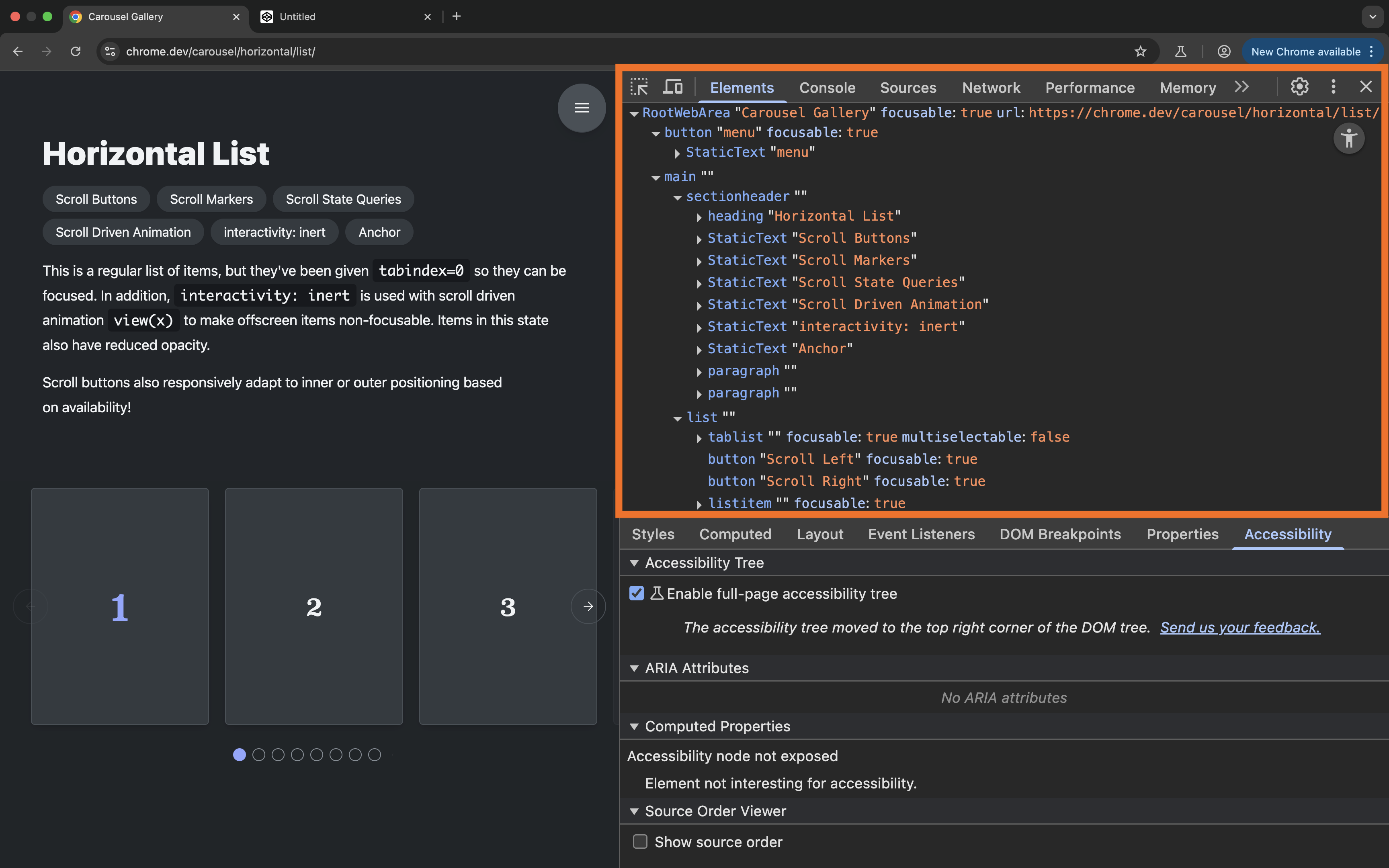
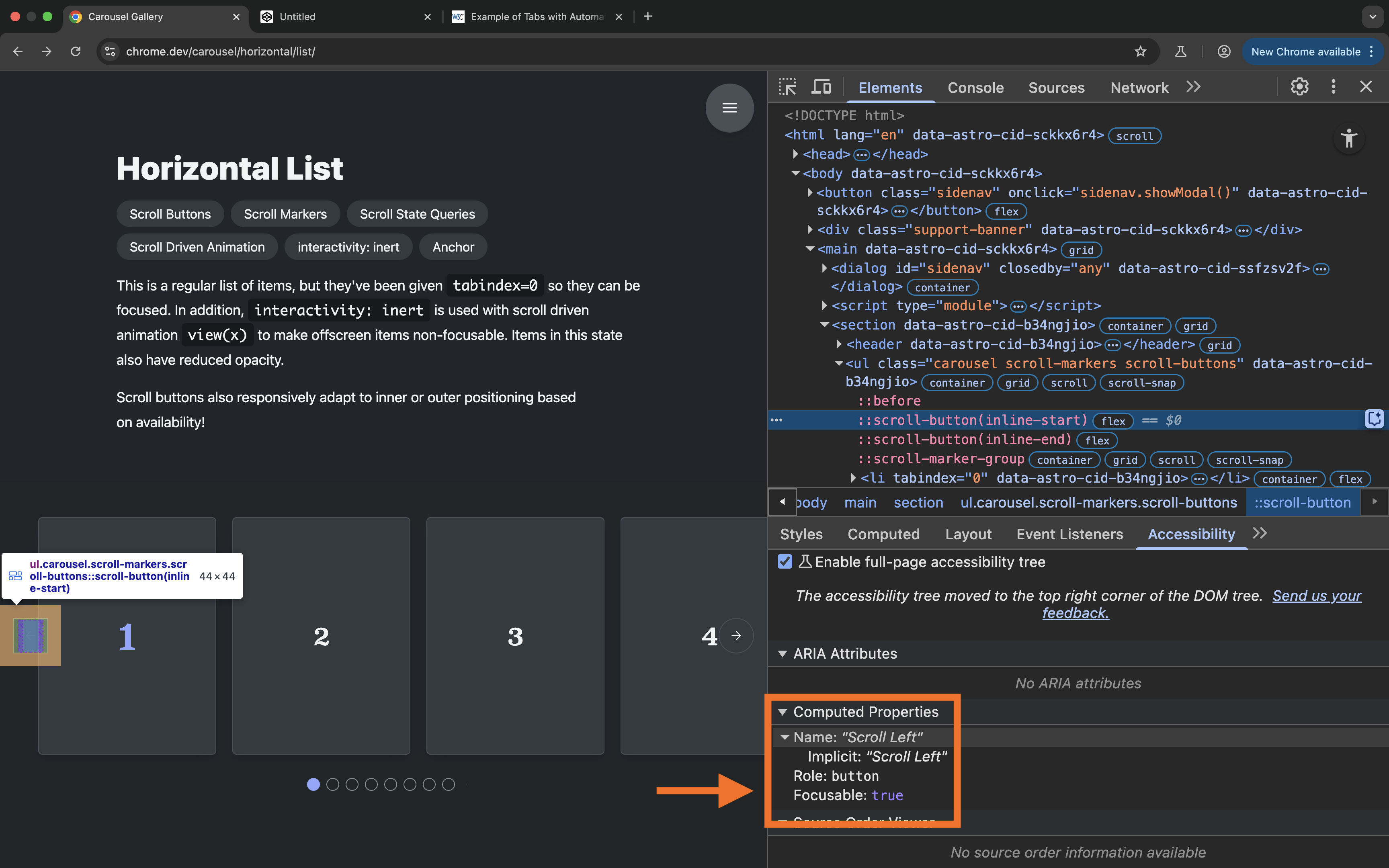
In this example, like all the other examples in the gallery, if you open the DevTools and inspect the accessibility tree you can see that the scroll markers are exposed as tabs contained in a tablist.
However, there are no corresponding tabpanels for these tabs.
As we mentioned earlier, the ARIA specification states that you "MUST ensure that if a tab is active, a corresponding tabpanel that represents the active tab is rendered." However, there are no tabpanels at all in this example. So this Tabs widget is already missing an integral part of what makes it a Tabs widget. What do the tabs control?
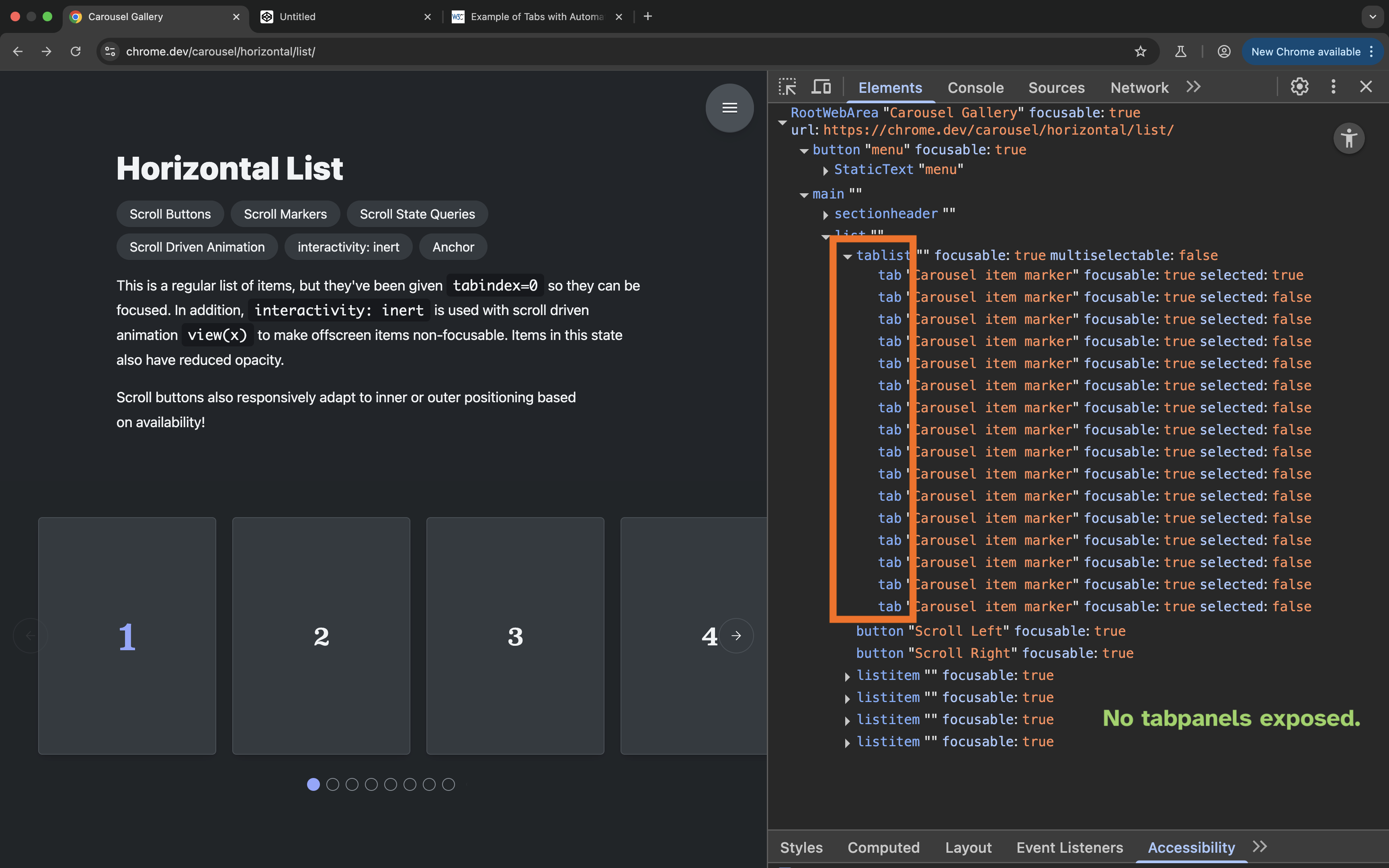
Looking at the individual tabs, you’ll find that all the tabs in the tablist share the same accessible name.
Looking in the Styles panel, you will find that the accessible name for all of the ::scroll-markers is provided using the CSS content property:
.scroll-markers {
    ..
    &::scroll-marker {
        content: "" / "Carousel item marker";
        ..
    }
}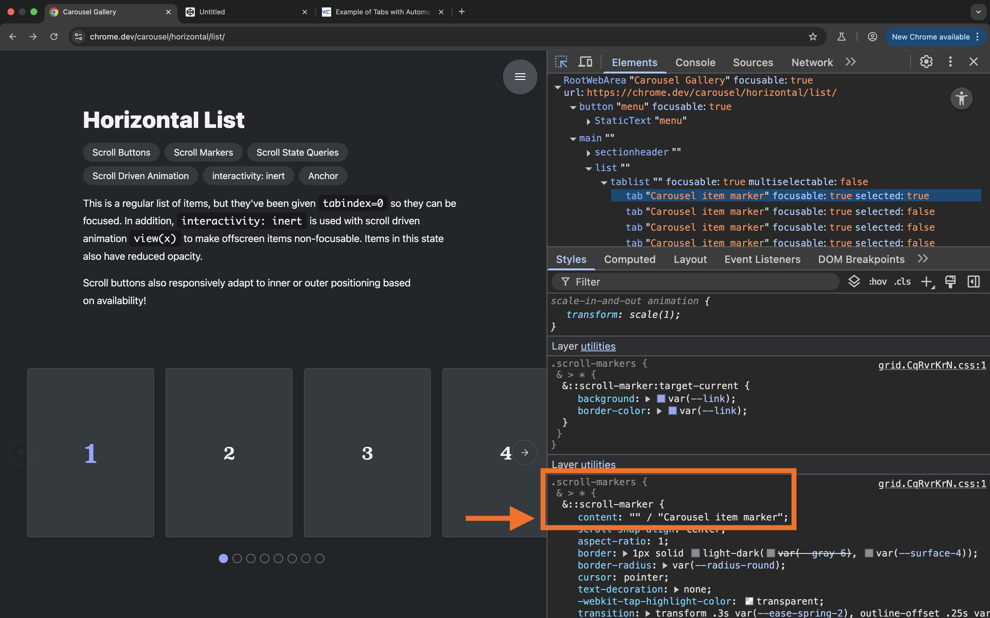
The notable thing here is that the name is provided as a fallback alt text. This is because the dots are not supposed to have visible text labels, so the content is left empty.
Now, because this declaration is provided as alt text for all scroll markers on all the list items, the alt text is exposed as the accessible name for all the scroll markers corresponding to all the list items.
Buttons, tabs, and other interactive elements that do different things should have unique names that describe their purpose. But what we have here is 16 tabs that share the same name. So how does a user know which item each “tab” corresponds to?
Instead of providing one accessible name for all scroll markers, each marker should be given its own unique name. This means that you will want to select each list item and provide a unique accessible name for its marker. You can do that by providing a unique label in the content property, or, alternatively, you could provide the unique names in the form of HTML attributes in the markup and then reference the names in CSS using one declaration that uses the attr() function. We’ll see this declaration in action in another example.
Now, looking at the carousel itself, the first thing that comes to mind is that unlike a Tabs widget, more than one item is shown in this carousel at a time.
The APG description of a Tabs widget says that “Tabs are a set of layered sections of content, known as tab panels, that display one panel of content at a time.”
The ARIA specification also states that “for a single-selectable tablist, authors should hide other tabpanel elements from the user until the user selects the tab associated with that tabpanel.”
Now, tabs can be multi-selectable. The ARIA specification specifies a multi-selectable tabs widget as a kind of tabs where more than one tab can be selected at a time.
However, when more than one tab can be selected at a time, the specification states that you should ensure that the
tab for each visible tabpanel has the aria-expanded attribute set to true, and that the tabs associated with the remaining hidden from all users tabpanel elements have their aria-expanded attributes set to false.
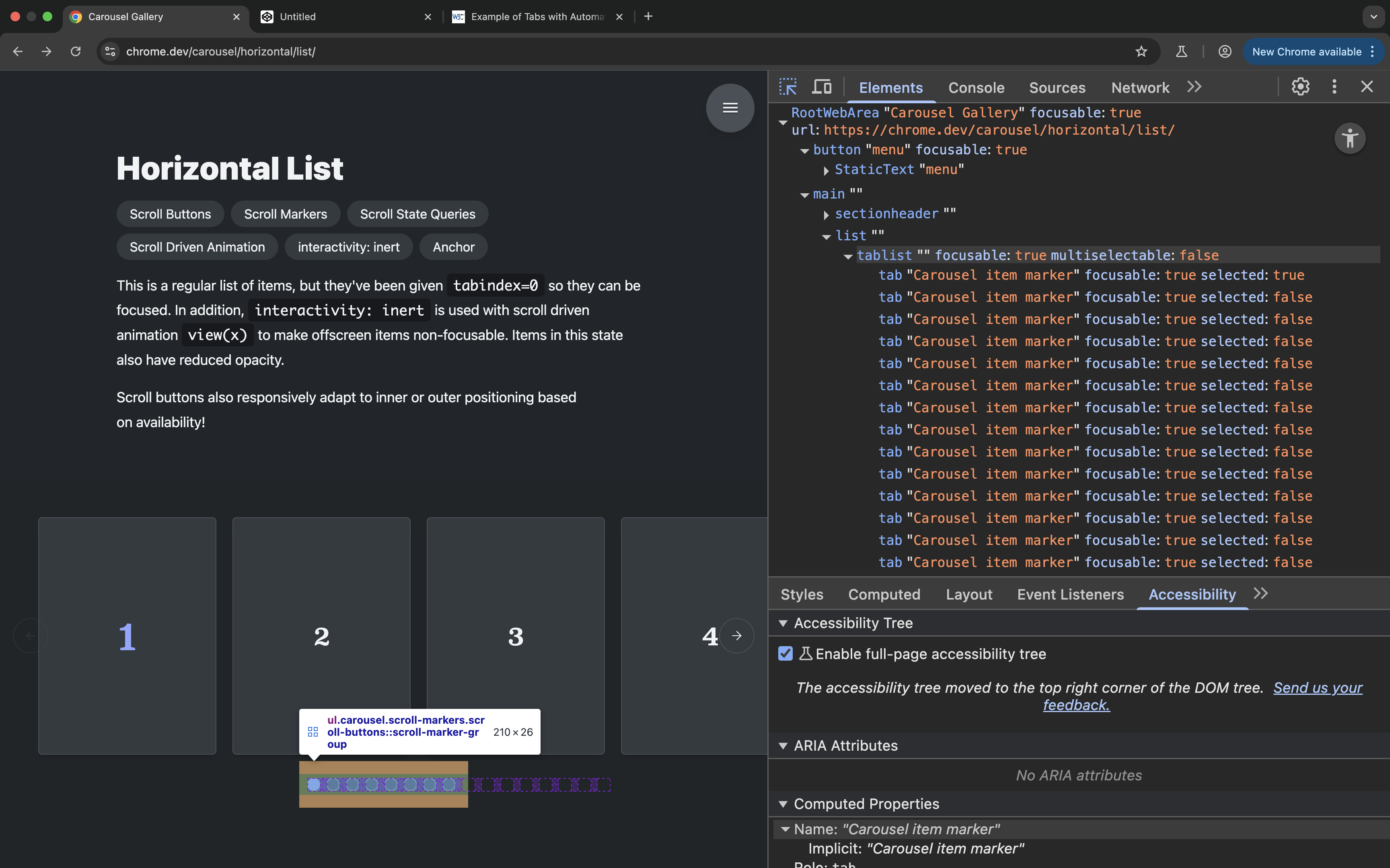
If you inspect the accessibility tree, you can see that the scroll marker group is not a multi-selectable tablist. The browser sets the multiselectable attribute value to false on the list indicating that only one tab can be selected at a time. And if you inspect the tabs within the tab list, you can see that only one tab has aria-selected=true on it at a time.
If this were meant to be a multi-selectable tabs widget, then it should indicate that, and the browser should set the aria-selected and aria-expanded attributes to true on all the scroll markers of the visible items.
However, even the CSS specification is specific about selecting only one scroll marker at a time. It literally states that exactly one scroll marker within each scroll marker group is determined to be active at a time.
So, by definition, scroll markers are not designed to be used to create multi-selectable components, and especially not multi-selectable Tabs components.
So, what we have here is scroll markers being exposed as single-selectable tabs in a carousel component where more than one item is “active” at a time. And even though more than one one item is active, only one scroll marker is “selected”.
And this is not something that you, as the author of the code, can change because you have no control over the semantic output of the CSS properties you use.
This indicates that the semantics exposed for the scroll markers are neither suitable nor representative of the component they are used to implement.
Now, if you navigate to the carousel using a screen reader (I am using VoiceOver on macOS), you will notice that numeration inside the list is off. This is because the browser adds the scroll marker group as well as the Previous and Next scroll buttons as direct children to the list, as siblings to the list items. So the total number of items in the list is miscommunicated to the user and no longer represents the actual number of list items.
Here is a video recording of how the carousel is announced with VoiceOver on macOS:
Furthermore, notice how the Scroll Left button remains focusable even though it is meant to be disabled.
A disabled <button> will typically be removed from the sequential tab order of the page, and will be exposed as a disabled button to screen reader users. However, if you inspect the accessibility information of that button when it’s in the disabled state, you’ll find that the browser does not expose it as a disabled button.
You may have noticed in this recording that some tabs were announced as selected even though their corresponding items were not active/visible. On the other hand, only one of the active tabs was announced as selected even though more than one item is active/visible at a time.
So, this carousel example has several accessibility and usability issues.
A blind screen reader user navigating this carousel would encounter a broken component and would likely be confused as to what it is they are interacting with, and what will happen when each of the “tabs” is activated.
So, as a conclusion I would say that this implementation of a horizontal list carousel is not accessible, and not ready for production.
Moving on to the Cards example…
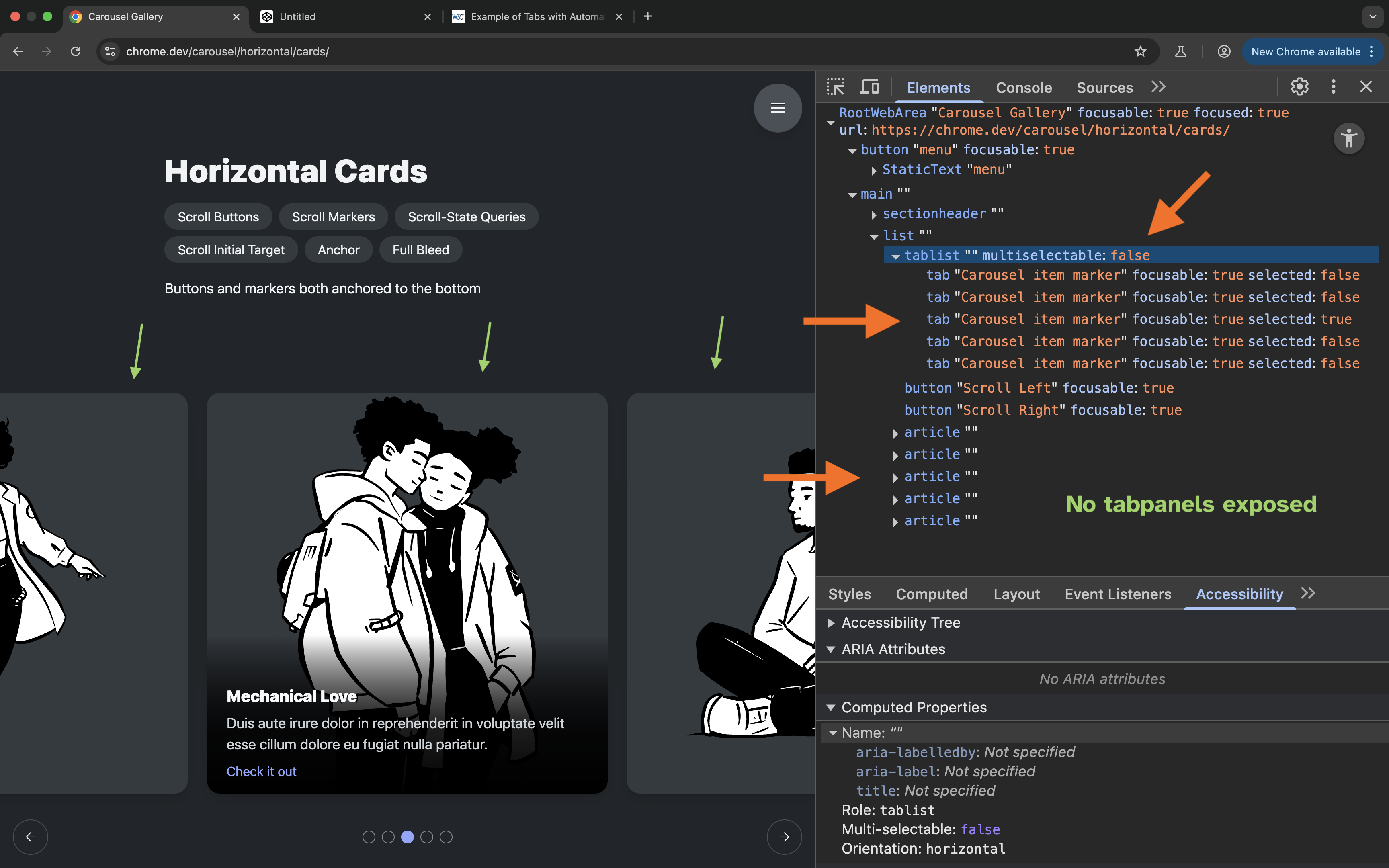
The Cards example
If you pull up the browser DevTools again to get an overview of the accessibility information exposed to screen readers in the accessibility tree, you can see that, like with the previous example, the browser has appends a single-selectable tablist to the scroll container.
Like with the horizontal list example, more than one Card is visible at a time, yet only one tab is selected at a time.
The tablist in this example contains five tabs corresponding to the five different cards. Yet all the tabs have the same accessible name.
The cards are implemented (and exposed) as articles. So, once again, there are no tabpanels in this widget either.
Since this example contains interactive elements inside the carousel items, let’s focus on how keyboard navigation works in the carousel. We will also be testing screen reader navigation separately.
When I start to navigate the page using the Tab key, focus moves inside the carousel to the scroll marker group (the tablist).
Pressing the tab key again moves focus outside the group into the next focusable element in the DOM, which is the Scroll Left button. Pressing the tab key again moves focus to the Scroll Right button. Normally, you would expect keyboard focus to move from the selected tab to the tab panel it controls (or a focusable element inside that panel). This is also the expected behavior stated and demonstrated in the APG.
Now, when I press the tab key again, this is where the carousel starts to behave erratically.
Here is a short video recording of me navigating the Cards example using keyboard, followed by some of the most important observations:
First, when you’re in the scroll markers group and you press the tab key, focus does not necessarily move to the currently selected card (the “tabpanel”). Instead, it moves to the first focusable element in the first card inside the scroller. Sometimes it will move to the first visible card. Sometimes it will move to the first card in the container even when it’s not visible. And sometimes it will move to the expected card.
Second, pressing Shift + Tab when you’re inside a card to navigate backwards does not return keyboard focus back to the tab that activated the card (which is the expected keyboard behavior for a Tabs widget). Instead, keyboard focus moves to the link in the previous card, and then to the link in the previous previous card, and then to the link in the previous previous previous card, and so on and so forth. This is because the invisible cards are not really hidden like they would be in a Tabs component. They are just scrolled out of view. As such, keyboard focus moves to an element that is not even supposed to be active or accessible.
Third, you will also notice that when focus moves to the link inside a card, the card’s corresponding tab is not selected. A tab is only visually marked as selected when it scrolls into a certain position within the container. Because of that, the browser will skip a tab and visually select the one that comes after it.
And lastly, if you inspect the accessibility information exposed to the user as you navigate the carousel using keyboard, you’ll also see that the state of the tabs is not correctly conveyed to the user. Even when a tab is visually marked as selected, its accessibility state is not updated. So a blind screen reader user navigating using a keyboard will not be getting the same feedback as a sighted user does.
And a sighted screen reader user will also get a mismatch between what they see on screen and what the screen reader announces to them.
Here is a video recording of navigating the Cards carousel using VoiceOver on macOS:
- The scroll markers are not visually updated to indicate which card is currently selected when navigating through the cards with keyboard and VoiceOver navigation.
- Numeration in the list is wrong due to the fact that the scroll buttons and scroll marker group are included inside the list. So the number of items in the list is micsommunicated to the user.
Both keyboard and screen reader navigation is broken in this example.
The entire behavior of this widget is based on how any normal scrolling container containing focusable elements would behave. This carousel does not behave like Tabs because it is not a Tabs widget. The accessibility information exposed to screen reader users is generally misleading and mostly incorrect, making it unusable.
Moving on to the Scroll Spy example…
The Scroll Spy example
The ScrollSpy example displays a series of content sections inside a vertically-scrolling container.
This scrolling container contains what effectively looks like an article made up of a series of sections with headings, and that has a table of contents on the left side of the article. Only instead of having a table of contents—which is semantically structured using a list of links, this example is also implemented using CSS scroll markers. This means that instead of a list of links, the “article” has a group of tabs!
If you inspect the accessibility information in the accTree, you’ll notice common issues with the previous examples:
- We have a single-selectable
tablistwith only onetabselected at a time, when more than one section is visible at a time. - Like previous examples, there are no
tabpanels in what is supposed to be a Tabs widget. Instead, the sections are implemented as regions. This means that each section is exposed as a page landmark, which is very uncommon for a series of text sections like these. We’ll talk about why they are exposed as regions shortly.
Once again, the browser is exposing semantics that are not representative of the pattern they are used to implement.
Furthermore, the tabs in this example do not have accessible names.
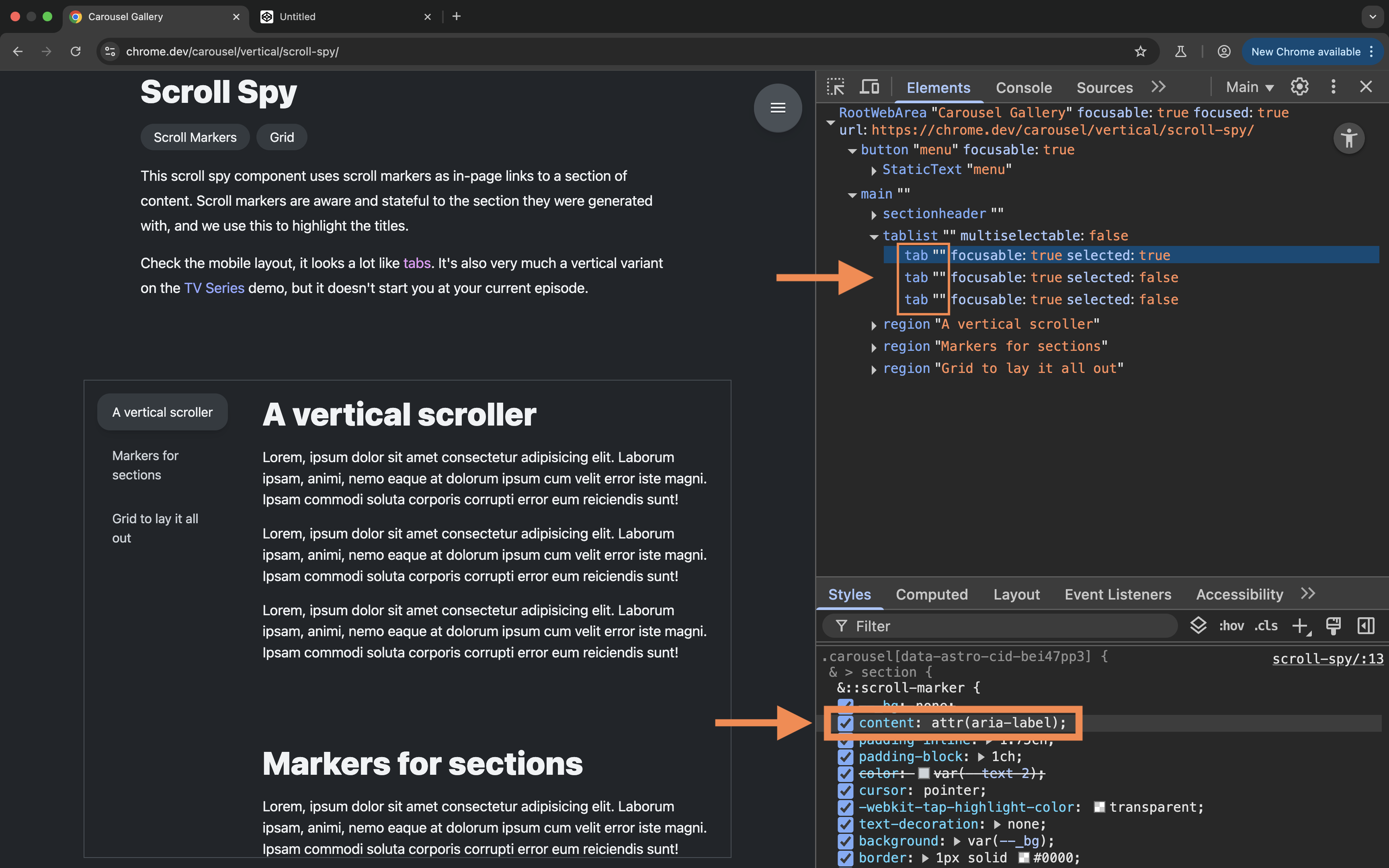
If you check the Styles panel, you’ll notice that the name of the markers is provided using the attr() function.
The :scroll-marker of each section pulls its content (and by extension: its accessible name) from the aria-label attribute on that section.
section::scroll-marker {
    content: attr(aria-label);
}
Even though the content of the aria-label attribute is visually rendered in the scroll markers, it is not exposed as a name for the tabs in the accessibility tree. So these markers have no accessible names.
This is probably a bug.
Now, the presence of aria-label on the <section>s provide these sections with an accessbile name. And, according to the specification, a <section> is exposed as a region landmark when it is given an accessible name. This is why the sections in this component are exposed as landmark regions.
Here is how VoiceOver on macOS announces the ScrollSpy example:
Notice how VoiceOver announces the tabs with no names.
You will also notice in the recording that the tabs are announced as selected, even when their target sections are not scrolled into view.
So the screen reader announces the presence of tabs only, but there is no other information describing the component to the user. A blind screen reader user will come across a list of controls that have no names and no indication of what they control.
In addition to highlighting the scroll marker naming bug, I wanted to use this example as an opportunity to highlight another issue with the :target-current selector introduced in the specification.
Instead of using ::scroll-markers to implement this example, I would instead expect to be able to create a semantic table of contents using an HTML list of <a href="">, and then use the :target-current pseudo-class to apply active styles to a link (the native scroll marker!) when its target is scrolled into view.
However, that doesn’t seem to work at the moment. I created a reduced test case where I have a series of sections, and a list of links to those sections. I used the :target class to apply a yellow background color to the target section, and the new :target-current class to style the link associated with that section. But the styles are not applied to the link when its target section is “active”.
See the Pen target-current test by Sara Soueidan (@SaraSoueidan) on CodePen.
Unfortunately, even though the specification states that it defines the ability to associate scroll markers with elements in a scroller
, the current implementation of the :target-current pseudo-class seems to work only for CSS-generated ::scroll-markers, but not for native HTML ones.
Personally, I think :target-current is one of the most useful additions to the specification. It’s unfortunate that its current implementation is limited to the new pseudo-elements.
Moving on to one last example: the horizontal tabs example—the perfect candidate for a Tabs widget implementation.
The Horizontal Tabs example
If you inspect the accessibility tree for this example, you can see the scroll marker group exposed as a tablist, and each of the three scroll markers exposed as a tab.
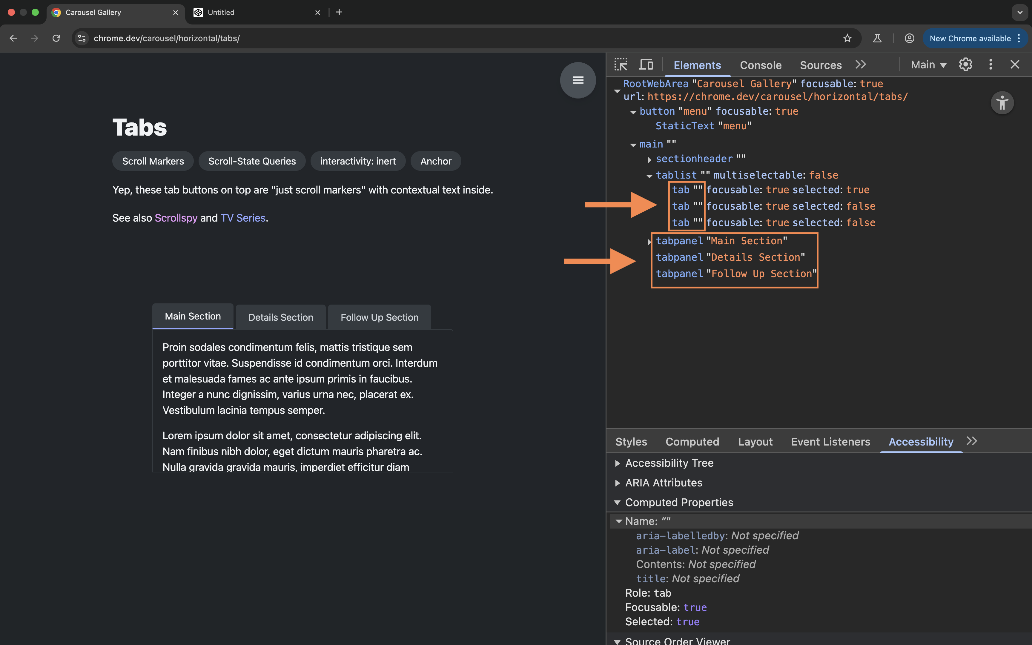
The tabs don’t have an accessible name in this example either. We’ll inspect the CSS declaration for the markers shortly.
Unlike the previous examples, this example does have three tabpanels exposed in the tree.
We know by now that the browser does not add tabpanel roles to the items in a scroller. So these roles must be provided in the markup.
And sure enough, if you inspect the HTML markup for this component, you can see that the tabpanel roles are hard-coded into the HTML.
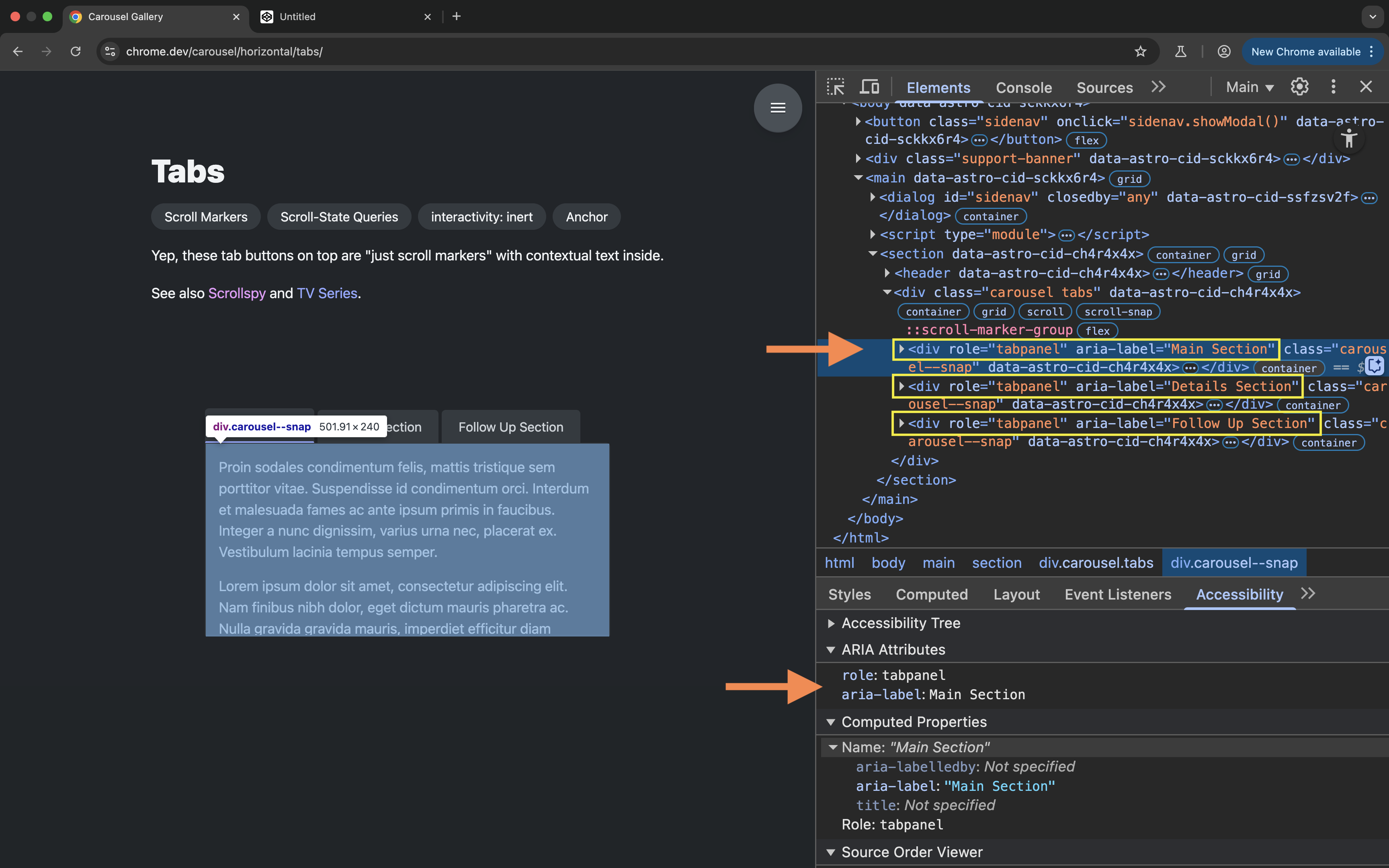
The panels are also given accessible names using aria-label, which is once again used to provide the contents and names for each of the scroll markers in CSS.
.carousel--snap {
    ..
    &::scroll-marker {
        content: attr(aria-label);
        ..
    }
}
This is why the tabs don’t have an accessible name. As we mentioned in the previous example, this is probably a bug.
Let’s fire up VoiceOver and check how the Tabs are announced.
When using VoiceOver navigation to navigate to the tabs, all the tabs are announced as selected, and the selected state of the tabs is also updated in the accessbility tree. However, their visual styles are not updated to reflect that they are selected, and their corresponding tabpanels are not shown when they are selected.
Additionally, using VoiceOver navigation (Right and Left Arrow keys) you are able to navigate between the tabpanels without needing to activate their corresponding tabs. That said, when you navigate to a tabpanel, the tabpanel is initially announced as empty. Pressing the Right Arrow key again, the screen reader announces the content inside the tabpanel just fine.
It is possible to also navigate through the tabpanels using keyboard Arrow keys, without needing to use the tabs at all.
As the ARIA specification notes, you should hide other tabpanels from the user until the user selects the tab associated with that tabpanel. In this case, the tab panels were accessible and were shown even when their corresponding tabs were not activated. Again, this is because what we have here is technically still a scrolling container, not a Tabs widget.
In my opinion, allowing the tab panels to be accessed by scrolling defeats the purpose of using Tabs to begin with. What is the purpose of the tabs if the content is already accessible without them? Selecting one tab does not really hide the tabpanels associated with the other tabs, it only scrolls it out of view. So this Tabs example only partially behaves like a Tabs widget, and partially like a typical scrolling container.
Now, as we mentioned earlier, the tabpanel roles are hard-coded into HTML in this particular example. It is not the browser that is adding and exposing these roles.
I don’t know why this example has the tabpanel roles hard-coded in. However, what I do know is that you, as a developer, are also expected to add these roles to your markup.
This also means that you should be aware of the fact that these roles are missing in what is otherwise being exposed as a Tabs widget. Yet, as we mentioned earlier, these exposed semantics are not specified in the CSS specification.
This is why it is very important for you to be responsible for the code you write/use and always, always check how it is exposed to screen reader users, and to test it to ensure that it is usable.
And this is why it is critical that you understand the role of the accessibility tree and the information it carries, understand how ARIA roles work, as well as understand the requirements for the widgets you are creating to ensure they are operable and that they meet the user expectations.
If you didn’t know that scroll markers are exposed as tabs and that you needed to add tabpanel roles to the widget you’re creating, then you would end up with a widget that’s broken in many ways, like the examples we examined earlier.
That being said, even hard-coding the tabpanel roles into your markup has its downsides because the tablist and tab roles are added via CSS. So what happens when CSS is not available? What happens if the user is viewing your page in Reader Mode, for example?
What I think would be a little more foolproof is if the browser added these visual affordances and behavior only when all the required ARIA roles are present in the markup.
In other words, the features defined in the specification could be made useful for some common use cases, not all—because one size almost never fits all; and then you would make sure you have the important accessibility bits taken care of in your markup.
That being said, what I personally think we really need instead is a standardized HTML markup structure.
Wouldn’t it be nice if we could just write HTML and have the browser just know what ARIA roles to expose to AT, and have it provide all the necessary keyboard interactions for free?
We can already do that for native interactive elements like a <button> and a <a> and a <details> element, to name a few.
So what we really need is native HTML elements with built-in semantics and interactive behavior for creating UI patterns that currently have no equivalents in HTML. This includes Tabs, sliders, and carousels.
This brings me to the end of this examination. So, what’s the conclusion here?
Conclusion and closing thoughts
All the issues I have covered in this post are specific to screen reader and keyboard navigation. I haven’t discussed how the tabs and scroll buttons could be cumbersome to operate for speech control users, particularly when they don’t have text labels. We haven’t talked about how the tabs could become invisible in Forced Colors Modes if they are styled using CSS background colors alone. And we haven’t tested the names of the tabs to see if they actually translate into other languages. And what happens when CSS is not available?
As developers, we are responsible for the code we write. And we are responsible for testing the components we create.
That said, I think the specification should be more explicit about how the new features it defines affects and don’t affect the accessibility of the content they are used on. That would make it easier for developers to know where there are gaps that need to be filled, and issues that need to be resolved before using these features in production.
Knowing the capabilities and limitations of a new feature is critical to understanding when to use it and what it is appropriate for.
In its current state, the specification adds a layer of abstration on top of HTML semantics that, dare I say, is quite risky, especially because these features are introduced as accessible by default.
There’s a lot the browser doesn’t currently do and that you need to take care of yourself if you want to use these new features in your projects.
If you don’t know better, you could end up creating inaccessible and unusable user interface elements with these new features, all the while assuming that the browser is “taking care of accessibility” for you.
While abstractions are often convenient for us developers, this convenience must not be delivered to us at the cost of user experience and accessibility. As responsible developers, it is on us to push back when necessary and require new features to be inclusive of the users we are creating user interfaces for.
The browser is currently creating lists of scroll markers for our convenience and it exposes them as tabs, regardless of whether the pattern they are used to create is actually a Tabs widget or not. And it does that because—surprise, surprise!—CSS is not where semantics are defined. How does the browser know what an element is? It knows that from HTML.
Semantics should be defined in HTML. And styles and visual affordances should follow from there.
As I mentioned earlier, what I believe we need is native HTML elements with built-in semantics and interactive behavior for creating other UI patterns that currently have no equivalents in HTML. This includes Tabs, sliders, and carousels. And CSS could provide an additional layer of visual affordance on top of that. That would be great!
The OpenUI has already started research on a native Tabs component long ago, as well as a new carousel and slider component. And there are current discussions already happening about a native <menu> element (which replaces the current HTML <menu> element which is essentially just a list).
It would be great if more resources were allocated for doing proper research and user testing for the work being done by the OpenUI group, so that these well-researched and accessibility-reviewed features are implemented sooner than later.
Outro
So, there you have it. CSS Carousels are highly experimental, not currently accessible, and therefore, not ready for production.
But this is not the only insight I want you to take away from this post. After all, this post isn’t merely about highlighting the current issues with CSS Carousels.
Rather, it’s about awareness.
If there is one thing you take away from this post let it be to learn how to think critically about new features, and to always question the accessibility and usability of a new feature before using it in production.
Put your users front and center, and measure how useful a feature is by how it affects the usability of their interfaces. This is especially true for new features that have a direct impact on the accessibility information of the page.
And how do you know if a feature affects the accessibility information of a page?
Learn more about semantic HTML, and why it is important. Learn more about what makes semantic HTML accessible. Learn more about how ARIA affects HTML, and how it doesn’t! And learn about the proper use of ARIA in HTML.
Then, learn about how CSS can affect accessibility.
And most importantly, learn about your users, and all the diverse ways that they access the Web, and how the code you write affects their experience of the Web.
There’s so much to learn and to be inspired by, and that will make you a better developer.
I know this sounds overwhelming. But I promise you it’s not. Once you understand the foundations of accessibility, these things become second nature,and it becomes easier to spot accessibility issues and to fix most of them (if not all) on the spot.
Feel free to use the knowledge we covered in this post to go over the rest of the examples, inspect their accessibility information, test them using keyboard and a screen reader, and get an idea of how usable they are. Maybe even try to have some fun by imagining how you could improve them and make them more usable. (That can sometimes be by removing features!)
If you want to learn accessibility in-depth and learn how to find and fix accessibility issues by yourself, I have created a comprehensive, structured curriculum in the form of a self-paced video course that is aimed to equip you with the knowledge you need to confidently create more accessible websites and web applications today.
The course is called Practical Accessibility, and you can enroll in it today at practical-accessibility.today.
Update: May 29th, 2025
This post started an excellent discussion on the topic of CSS Carousels within the community, and some have blogged their thoughts on their personal websites.
Vale shared her thoughts on the topic asked the same question I asked when I first heard of them: Why?
It completely fails with regard to separation of concerns by using CSS for structure, rather than HTML. I don’t know how to address that other than asking why? I’ve noticed a lot of new CSS features, especially ones with the Chrome team’s influence, are getting a little too markup-y for my liking. David Bushell has covered this and the overreliance of pseudo-elements with touchings on the carousel kerfuffle.
In David’s first Note he mentions not being a fan of the overuse of pseudo-elements in CSS specifications, because the developer ergonomics aren’t fun
and because we’re losing “separation of concerns” with content and accessibility semantics getting mixed into CSS
.
David shares more of his thoughts in another post on pseudo-elements:
These demos are a pretty sales pitch but I see problems for practical use.
Text content in CSS is code smell. A clear violation of separation of concerns. Content in CSS is a pain for content management systems. It plays havoc with translation tools too. These issues can be alleviated using attr() to move content back into HTML but not without pains.
You know what I want to see? […] I just want to see HTML. We have interactive elements like
<button>,<details>, and<dialog>these are immensely useful. Give us more primitives to build upon. […] Where pseudo-elements shine are implementations like ::selection and ::first-letter. Where it’s impossible or impractical to add additional HTML. As primitives to build a carousel they’re too limiting. They’re a dead-end.Can we stay in HTML, please?
Adrian Roselli wrote a post with a general request to Google on accessibility:
Please, if your team cannot explain how the thing satisfies all WCAG Success Criteria at Level AA, then don’t release the thing.
If the thing is a new feature for the web platform (HTML, CSS, ARIA, SVG, etc.), then don’t even propose the thing until you have its WCAG conformance sorted.
Then understand WCAG is the bare minimum, is only table stakes, and does not in itself guarantee the thing is accessible. Which means be prepared for the thing to still contain barriers that must be addressed before it goes any further. Which means you’ll field some questions.
The post is not specifically about CSS Carousels, but CSS Carousels are one of the examples Adrian mentions of Google-led Web platform features that are not accessible.
Adrian’s post does, however, include a series of updates—of which are specifically about CSS carousels and how the feature is progressing.
Update: August 19th, 2025
Since I published this post, a new property has been proposed and added to the specification. This property is named scroll-target-group and it “enriches HTML anchor elements functionality to match the pseudo elements one”, which makes it possible to use the :target-current selector to highlight links when their respective targets are in view.
Learn about this new property and how to use it in the “CSS-only scrollspy effect using scroll-marker-group and :target-current” article.