A guide to designing accessible, WCAG-conformant focus indicators
|
Imagine you visit a website and you want to browse it for some content. You want to buy something; or maybe book a flight somewhere. And as you move your cursor onto the page, it suddenly disappears. Your hand may be still on the mouse, and you’re moving the mouse across the screen and across the page; but you can’t see where it is. You may or may not be hovering over a link or a button or any other form control at any moment. But if you are hovering over one, you don’t know which one it is. You could try clicking and then finding out, but you can probably already imagine what a nightmare of an experience you’re about to get into.
Unfortunately, keyboard users experience the Web in a similarly frustrating manner too often. Their equivalent of a mouse cursor is usually hidden on too many websites, making it almost impossible for them to navigate those sites. A keyboard user’s cursor equivalent is the focus indicator. By designing and implementing accessible focus indicators, we can make our products accessible to keyboard users, as well as users of assistive technology that works through a keyboard or emulates keyboard functionality, such as Speech control, switch controls, mouth sticks, and head wands, to mention a few.
What exactly is a focus indicator?
Keyboard users typically navigate their way through websites by pressing the tab key. This allows them to jump from one focusable element on the page to another.
Just like mouse users, they need to be able to see where they are on a page as they Tab their way through it, otherwise they won’t be able to identify the elements they are interacting with. That’s what focus indicators are for.
A focus indicator is a visual indicator that “highlights” the currently focused element. This visual indicator is commonly presented as an outline around the element. An outline takes the shape of its element, and since every element in CSS is a rectangle, a focus indicator is, therefore, typically a rectangle drawn around an element.
So a focus indicator allows a keyboard user to see exactly where they are at any given moment. Without it, they wouldn’t know where they are on a page and they wouldn’t be able to navigate the page and operate its controls.
The focus indicator is to keyboard users what the mouse cursor is to mouse users. And just like you would never want to hide the mouse cursor, you never want to hide the focus indicator.

In fact, a visible focus indicator is a requirement for a site to be considered accessible under the Web Content Accessibility Guidelines (WCAG). Removing or hiding focus indicators is a violation of (and will therefore fail) Success Criterion (SC) 2.4.7: Focus Visible (Level A), which states that:
any keyboard operable user interface has a mode of operation where the keyboard focus indicator is visible.
Browser default focus indicators
Browsers provide focus indicators to native interactive elements out of the box, for free. And most of us—if not all—have at some point in time included this CSS snippet in our stylesheets:
:focus {
	outline: none;
}
to remove those focus indicators applied by the browser.
To meet Focus Visible, you should avoid removing the focus indicator provided by the browser unless you are replacing it with your own accessible focus indicator. And I do recommend that you do that. (We’ll elaborate why in this article.)
By not removing the default browser focus indicators, you may meet the requirement of showing a visible focus indicator. But that may not always be enough because a focus indicator needs to be clearly visible to be considered accessible. And browser focus indicators may not always be.
(What’s the benefit of showing a focus indicator that many users can’t see?)
In order for a focus indicator to be clearly visible it needs to have a color contrast that is high enough for users with moderately low vision to be able to discern it.
The default focus indicator’s color contrast is not consistent across browsers.
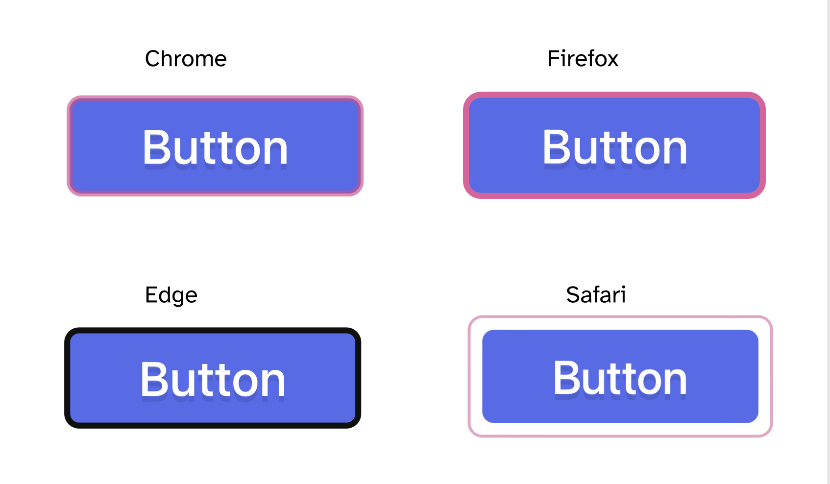
How Chrome, Firefox, MS Edge, and Safari style their respective focus indicators (at the time of writing) when applied to a blue button on a white background.
Depending on your website’s color palette, the colors of the default browser focus indicators may clash with the colors used on your website, making them difficult (if not impossible) to see. When that happens, you’ll need to override the default focus styles with better, more accessible ones.
In this article, we’re going to learn about the accessibility requirements that your focus indicators need to meet to be considered accessible. Using these requirements, you’ll be able to determine when and why default browser focus indicators don’t meet these requirements, and how you can ensure that your custom indicators will.
WCAG 2.1 and WCAG 2.2 focus indicator accessibility requirements
SC 2.4.7: Focus Visible (Level A) requires that a visible focus indicator exists for components that have keyboard focus.
So, the first step in creating accessible focus indicators is to not hide focus indicators. 😊
/* Do. Not. Do. This. */
* {
    outline: none; /* This is bad. */
}
SC 1.4.11 Non-Text Contrast (Level AA) states that (emphasis mine):
The visual presentation of the following have a contrast ratio of at least 3:1 against adjacent color(s):
User Interface Components: Visual information required to identify user interface components and states…
Focus indicators are used to identify a component state (focus). So, according to this criterion, focus indicators must have a color contrast ratio of at least 3:1 against adjacent colors.
For user interface components, ‘adjacent colors’ means the colors adjacent to the component. For a component’s focus indicator, ‘adjacent colors’ depends on the position of the focus indicator within the component. We will learn about this in more detail in another section.
In WCAG 2.2, three success criteria are added that define the accessibility of focus indicators depending on their color, surface area, and visibility:
- SC 2.4.11 Focus Not Obscured (Minimum) (Level AA),
- SC 2.4.12 Focus Not Obscured (Enhanced) (level AAA)
- SC 2.4.13 Focus Appearance (Level AAA)
These new criteria aim to ensure that a keyboard focus indicator is clearly visible and discernible, and they define the conditions to ensure that.
SC 2.4.13 Focus Appearance states that:
When the keyboard focus indicator is visible, an area of the focus indicator meets all the following:
- is at least as large as the area of a 2 CSS pixel thick perimeter of the unfocused component or sub-component, and
- has a contrast ratio of at least 3:1 between the same pixels in the focused and unfocused states.
Focus Appearance is closely related to Focus Visible and Non-Text Contrast.
Focus Visible requires that a visible focus indicator exists while a component has keyboard focus; Focus Appearance defines a minimum level of visibility (which we’ll learn about in this article).
Where Non-Text Contrast mandates that focus indicators have a color contrast ratio of at least 3:1 against adjacent colors, Focus Appearance requires a sufficient change of contrast for the focus indicator area. (We’ll elaborate more on what this means shortly.)
Even though these criteria are at varying conformance levels, they complement each other, and together they ensure that focus indicators are clearly visible and accessible to more people. Since we’re always aiming for usability beyond conformance, we’re going to treat them all equal and learn how to design focus indicators that pass all of them.
The purpose of Focus Appearance is to specify a minimum area for the focus indicator, as well as a minimum contrast ratio for that area.
The “2px thick perimeter” part of the SC is the minimum area of the focus indicator that has a 3:1 contrast ratio between the same pixels in the focused and unfocused states. This does not mean that the focus indicator needs to be a 2px-thick solid outline around the element, only that the indicator needs to be at least that large.
A keyboard focus indicator can take different forms. This Success Criterion encourages the use of a solid outline around the focused user interface component, but allows other types of indicators that are at least as large. . — Understanding Focus Appearance
Obviously, providing a 2px thick outline around the element would be the simplest way to meet the size requirement. But the focus indicator can take other forms.
In this article, we’re going to understand what it means to be “at least as large as a 2px thick perimeter”, and we’re going to see examples of how you can meet the minimum area requirement without necessarily providing a 2px thick outline as a focus indicator.
We’re going to start by defining two terms that will help you design custom focus indicators while still ensuring they pass the requirements specified in Focus Appearance: the focus indication area, and the contrasting area. These terms were introduced in previous versions of the success criterion and have been edited out in the final wording. But I think they are helpful in understanding and meeting the requirements.
For most of the examples, we’ll be demonstrating and examining the focus indicator requirements when applied to a blue button set on a white background.
In what follows, we’re going to get a little nerdy!
1. The focus indication area and the contrasting area
When a component changes on focus to include a focus indicator, that change can always be measured as a change of color contrast.
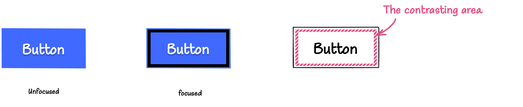
If you add a black outline around the blue button, the change of color between the unfocused and focused states is from white to black. That’s because the area — the pixels on the screen — that has changed color in the focused state is the area around the button. That area was initially white, and it changed to black when the button received focus. This area is called the focus indication area.
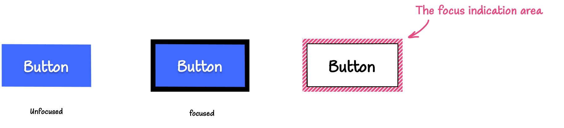
The focus indication area is the area in square CSS pixels where the change in color between the focused and unfocused states of the component happens.
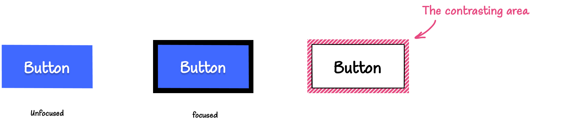
Focus Appearance states that “an area of the focus indicator” must have a 3:1 contrast ratio between the unfocused and focused states. That is, an area of the focus indication area (a subset of the focus indication area) must have a 3:1 contrast ratio between the unfocused and focused states.
The area that meets this contrast requirement is called the the contrasting area. And the contrasting area may or may not be equal to the entire focus indication area.
In the previous example, the color change happens from a solid white to a solid black, and the color contrast ratio between the unfocused and focused state (white and black) is 21:1. So the entire focus indication area meets the minimum contrast requirement. This means that the contrasting area is equal to the entire focus indication area.
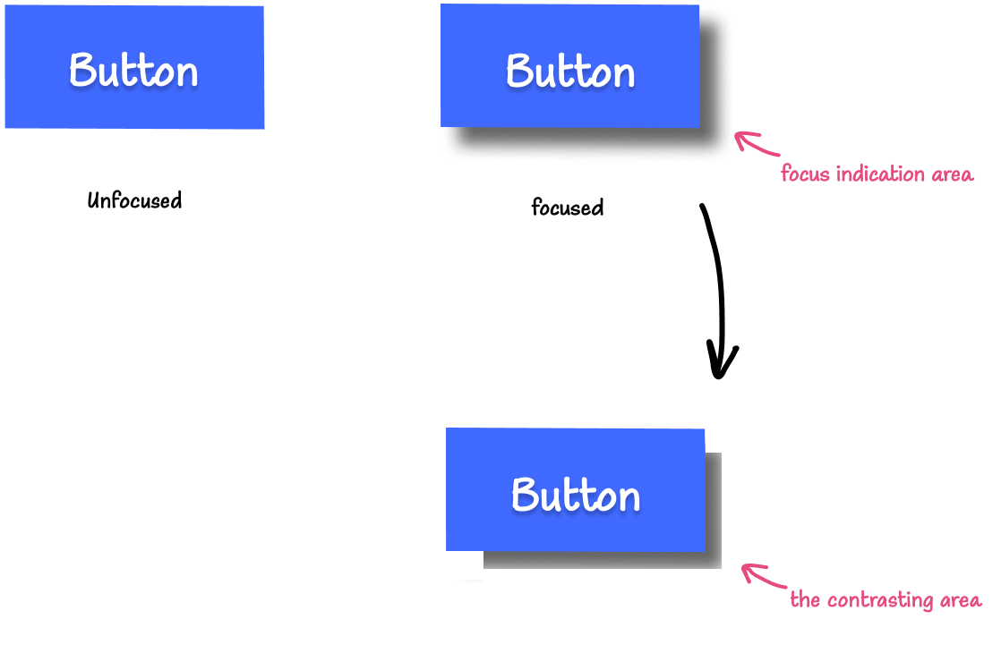
Similarly, if you add a black outline that is separated from the button, once again, the area that exhibits the change in color is the contrasting area.
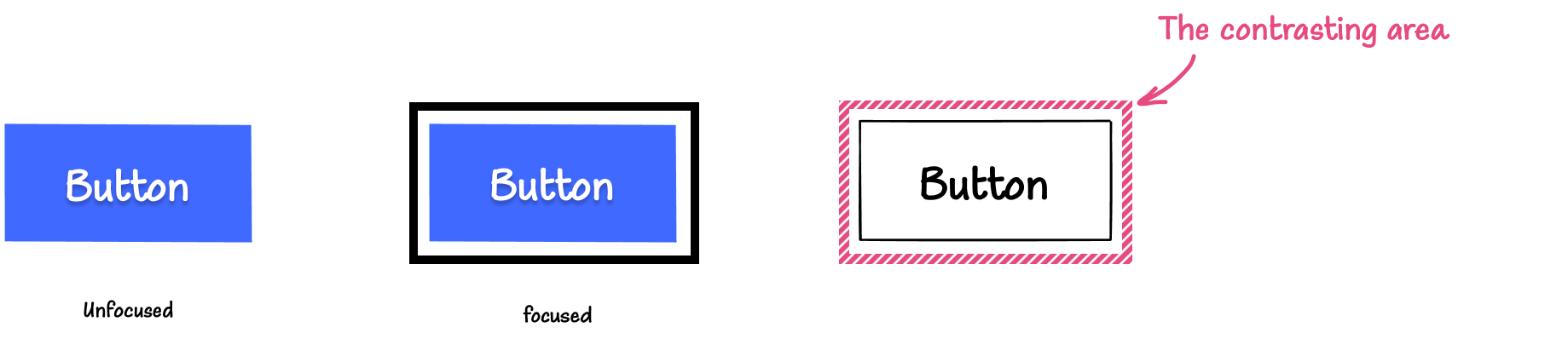
I like this pattern because it adds some breathing room and helps the focus indicator stand out, making it easier to see.
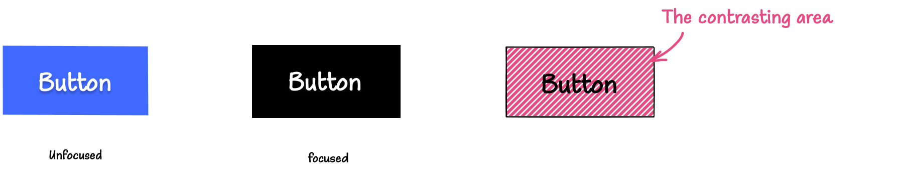
If you add an outline inside the button itself, the contrasting area then lies inside the button. The change of color is from blue (the button’s background color) to black. The color contrast ratio between the focused and unfocused state is 4.86:1.
If the button changes its background color from blue to black on focus, then the entire button’s background area is the contrasting area, and the color contrast ratio between the focused and unfocused state is once again 4.86:1.
If the button’s border color changes when it receives focus, then the contrasting area lies along the button’s border:
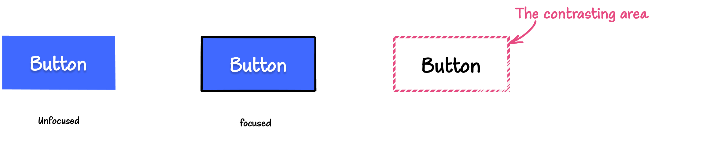
When the button’s border color or background color change on focus, the contrasting area must have a minimum contrast ratio of 3:1 between the focused and unfocused state to meet Focus Appearance contrast requirements. If the contrast change is less than 3:1, the focus indicator not only fails Focus Appearance, but it will also fail SC 1.4.1 Use of Color (Level A).
When the focus indicator is a solid color, measuring the color contrast ratio in the contrasting area is straightforward. But color changes may not always be solid. You may want to indicate focus on the button by applying a gradient drop shadow to it. In this case, only the portion of the gradient with sufficient contrast (larger than 3:1) will be our contrasting area; the remaining portion that fails will not be a part of it. This is an example of when the contrasting area is smaller than the focus indication area.
You may need to take some spot-checks on the gradient area and establish what area meets the contrast requirement.
The greater the change of contrast between the unfocused and focused states, the easier it is for users to see it.
2. Minimum contrasting area
The bigger the visible change when the component receives focus, the easier it is to see. And to ensure that focus indicators have good visibility, Focus Appearance requires a minimum surface area for the contrasting area: the contrasting area needs at least as large as a 2px thick perimeter around the element.
The simplest way to meet this requirement is to provide a 2px thick outline that encloses the element or component.
To enclose a component means to solidly bound or surround the component.
The Understanding Focus Appearance page provides two images that demonstrate the difference between an outline that bounds a component, and an outline that surrounds it:
A solid outline around an element is an example of a focus indicator that solidly bounds an element.
.element {
    outline: 1px solid #000; /* this outline *bounds* the element */
}
And a solid 2px outline has an area of at least 2px thick perimeter of the component. (Of course, any outline thicker than 2px will also meet the area requirement.)
.element {
outline: 2px solid #000; /* this outline meets the minimum area requirement */
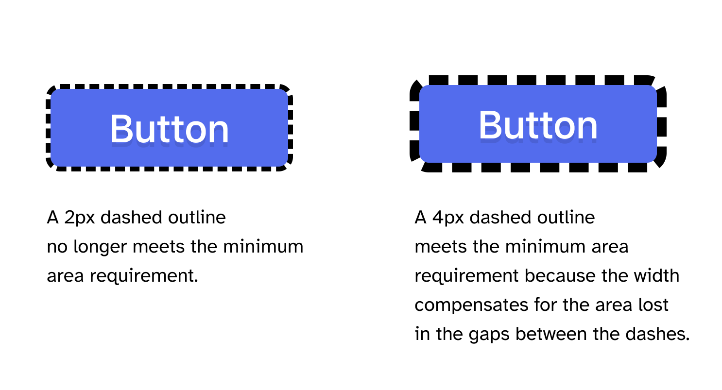
}If the focus indicator is dashed or dotted (not solid), it no longer “solidly” bounds or surrounds the component (because it is no longer “solid”). And it will also no longer be equal to a 2px thick perimeter of the component.
.element {
outline: 2px dashed #000; /* this outline does not the minimum area requirement */
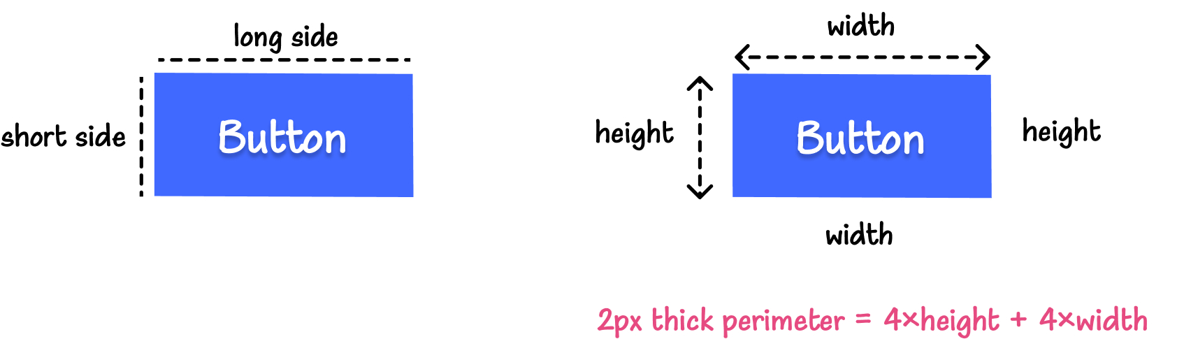
}The perimeter is a continuous line forming the boundary of a shape not including shared pixels, or the minimum bounding box, whichever is shortest.
The perimeter calculation for a 2px thick perimeter around an element is: 2×(2×h+2×w) = (4×w + 4×h), where h is the height of the element, and w is the width. (The calculation is simplified in that it does not include shared pixels.)
The perimeter of a circle is 2𝜋r, where r is the radius of that circle. A 2px thick perimeter around a circle is equal to 4𝜋r.
When the focus indicator is a 2px dashed outline, its area is equal to 2 times the length of the perimeter of the button (or component) minus all the gap spaces introduced between the dashes of the outline. The resulting length is approximately half of the required minimum area.
To meet the minimum area requirement, you can double the thickness of the outline to compensate for the area that is lost in the gaps.
.element {
    outline: 4px dashed #000; /* this outline meets the minimum area requirement */
}
Here’s what a dashed outline looks like with 4px thickness. The thicker the outline, the larger its surface area, and the easier it is to see.
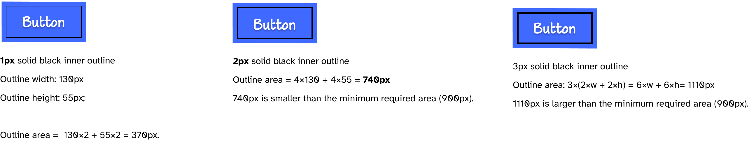
Now let’s assume, for demonstration purposes, that you’re designing focus styles for a 150px by 75px button. A 2px thick perimeter around this button is equal to 4×150px+4×75px = 900px.
So the focus indicator of this button needs to have a contrasting area of at least 900px.
If you apply an inner outline to the button, this outline is going to be smaller than the perimeter of the button (because the outline’s width and height are shorter than the button’s width and height). And an inner 2px solid outline has an area less than the 2px thick perimeter of the button.
Once again, increasing the thickness of the outline will make up for the area lost by placing the outline inside the button.
Inner outlines are useful for many elements where providing an outer outline may not be always suitable, like if you have a list of items in a drop-down menu or a drop-down navigation, for example. Other elements with hidden overflow will also benefit from inner outlines.
As we mentioned before, the focus indicator can take other forms, too.
For example, you may provide a focus indicator only on either side of the component. You only need to ensure that the line is thick enough so that its area is at least as large as the perimeter of the item.
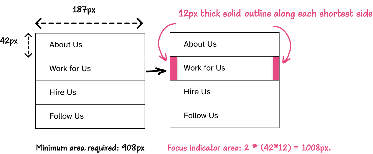
The focus indicator provided is a 12px thick line along each of the shortest side of an item. The area of each line is 12×42 = 504px. The total area of the focus indicator is 2×504 = 1008px, which is larger than the minimum 916px area. So, this indicator passes minimum area requirements.
The thicker the lines, the larger the contrasting area, the more visible the focus indicator is.
The main goal of the minimum area requirement is to ensure that the focus indicator is easier to see. Whetever the style you choose to indicate focus, the important thing is to ensure that the contrasting area meets the minimum area requirement(s), so that it can be easily seen.
If you provide a gradient focus indicator to an element, you’ll want to calculate the component’s perimeter and ensure the contrasting area within the gradient is at least twice as large as the perimeter.
3. Minimum contrast against adjacent colors
According to SC 1.4.11 Non-Text Contrast (Level AA), focus indicators must have a color contrast ratio of at least 3:1 against adjacent colors.
The Understanding Non-Text Contrast page defines ‘adjacent color(s)’ as the “colors adjacent to the component”.
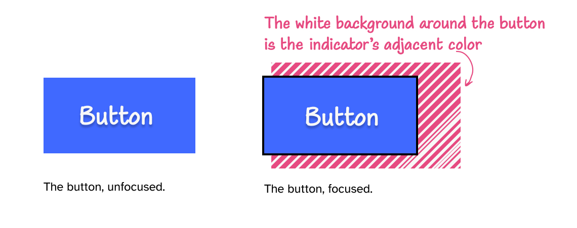
For our button, the adjacent color is the color of the white background around the button.
The adjacent colors for the focus indicator depend on the position of the focus indicator within the component.
The focus indicator can be:
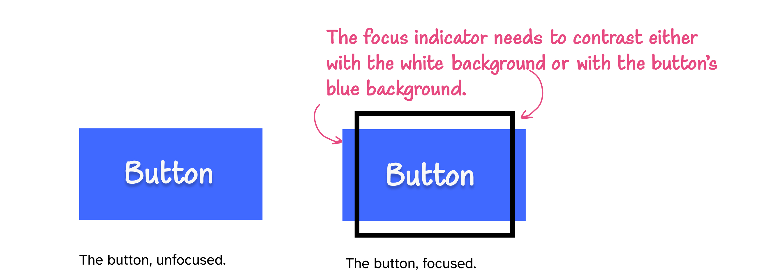
- outside the component, in which case it needs to contrast with the background around the component (that’s the indicator’s adjacent color).
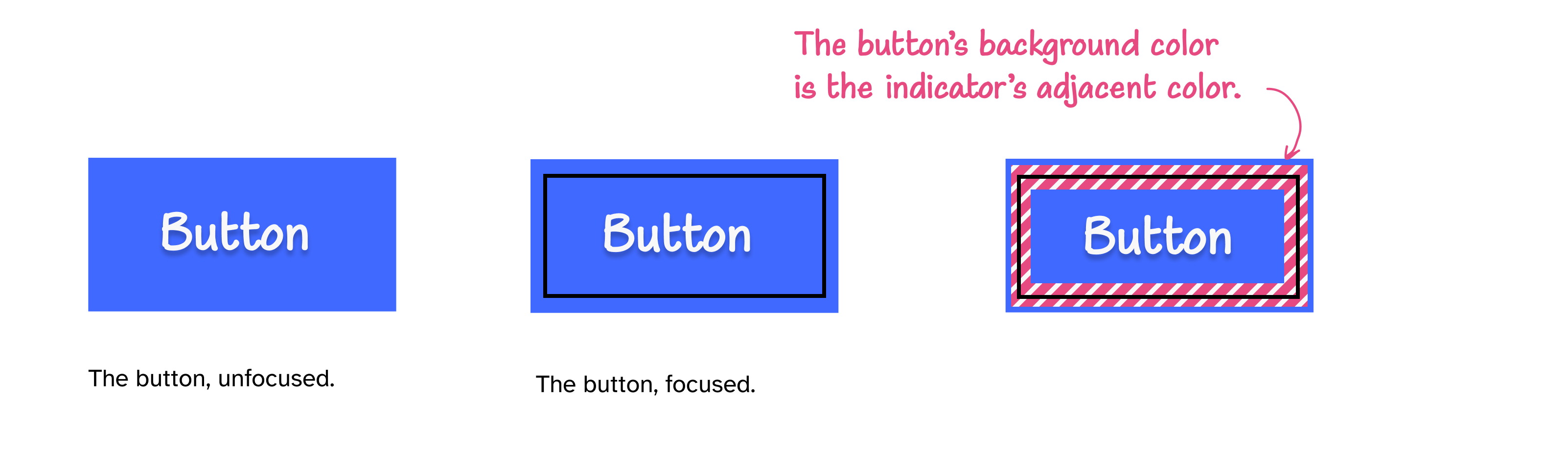
- inside the component, in which case it needs to contrast with the adjacent color(s) within the component.
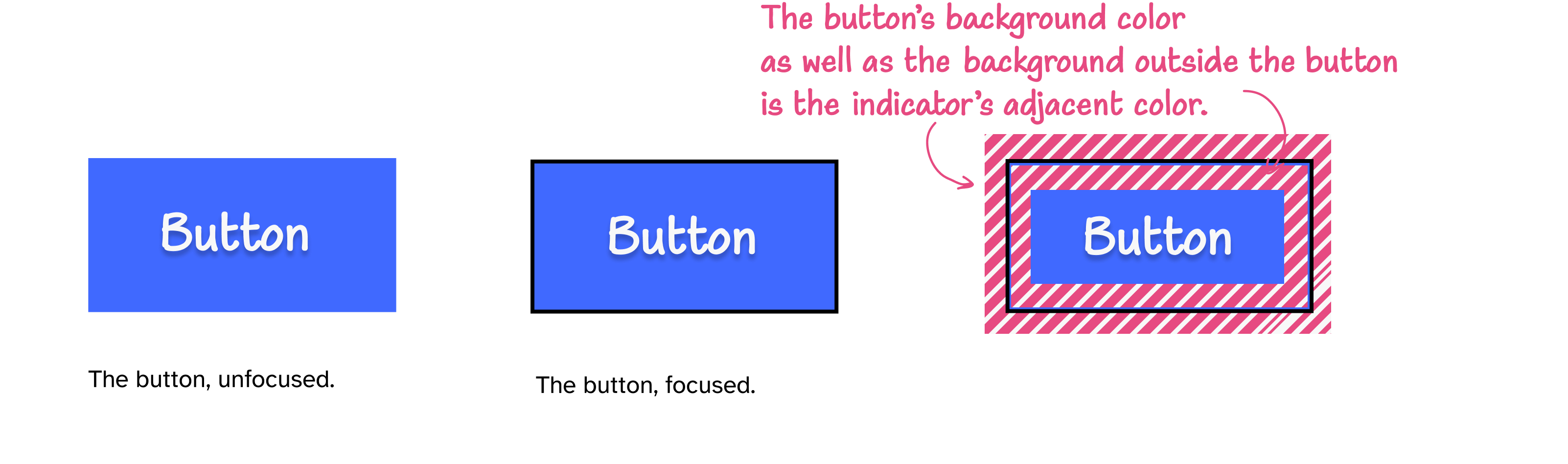
- along the component’s border, in which case it needs to contrast with both the component’s background as well as the background around the component.
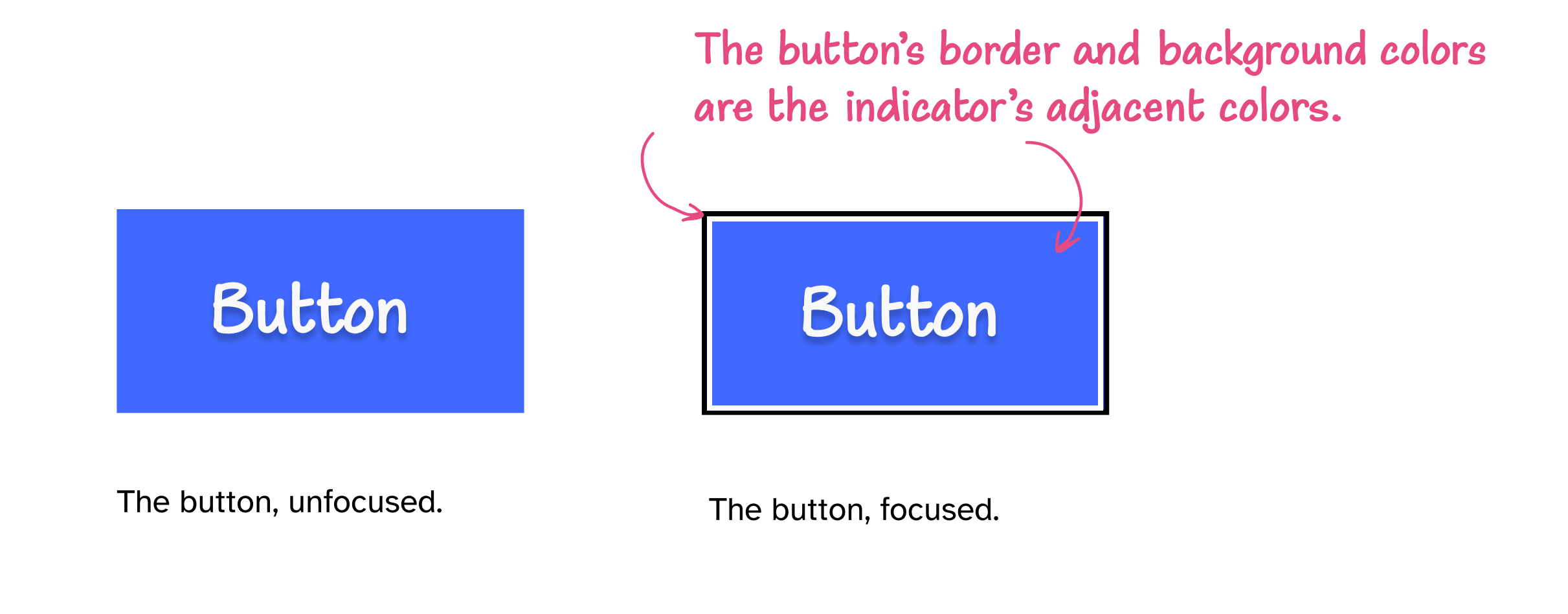
If the focus indicator is an inner border, it needs to contrast with the component’s background color, as well as with the component’s border color. Those two are its adjacent colors.
For example, if the button has a blue background, a black border, and the focus indicator is a white inner border, then the white indicator must have a 3:1 contrast ratio against both the blue background and the black border.
- partly inside and partly outside the component, where either part of the focus indicator can contrast with the adjacent colors.
I haven’t seen a focus indicator in the wild that’s partially inside and partially outside an element. But if the indicator is partially inside and partially outside, then it needs to have a 3:1 contrast ratio either with the component’s background color, or the color outside the component.
4. The focused element cannot be obscured
The purpose of a focus indicator is to allow the user to see where they are on a page, by making the currently-focused element more prominent.
But what good is a focus indicator if the focused element itself is not visible because it’s hidden off-screen or obscured by other elements on the page?
SC 2.4.11 Focus Not Obscured (Minimum) states that:
When a user interface component receives keyboard focus, the component is not entirely hidden due to author-created content.
In other words, you want to make sure the user can actually see the element or component that they’re focusing on, by making sure it’s not hidden behind other content on the page.
That being said, this criterion requires that the component be not entirely hidden
. This does imply that it could be partially hidden, as long as it’s still partially visible.
SC 2.4.12 Focus Not Obscured (Enhanced) (which is the level-AAA version of this requirement) states that:
When a user interface component receives keyboard focus, no part of the component is hidden by author-created content.
When aiming for level-AA conformance, you may get away with partially hiding the focused component, though I can’t imagine where or how that would not be problematic. Try to always make sure focused component is entirely visible and not obscured by other content. It’s just better for usability. Focus Not Obscured (Enhanced) is one of the level-AAA criteria that are fairly easy to meet, even if you’re not aiming for level-AAA conformance.
When you’re testing your web pages for keyboard accessibility, check that the elements are visible when they receive focus. Make sure they’re not obscured by other elements, like modal dialogs, fly-outs, or fixed components like fixed headers. Conversely, you want to ensure that elements that are intentionally hidden cannot receive focus when they shouldn’t.
Examining (current) browser focus indicators against WCAG requirements
Now that we know the accessibility requirements for focus indicators, we can examine the focus indicators provided by the most popular browsers and measure how well they meet these requirements.
Non-Text Contrast states that Visual information required to identify user interface components and states [must have a contrast ratio of at least 3:1 against adjacent color(s)], except for inactive components or where the appearance of the component is determined by the user agent and not modified by the author
(emphasis mine).
What this means is that browser focus indicators are exempt from these requirements, even if they don’t meet them. That is, the default focus indicators are considered conforming to this criterion, even if they don’t have a 3:1 contrast ratio against adjacent colors — i.e. if they’re not clearly visible.
The default focus indicators are also exempt from Focus Appearance requirements as long as the focus indicator and the indicator’s background color are not modified by the author.
So, you could get away with showing the default indicator(s) and pass conformance tests, but this does not mean that the focus indicators will be usable by the people who need them. (And they’re often not going to be, as you’re going to see in this section.)
Furthermore, the default focus indicators can be modified and customized by users, and there is no way for you to know what color the indicator is, and whether or not it has sufficient contrast with the colors on your website.
This is yet another instance of “WCAG does not guarantee usability” that we’ve seen quite a few examples of over the course of the previous chapters.
In this section, we’re going to measure just how well the default focus indicators meet or don’t meet the requirements for focus indicators to be clearly visible (and usable).
The purpose of this section is to demonstrate how you might check whether a focus indicator meets the requirements specified in the WCAG criteria we discussed earlier, and to show how and when the default focus indicators would not meet these criteria and, therefore, why you should consider providing more accessible indicators instead.
To determine if the default indicator passes the requirements, you need to check that:
- it has sufficient contrast with adjacent colors
- it has a contrasting area that is at least as large as a 2px thick perimeter of the button
- it has sufficient contrast in the contrasting area between the focused and unfocused state
If it does not meet either of these, then there’s a good chance the indicator is not easily discernible by people with low vision, and you may want to consider overriding the default focus indicators with more visible ones.
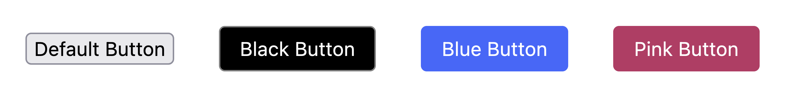
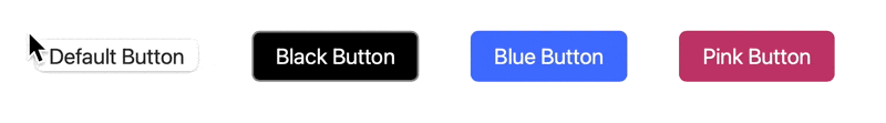
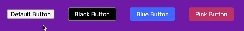
We’re going to test the default focus indicators as they are applied to an unstyled, native button, as well as to three styled buttons: a black one with a grey border, a blue one, and a pink one.
We’re going to determine the position of the indicator relative to the button (inside, outside, or along the border) first, which we will use to determine the indicator’s adjacent color(s), and to calculate whether or not it has sufficient contrast with those colors.
When the focus indicator is provided outside the button, its adjacent color is the color of the background around the button. The background color is also going to be the color of the focus indicator’s contrasting area in the unfocused state. This means that if the focus indicator has sufficient contrast with the background color, then it will pass both color contrast requirements specified in Non-Text Contrast and Focus Appearance.
If the focus indicator is provided along the border of the button, then to meet Non-Text Contrast requirements, it needs to have sufficient contrast against the button’s background color, as well as the background color of the page. To meet Focus Visible and Use of Color requirements, it needs to have sufficient contrast between the colors in the unfocused and focused states (i.e. the initial color of the border and the color of the border in the focused state).
Safari:
Safari’s default focus indicator color is the accent color defined on the OS-level in Settings > Appearance > Accent Color. The default accent color is blue, and so is the default focus indicator color. This color is customizable, so the focus indicator may take any color chosen by the user. On my OS, that color is pink. So the focus indicator is a light pink outline that surrounds the button. The indicator’s adjacent color is the background color surrounding the button.
Depending on the color theme of your website, it may not meet the minimum contrast defined in Non-Text Contrast and Focus Appearance.
The pink color has a low contrast ratio against most background colors. It has a 2.1:1 contrast ratio against the white background. And a 2.1:1 contrast ratio against a black background.
Note that the indicator also changes when the button is styled: it is offset from the edges of the button, and it becomes thinner, which makes it even more difficult to discern.
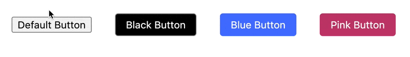
Chrome:
Chrome’s focus indicator is a pink outline applied along the button’s border. This means that it needs to have sufficient contrast against both the background color outside the button, as well as with the button’s background color.
Depending on the colors used in your components, it may not meet the minimum contrast defined in Non-Text Contrast.
For example, the pink outline has a low contrast against the background color of the black button (2.8:1), the blue button (1.7:1), and the pink button (1.4:1), which means that it does not meet Non-Text Contrast requirements.
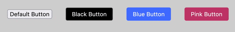
Edge:
Edge’s focus indicator is a black outline applied along the button’s border, which means that it needs to have sufficient contrast against both the background color outside the button, as well as with the button’s background color.
Depending on the colors used in your components, it may not meet the minimum contrast defined in Non-Text Contrast.
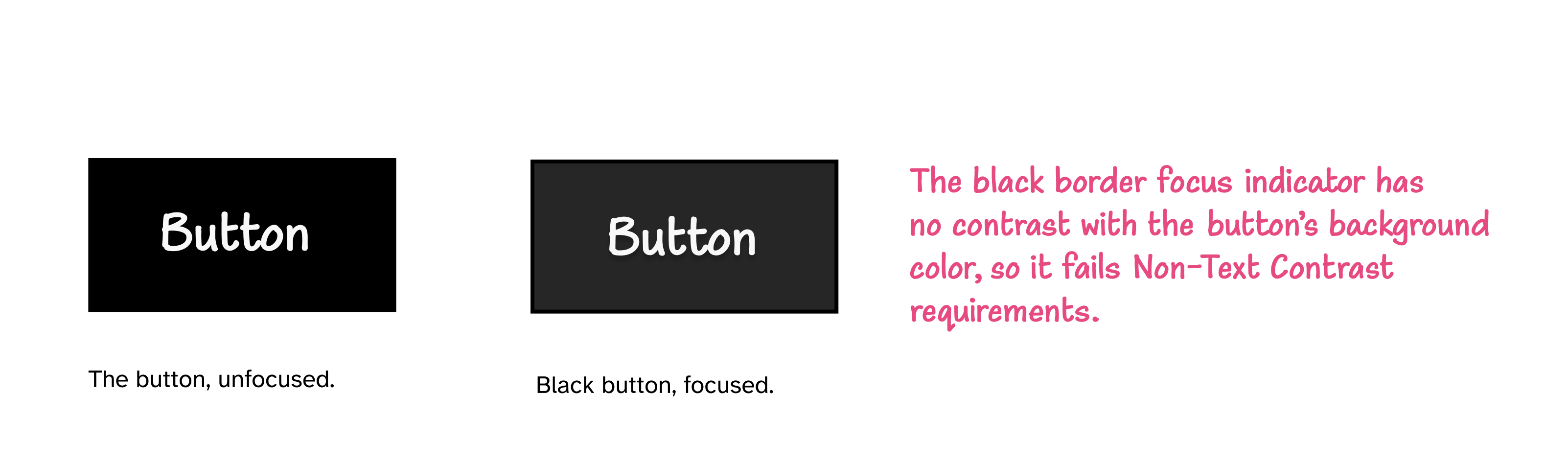
Being black, the indicator provides good contrast against light background colors. But it doesn’t meet the minimum contrast ratio against dark colors.
For example, in our test here, the focus indicator has no contrast against the adjacent black background inside the black button, so it does neet meet the minimum contrast defined in Non-Text Contrast.

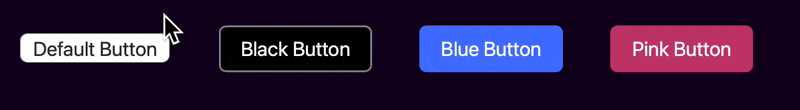
Firefox:
Firefox’s current focus indicator is a pink outline that surrounds the button. The indicator’s adjacent color is the background color of the page.
Depending on the background color you use, the pink outline may not meet the minimum contrast defined in Non-Text Contrast and Focus Appearance.
For example, on a light grey background, the contrast ratio between the pink and the grey is 2:1 (which is less than 3:1). This means that the contrasting area’s contrast ratio does not meet the minimum contrast requirement, and neither does the contrast ratio against adjacent colors.
Chrome, Edge, and Firefox apply what looks like a second outline — a white outline — around the indicator. You can see it more clearly on darker background colors. For example, here is what it looks like on a dark purple background in Chrome and Edge, respectively:
The fact that the focus indicator in these browsers consists of two outlines, and that both outlines meet the minimum area requirement (they’re both at least as large as a 2px thick perimeter), then either of these outlines may be sufficient to pass the minimum color contrast requirements.
This white outline lies outside the button, which means that it only needs to contrast with the background color outside the button. It does not need to contrast against the color(s) of the button.
The white color provides sufficient contrast against dark backgrounds, making the indicator clearly visible. This means that if the pink outline in Chrome’s focus indicator does not meet the minimum contrast ratio, for example, the white outline might, thus passing the criteria.
White and pink are still likely going to fail minimum contrast requirements against light background colors, though.
If the white outline were black instead, it would provide sufficient contrast against light background colors.
Now imagine if there were two outlines surrounding a component: a black one and a white one. The black would ensure sufficient contrast against light background colors, and the white would ensure sufficient contrast against dark background colors. This means that the outline would always meet minimum contrast requirements regardless of the colors used on the page.
Edge’s current focus indicator is the closest out of all default indicators that gets close to providing this level of contrast. But the fact that Edge’s indicator is provided as a border means that it should contrast against two adjacent colors, and if these colors are opposite colors (like if one of them is light and the other is dark), it is probably not going to meet the minimum contrast ratio defined in Non-Text Contrast against one of them.
But if the black and white outlines both surrounded the button, then they would only need to have a 3:1 contrast ratio against the background color around the button.
Measuring the contrast ratio against only one color means that either the black or the white outline will pass adjacent color contrast requirements. If white doesn’t pass, black will; and vice versa. This makes the combination of black and white the ideal recipe for a more ‘universal’ focus indicator.
A ‘universal’ focus indicator
Inspired by Edge’s indicator, you can provide an improved, universal, black-and-white focus indicator for your website that works for most (if not all) focusable elements and provides sufficient contrast against all background colors.
This focus indicator consists of two (or more!) outlines: a white outline and a black outline.
Since we can’t use the outline property to provide two outlines of different colors, we currently need to use a combination of outline and box-shadow to create our desired effect:
:focus-visible {
    outline: 3px solid black;
    box-shadow: 0 0 0 6px white;
}The box-shadow declaration creates a ‘solid’ box shadow (with a zero blur radius) around the element. Outlines overlap box-shadows, which means that the 3px solid (black) outline created with the outline property will overlap the box shadow created ‘behind’ the element. So we extend the box-shadow by 3px (so the total width is 6px). This ensures that the visible portion of the (white) shadow is also 3px wide and that it looks like a solid outline.
If most of the buttons or components on your website have dark colors, you may want to flip the order of the black and white outlines so that the white outline creates an even higher contrast with the components:
:focus-visible {
    outline: 3px solid white;
    box-shadow: 0 0 0 6px black;
}
In addition to providing sufficient contrast against adjacent colors, this outline has other advantages:
- Because it is provided outside the component, it increases the visual size of the component when it is shown, making it easier to spot.
- The outline provided using the
outlineproperty is retained in forced colors modes (like Windows High Contrast Mode) where other visual styles like box-shadows and background colors are overridden by system colors.
Here is a live demonstration of this focus indicator. Press the tab key on your keyboard to navigate to the focusable elements and show the indicator.
See the Pen #PracticalA11y: Universal focus indicator by Sara Soueidan (@SaraSoueidan) on CodePen.
If you want to take your focus indicators to the next level and make them even more visible, you can use what designer Erik Kroes calls the “Oreo-focus" indicator. The concept is the same: you use black and white to create a focus indicator, but instead of a white and a black outline, you create two black outlines with a white outline in between (like an Oreo!) This makes the focus indicator even more visible, regardless of what colors you use in your component(s).
You may want to use relative units to size your outlines like Erik does. For demonstration purposes, I’m going to use pixels and increase the outline width to 9px to ensure each black line is 3px thick:
:focus-visible {
  outline: 9px double black;
  box-shadow: 0 0 0 6px white;
}
Depending on the color theme of your website, you may also flip the order of the black and white outlines to make them even more visible against your components.
Here is a live demonstration of this focus indicator. Press the tab key on your keyboard to navigate to the focusable elements and show the indicator.
See the Pen #PracticalA11y: Universal focus indicator by Sara Soueidan (@SaraSoueidan) on CodePen.
You can use either of the outlines we just demonstrated in almost all of your projects. I’ve personally started including them in all my starter CSS files that I reuse across my projects.
Showing the focus indicator only for keyboard users
The main argument I usually hear against focus indicators is that they appear even when you don’t want them to—such as when you click on the component with a mouse or tap on it. Designers and stakeholders are usually not very fond of that.
Today, all modern browsers only show the default focus indicators when they are needed: when navigating the page with a keyboard. The focus outline doesn’t show up when you click or tap an element; it only shows up when you tab to it with a keyboard.
When you provide your own custom focus indicators, you probably want to do the same and only show them for users who need them. You can do that using the :focus-visible selector.
:focus-visible does exactly the same thing :focus does, except that it only applies the focus indicator styles to an element when that element receives keyboard focus.
/* shows the universal focus indicator only when elements receive keyboard focus */
:focus-visible {
    outline: 9px double black;
    box-shadow: 0 0 0 6px white;
}
Now the focus indicator will only be visible to users navigating with a keyboard (or keyboard-like assistive technology), and those who aren’t using a keyboard won’t even know it’s there!
Browser support for :focus-visible is pretty good — pretty much all modern browsers support it today.
If you (still) need to support Internet Explorer, you can use either use the focus-visible JavaScript polyfill, or, if you’re like me and you prefer a progressive enhancement approach that doesn’t rely on JavaScript, you can use :focus-visible as an enhancement in combination with :focus.
In his article about :focus-visible and backwards compatibility, Patrick Lauke demonstrates how you can use the :not() negation pseudo-class, and (paradoxically) define styles not for :focus-visible, but to undo :focus styles when it is absent, and then to use :focus-visible if you wanted to provide additional stronger styles for browsers that support it.
button:focus {
	/* some exciting button focus styles */
}

button:focus:not(:focus-visible) {
 /* undo all the above focused button styles

 if the button has focus but the browser wouldn't normally

 show default focus styles */
}

button:focus-visible {
 /* some even *more* exciting button focus styles */
}
The button:focus:not(:focus-visible) part is CSS for “when the button receives focus that is not focus-visible”. That is, “when the button receives focus that is not keyboard focus”… then undo all the :focus styles. Then apply keyboard-only focus styles using button:focus-visible.
As Patrick notes, this works even in browsers that don’t support
:focus-visible because although :not() supports pseudo-classes as part of its selector list, browsers will ignore the whole thing when using a pseudo-class they don’t understand/support, meaning the entire button:focus:not(:focus-visible) { ... } block is never applied.
I’ll end this section with this paragraph from Patrick’s article (emphasis mine):
If you care about backwards compatibility (and you should, until you can absolutely guarantee without any doubt that all your users will have a browser that supports :focus-visible), you will always have to either polyfill or use the combination of
:focusand:not(:focus-visible)(plus optional even stronger:focus-visible).
Outro
Focus indicators are one small yet critical addition to your websites that has the ability to improve the usability of your website or application for millions of people who will use it.
If you’re a designer, make a habit to design and include focus indicator styles in your design specs if you don’t already do so. And when you’re designing them, aim for maximum visibility and prioritize usability over aesthetics.
If you don’t want to design custom focus indicators that match your design theme, you may provide the universal focus indicator we showed earlier.
If you’re a developer, include focus styles in your CSS defaults. If you’re working with designers, strike up a discussion about focus styles with them if they don’t already prioritize them in design specs. And use :focus-visible to ensure the focus indicators are only shown for the people that need them.
Resources, references and further reading
- Understanding SC 2.4.13 Focus Appearance
- Indicating focus to improve accessibility
:focus-visibleand backwards compatibility- Focusing on Focus Styles
- Prevent focused elements from being obscured by sticky headers
- The universal focus state
Many thanks to James Edwards for his review and feedback on this version of the article, and to Alastair Campbell for his review and feedback on the previous version.