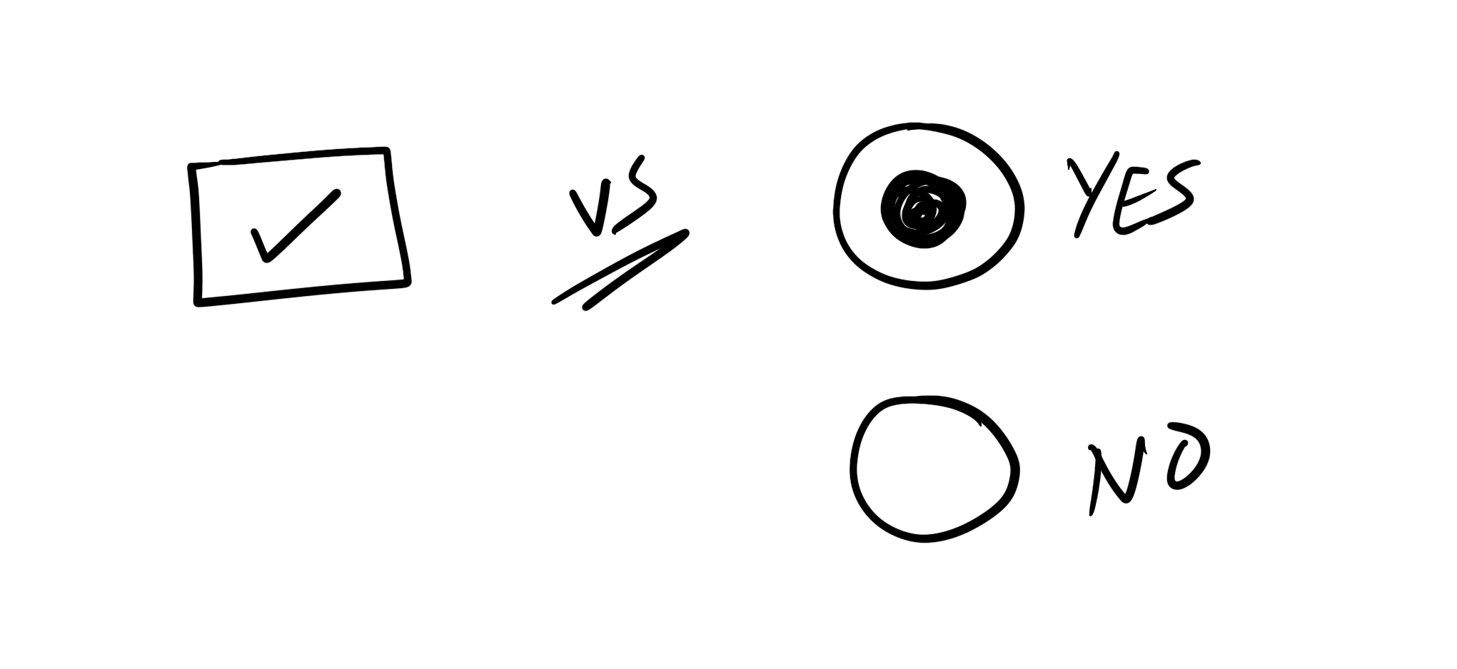
"Yes or No?" — One Checkbox vs Two Radio Buttons.
Published on
Should you use a checkbox?
Or should you use two radio buttons?
Which one should you use when you can use both?
First, some backstory:
I’m currently working on a client project unlike any other I’ve worked on before. The project is basically us building a Web UI that will replace an old, outdated native Windows desktop application. (It looks worse than you probably just imagined.) This is an app used by government employees and is chock full of forms. Actually, it is literally basically just a lot of forms. I’ve never worked on a project so forms-heavy before. I am building almost every form field imaginable. Surprisingly, though, I am enjoying this very much as I’m learning a tonne in the process.
My client was giving me a tour of the native app last week so that I’d have a clearer understanding of some of the UI components I was building. I have mockups for most of the UI elements, but of course, I can only implement a control or a component correctly and accessibly if I know exactly what it is, what it does, how it works, how users will interact with it, etc. So I needed more context and insight into why some of the design decisions were made because I wasn’t working on this project during the design phase and was only recently hired to work on it.
Learning more about the native app UI was extremely insightful and I had so many questions that led to extremely insightful design and UX conversations, many of which are worth their own articles (or even a talk).
We were also discussing potential ways we can improve the native functionality. We did not want to just blindly convert the desktop UI into a Web UI. The redesign and platform change is an opportunity to improve and modernize the user experience where possible, keeping the user in mind and making them the priority.
Going through the native app UI, my client told me that there were some “inconsistencies” that we might try to address and come up with better alternaties for in the Web UI. One such inconsistency is having questions with binary Yes/No answers sometimes presented as one checkbox and other times presented as straight up questions with two radio buttons: Yes and No. My client wasn’t sure why those decisions were made. Why are some fields for binary questions presented as one checkbox and others as two radio buttons?
Looking at the fields in question, I wasn’t sure why those decisions were made. But it looked like there was potential for unifying the controls there and making them more consistent. But can we do that? Is it really feasible to use either one checkbox or two radio buttons for all the fields we were looking at? What are the UX advantages to using either of these? Why and when would we use each?
I don’t remember reading any research that answers this particular question: if you have a question with a binary Yes/No answer, is it better to use one checkbox or two radio buttons?
Now, just to clear things up before moving on: I am aware of…
the difference between checkboxes and radio buttons:
- checkboxes are used when the user can select one or more options, and
- radio buttons are used when the user can choose only one of two or more options.
In addition to checkboxes and radio buttons for binary answers there are also toggle switches as a third option. But a checkbox, radio button, and a toggle switch are not the same. To learn more about the differences between these three, you may find the following two articles by the Nielsen Norman Group useful:
For my client project, I was specifically interested in one specific use case. And I needed to collect more information that would help us make a more informed decision.
Collecting input from the UI/UX design community on Twitter
I’ve asked the UI/UX community on Twitter for their input on this matter. The answers were overwhelmingly insightful and show just how nuanced this question can be depending on your specific use case. I invite you to read the whole thread on Twitter. But for the sake of this article, I’ve collected the most relevant responses and points that are worth considering when making the decision of which option to use.
Hey #UX #UI design Twitter, I got a question for you: when do you decide to use a checkbox versus two radio buttons for a field that can have a Yes or No state?I know there are scenarios when a checkbox is common, but when would you do separate radios (Yes & No) instead? Thx!
Use radio buttons if you expect the answer to be equally distributed. If I expect the answer to be heavily biased to one answer I prefer the checkbox. That way the user either makes an explicit statement or just acknowledges the expected answer.
If you want a concrete, deliberate, explicit answer and don’t want a default selection, use radio buttons. A checkbox has an implicit default state. And the user might be biased to the default option. So having the requirement for an explicit “No” is the determinig factor.
For me, a checkbox signifies that there a default state (usually unchecked). A radio, however, requires a deliberate choice from the user, so it depends on how optional that Yes/No choice is.
— Adam Harris (@Adam_J_Harris) November 18, 2020
A selected “No” radio button means No, but an unchecked checkbox could simply mean that the user missed the question. That might be something you don’t want happen if you need the information you’re asking the user for. So prefer radio buttons if you want the user to actively choose an option (none of the radios is preselected) – so there isn’t a default yes or no.
So I work in clinical trials, and for me if you have radio button Yes/No and they pick No... that means no. If you have a checkbox, that means they didn't check it. Could be a No. Could be a missing field.
— Evil Blond Dad (@sonofalink) November 18, 2020
If questions are like this:
— Muhammad Hanif (@HanifOnline) November 19, 2020
"Subscribe to newsletter?", then its definitely checkbox. If its missed, then, they don't miss something important
If questions are like this:
"Should we email you the order details for record?" then definitely go for radios.
I think if the no option is passive, like no i dont really want to be added to your mailing list. Then i would use a checkbox. But if the user is required to commit to an answer id user radio buttons. Like do you consider yourself Aboriginal/TSI on a employment application
— Michael Little (@cleandevelop_) November 20, 2020
I would use 2 radio inputs when I wouldn’t want to infer that one of them is the default. For instance if the question is “Are you a US citizen?”, I would provide Yes/No, rather than a “Yes” checkbox.
— Hugo “Kitty” Giraudel (@HugoGiraudel) November 18, 2020
I believe @leoweigand did some research on this for our signup flow.
Checkboxes can be suitable for certain optional, opt-in questions that are not required. But in this case it should be clear to the user what not checking the checkbox would mean, too. If the field is required, prefer radios.
For a *required* field, both options have to be presented, and I’ll use radio buttons.
— Taylor dunham (@taylordunham_) November 18, 2020
⚠️Radio Defaults: Whether or not there’s a default state selected is nuanced and important. If there could be any harm at all to the user by defaulting them to either choice, then NO default.
I work on products that deal with consent and data privacy. I use a checkbox (or a toggle) to collect consent as per definition (under GDPR) it has to be an active opt-in. The absence of action means no. I would use 2 radio buttons when the default option cannot be inferred.
— Cyrièle Piancastelli (@cyro) November 18, 2020
Checkboxes or toggles are optional, opt in items. You are making binary selections for each label/check pair, but they are optional.
— orgy porgy centrifugal bumblepuppy (@designnotdrum) November 18, 2020
Radio buttons are for question groupings with strict logic this or that, one must be selected.
🔘 Radio buttons = required fields
— Alex Martin (@AlexMartinFR) November 18, 2020
☑️ Checkboxes = optional fields#UX tip for faceted search engines:
If you use radio buttons to force the user to only select one of exclusives values, remember to give them a way to unselect it if it’s too restrictive!
Generally, opt-in toggles such as “Subscribe to our newsletter” or “Show extra columns” would be checkboxes.
If the choice is about enabling/disabling then checkbox, if the choice is about answering a question, the choice has semantic meaning and I’d say radio
— Jeroen Koomen (@Jjeekkoo) November 20, 2020
It also depends on how the question is phrased. Radio buttons are the obvious choice if the label is a question. Checkboxes are more suitable if the label is a statement (and assuming it is an opt-in field).
I agree with @morganc_smith. It depends on how the question is phrased.
— Betsy Dupuis (@BetsyDupuis) November 18, 2020
Are you 18 years or older? Yes / No
vs
✅ I am over 18 years old.
Checkbox - the label is a statement ("I have read the terms and conditions", "Opt me into your mailing list")
— Graeme Coleman (@graemecoleman) November 18, 2020
Yes/no radio buttons - the label is a question ("Have you read the terms and conditions?", "Would you like to join our mailing list?")
When the field is phrased as a question, it requires the user to read it more carefully. Something to keep in mind if you do want them to read it carefully or not. There will be situations where you don’t want that additional congnitive load. For example, if you want to know if the person if a citizen of a country.
Two radios ensure users need to take action, so a field cannot be skipped without considering the options. I would furthermore use an option label like "I am a US citizen" instead of yes / no, so users don’t have to read the question so carefully.
— Leo (@leoweigand) November 18, 2020
So, which one should you choose? one checkbox or two radio buttons?
The answer is, as with most matters: It depends. Depending on the type of content you’re working with and the kind of information you’re asking for, it could easily either be one checkbox or two radio buttons. The collection of answers above can hopefully help you make a more informed decision. But as with all user interfaces, nothing beats the input you can get from user testing and research. So hopefully the answers above can at least serve as a starting point in situations where you need more to make a decision.
Thanks to everyone who chimed in the Twitter thread.
And thank you for reading.