Global and Component Style Settings with CSS Variables
Or how I use CSS variables to create more manageable project styles and more portable patterns
Ever since I learned about CSS Variables a few years back, my absolute favorite feature has been the ability to scope variables to components. But to be honest, I haven't been putting this feature to much use over the years, until I created my own pattern library last year to speed up prototyping and client work. That’s where scoped CSS variables really shined for me. So I want to share my favorite two ways to use CSS Variables to organize and maintain styles in my projects today.
Over the last few months, I’ve started approaching the way I organize and manage my CSS differently…
Global Project Settings
Today, at the beginning of each project, I create a _settings.scss stylesheet. This stylesheet contains the global settings for the project. These settings are usually derived from the design style guide provided by the design team I’d be working with.
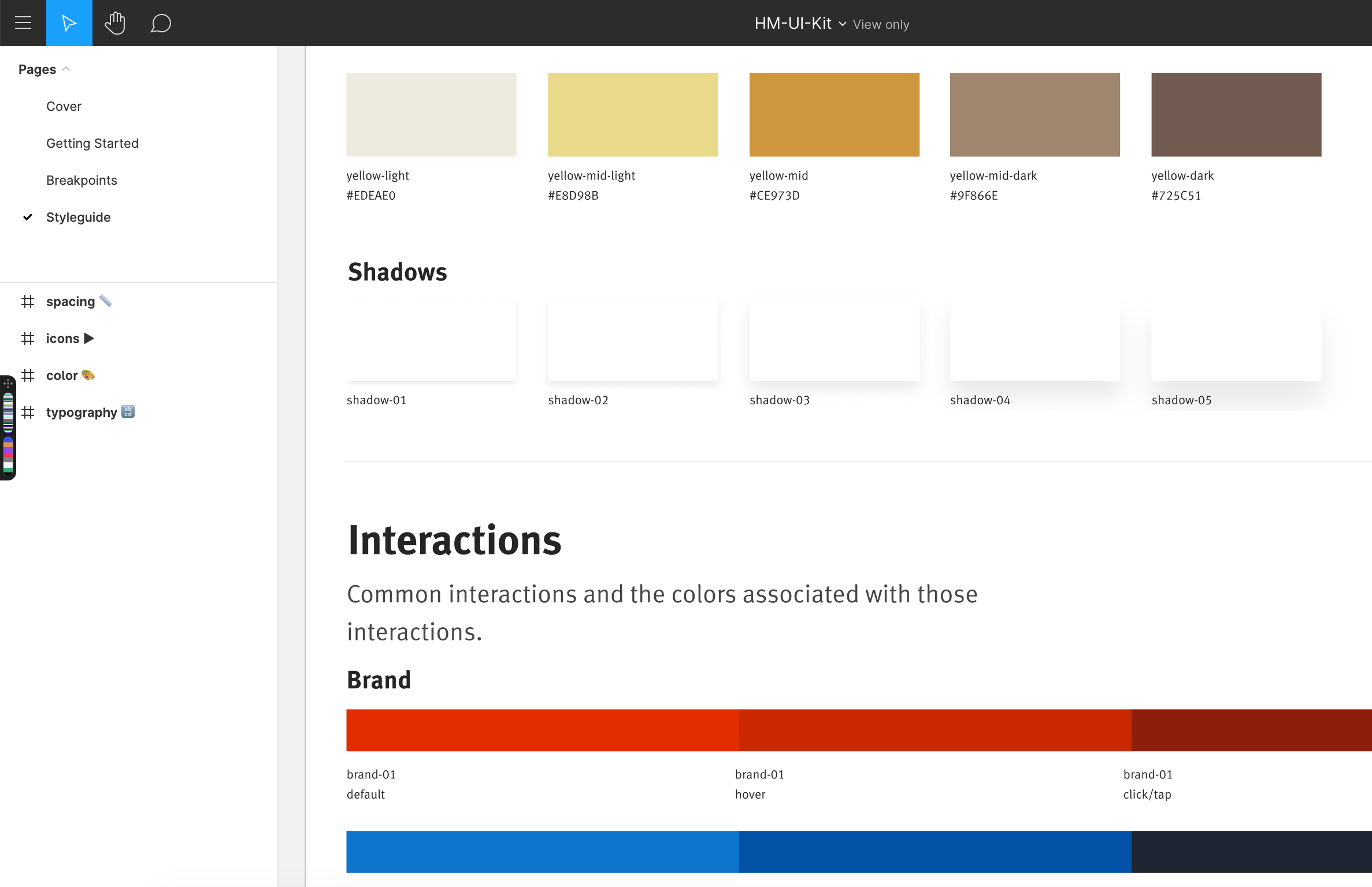
Just like the style guide contains settings for visual styles like colors, box shadow styles, font styles, type scales, etc., the _settings stylesheet contains variables that serve as the code equivalent of those settings, and that are used across the CSS to maintain visual consistency across the project.
/* … */
–border-color: #ebebeb;
/* Box Shadows */ –shadow-01: 0px 2px 4px rgba(37, 37, 37, 0.1); –shadow-02: 0px 4px 8px rgba(37, 37, 37, 0.1); –shadow-03: 0px 8px 16px rgba(37, 37, 37, 0.1); –shadow-04: 0px 16px 24px rgba(37, 37, 37, 0.1); –shadow-05: 0px 24px 32px rgba(37, 37, 37, 0.1);
/* … */
}
<figcaption>An example of global style settings defined in a <code>_settings.scss</code> style sheet in my current client project.</figcaption>
</figure>


```css
.card {
    /* ... */

    box-shadow: var(--shadow-01);
    border: 1px solid var(--border-color);

    transition: box-shadow .2s linear;

    &:hover,
    &:focus {
        box-shadow: var(--shadow-03);
    }
}
If at any point during the project any of those settings need to change, I know exactly where to go make that change, and I know it will propagate consistently throughout my entire system.
In addition to these settings, I’ve been finding the most value and convenience in using CSS variables to define local, component-scoped styles…
Quicker Prototyping with “Skeleton” Components
Over the years, and in the interest of saving myself time and speeding up prototyping ideas and client work, I’ve created a library of UI and design patterns that I find myself needing to recreate on most of my projects. The library now contains a growing collection of easily reusable UI patterns that I can reliably copy-paste into my projects when I need them. Each pattern is progressively enhanced using modern CSS and JavaScript, and is cross-browser and cross-platform accessible from the ground up.
Since I created the library as an ‘internal’ project, it currently lives in a private Github repository, and behind a password on the .dev domain of my site.
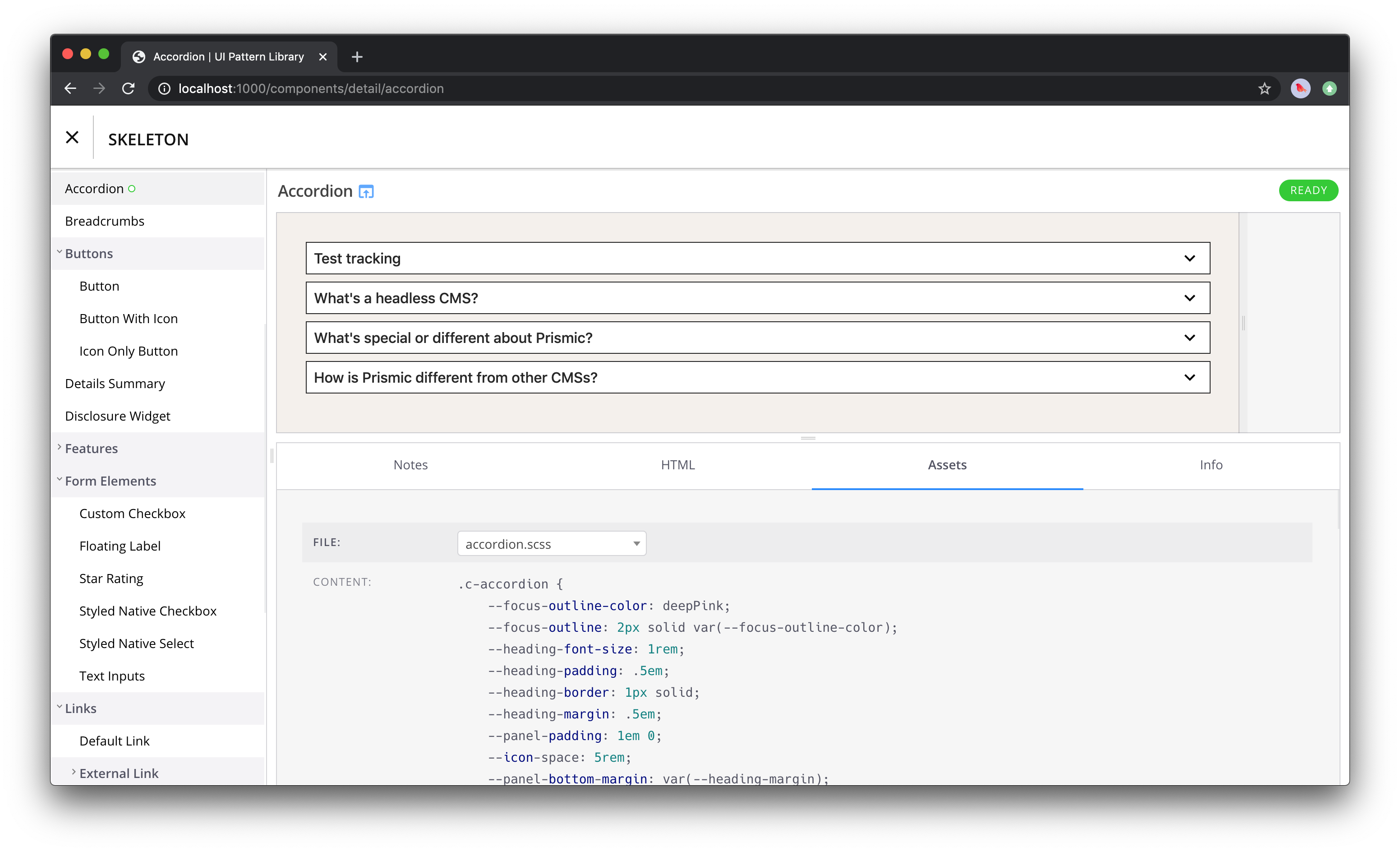
I named the library ‘Skeleton’, and I built it with Fractal. I’ve been using Fractal for a couple of years now. I chose it over other pattern library tools because it fit my needs perfectly — I wanted a tool that was unopinionated and flexible enough to allow me to set up and structure my project the way I wanted to. Fractal fit the description perfectly because it is agnostic as to the way I develop or the tools I use. And I was further sold on it after reading about how Rachel Andrew uses it to manage CSS using a pattern-first approach, which was exactly what I was going for. I particularly love that components can be nested into folders to make it easier to locate particular components, and how you structure the folders is completely up to you.
I organize my patterns so that each pattern lives in its own directory, containing the component’s HTML template, CSS, and vanilla JavaScript files, along with any additional Fractal-specific assets (such as config files).
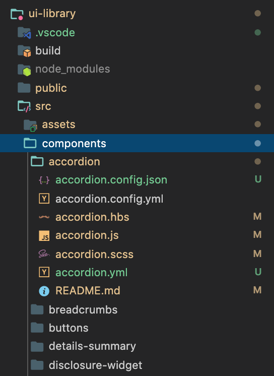
Using this structure, each of my patterns is self-contained. And I can include and concatenate the pattern’s styles and scripts in my projects as I need.
@import "accordion";
@import "modal";
To quote Tyler Sticka in “Tips for Portable Patterns”: Patterns, like songs, are easier to remix when each master track is separated.
My goal from creating this library is to create a tool that allows me to prototype faster, and that’s flexible and efficient enough to use across different projects. And since patterns are usually styled differently across my projects, I wanted a way to simplify the process of customizing or “configuring” them for each project. Enter CSS Variables.
Scoped Component Settings
Because I don’t want to spend a lot of time overriding and undoing styles when I use a pattern in a new project, I created this library with the components having little to no styling by default — mostly white (no colors), minimal spacing, and only borders where visually appropriate. So the patterns literally look like skeletons of sort, hence the name. Now when I need to use one of these components, I have little CSS to override before they’re ready to be plugged into the new project.
For each pattern, I’ve found myself modifying the same properties whenever I needed to use it — like the font, colors (text, background, border), box shadow, spacing, etc. So I figured it would be useful and time-saving if I created variables for those properties, define those variables in the ‘root’ of the component, and ‘pass in’ the values for these variables when I use the pattern as I need. This way I can customize or theme the component by changing the property values in one rule set, instead of having to jump between multiple ones to do so.
I use variables to abstract all styles that I usually need to override. So every property that changes across projects is usually “promoted” into a variable. Then, if, at any point during the project, I need to tweak a pattern’s style(s), I know exactly where to do it. This makes the styles for each pattern more readable and more maintainable, which is even more important for when someone else needs to modify the CSS.
This approach works quite well with my approach to organizing my CSS files. I like to organize my CSS into separate style sheets per patterns, that includes all the pattern’s styles and responsive behavior. There will be exceptions to this rule... for example, styles for “atoms” (like buttons, input fields, etc.) that are re-used across patterns are defined in one style sheet. And even then, when an atom’s styling gets a little complex (e.g. styling a custom file upload input), I may create a separate style sheet for that. I’ll go into a little more detail about the way I organize my CSS in another article.
Example
Like most of you, I find myself creating a <select> element in almost all of my projects. As of last year, I use Scott Jehl’s cross-browser styling technique. I find that I mostly need to change the icon, border color, border radius, and background color the most. In every project, I also set a focus outline for interactive elements. The outline color also varies across projects.
So, I promoted these properties into variables. For each property, I set a default or empty value and change that value when I use the component in a new project as I need.
.c-custom-select {
    --icon: url("data:image/svg+xml;charset=US-ASCII,%3Csvg%20version%3D%221.1%22%20xmlns%3D%22http%3A%2F%2Fwww.w3.org%2F2000%2Fsvg%22%20width%3D%2232%22%20height%3D%2232%22%20viewBox%3D%220%200%2032%2032%22%3E%0A%3Cpath%20fill%3D%22%23777%22%20d%3D%22M9.914%2011.086l-2.829%202.829%208.914%208.914%208.914-8.914-2.828-2.828-6.086%206.086z%22%3E%3C%2Fpath%3E%0A%3C%2Fsvg%3E%0A");
    --icon--disabled: ;
    --border-color: currentColor;
    --border-color--disabled: ;
    --color--disabled: ;
    --border-radius: 0;
    --background-color: #fff;
    --gradient-background: linear-gradient(to bottom, #ffffff 0%, #e5e5e5 100%);
    --outline-color: hsl(265, 50%, 50%);
    --padding: .5em;
}
I like to think of this rule set as a settings object for the component. It makes theming the component faster by passing in the values you want.
The rest of the rule sets for the select component contain fixed rules or styles that most likely won’t change across projects:
    -moz-appearance: none;
    -webkit-appearance: none;
    appearance: none;
    box-sizing: border-box;
    display: block;
    width: 100%;
    max-width: 100%;
    padding: var(--padding);
    padding-right: calc(var(--padding) * 3);
    font: inherit;
    color: inherit;
    line-height: 1.3;
    border: 1px solid var(--border-color);
    border-radius: var(--border-radius);
    background-color: var(--background-color);
    background-image: var(--icon), var(--gradient-background);
    background-repeat: no-repeat, repeat;
    background-position: right calc(var(--padding) * 1.5) top 50%, 0 0;
    background-size: 1em auto, 100%;
}

.c-custom-select::-ms-expand {
    display: none;
}

.c-custom-select:focus {
    outline: none;
    box-shadow: 0 0 0 3px var(--outline-color);
    box-shadow: 0 0 0 3px -moz-mac-focusring;
}

.c-custom-select:focus:not(:focus-visible) {
    box-shadow: none;
}

.c-custom-select:disabled, .c-custom-select[aria-disabled=true] {
	color: var(--color--disabled);
	background-image: var(--icon--disabled),
	  linear-gradient(to bottom, #ffffff 0%,#e5e5e5 100%);
}
.c-custom-select:disabled:hover, .c-custom-select[aria-disabled=true] {
	border-color: var(--border-color--disabled);
}
Moving Forward
As much as I’d love to do this in all of my projects, unfortunately I can only use this approach to styling and managing component CSS in my own projects at the time being. The reason for that is that most of my clients still need to support at least one or two versions of IE, which have no support for CSS Variables. And while there is a polyfill for CSS Variables, the polyfill only provides support for variables defined on the root HTML element. Depending on the level of support and optimization we need for the IEs, I currently reach for the polyfill and use CSS Variables at least for defining global project styles.
I see myself using this approach to style management in the future in combination with Web Components to create overall more portable patterns. And hopefully, some time in the future we’ll have container queries to make these components truly self-contained.
As for Skeleton, it still has a long way to go. My goal is to create a custom Fractal theme to go with it. I haven’t yet found a good and complete guide on how to do this, especially since I’m looking to create a theme from scratch so I have full control over its styles. If you know me, you know I’ll probably write that guide once I figure out how to create a theme from scratch.
I’m also constantly working on adding more patterns and variations of patterns. And I plan on including a Snippets section which includes code snippets I also frequently use in projects, such as JavaScript patterns and functions. And of course, I want to go heavy on documentation, including adding posts about best practices such as perf optimization techniques, icon and images best practices, etc., and I’ve already started drafting most of these ideas.
I may or may not turn the library into a shareable product at some point in the future. But this is not something on its roadmap at the moment. For now, I like the idea of this being a small personal project with no strings attached. That said, I would love to publish the library as an npm package (for private use to start). I’m not familiar with how to do this yet. But I found an article on CloudFour that dives into doing this exact thing, so that will probably be my starting point. And I will definitely document my process as I figure my way around doing it.
Update: June 8th 2020
Heads up: using scoped CSS variables also has performance benefits because setting & modifying variables defined on a global scope can be expensive & have performance pitfalls due to large amounts of style recalculations. Lisi Linhart has an excellent writeup about the performance of CSS variables as well recommendations to avoid any performance hits.