Cropping & Scaling Images Using SVG Documents
The SVG snippet that replaces a CSS object-fit declaration
I’m always interested in and thinking about ways to use SVG in my client projects to solve common UI challenges — uses that go beyond simple icon display and animated illustrations. I’m also always researching and looking for practical uses of SVG to add to my talk and workshops material that go beyond SVG the image format, and more into the document nature of it. After all, SVG on the Web isn’t just about displaying pretty and animated illustrations.
I’m also particularly interested in CSS and SVG as a combination (that I like to call “The Power Combo”) to solve common real-world challenges. These two work really well together. And it so happens than some of what’s possible in CSS is also possible in SVG, either because the CSS functionlity was imported from SVG to begin with, or simply because SVG documents also happen to offer tools that achieve the same functionality. And since SVG goes way back and has much better support than newer CSS features, it is possible to use SVG either as a fallback or as a replacement to some CSS functionalities. It all depends on the browser support you’re after.
SVG comes with a pair of attributes — namely viewBox and preserveAspectRatio — that allow us to manipulate the contents of an SVG (whether vector content or raster images) in a myriad of ways to achieve a myriad of things. One thing we can do with these attributes is control the scaling and position of the contents of the SVG. In this article, we’ll use these attributes to crop, scale and position images, as a fallback or alternative to the CSS object-fit and object-position properties.
viewBox, viewport and preserveAspectRatio, I highly recommend reading my extensive guide on the subject. Although this article does not require a deep understanding of these attributes, I highly recommend you get comfortable using these attributes.
Cropping, Scaling and Positioning in CSS with object-fit and object-position
Say you’re using a CMS, and you’re allowing your users or authors to upload photos of themselves to use as an avatar next to their biography on the site. And you want to make it possible for them to upload any image of any size and aspect ratio, and then you’d handle the cropping of that image before you display it on the page in a box that might very well have a different aspect ratio than the image the author uploaded.
There are many ways you could handle this. For example, you can handle the image cropping on the server-side using PHP or some JavaScript script, and then serve the cropped image on the site. You may even be in a different scenario, where you just want to be able to quickly crop and display the images on a page, without using a CMS and back-end script.
Fortunately, today, CSS has two properties that make cropping and scaling images within a fitted box a breeze. These properties are object-fit and object-position.
The object-fit property specifies how the contents of a replaced element should be fitted to the box established by its used height and width.
Even though a bitmap image has its own intrinsic dimensions and aspect ratio, you can size it to fit into any box of any size as defined in your CSS. And you can choose whether you want to preserve the aspect ratio of the image or not, all using one property (object-fit) and one line of CSS.
The following image shows the effect of each of the possible values for object-fit:
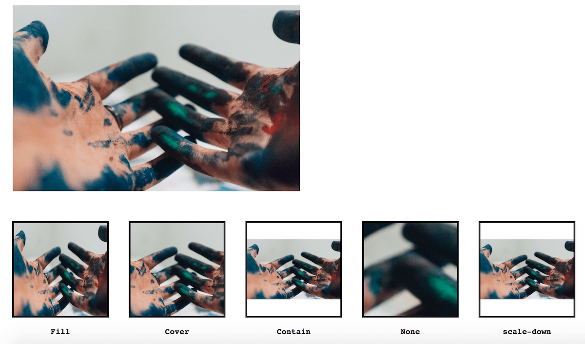
object-fit values to an image to be fitted in a box with a different aspect ratio.
By default, the image is centered within its containing box (the square, in our example). You can change that default position using object-position, which takes values similar to the values of background-position. For example, object-position: top left will align the top edge of the image to the top border of the box, and the left edge of the image to the left border of the box. Here’s a live Codepen for you to try the effect of changing object-position on the images:
See the Pen CSS `object-fit` Values by Sara Soueidan (@SaraSoueidan) on CodePen.
Browser support for object-fit and object-position is very good: it is supported in all the latest browsers, including MS Edge 16+ and Opera Mini, though it requires the -o- prefix in the latter. You can see the latest updated browser support on CanIUse.com.
If you, like me, want to be able to provide a similar experience to Internet Explorer, you’re going to need an alternative solution, or at least a fallback. And, ideally, the alternative solution needs to provide support at least back to IE9, maybe? This is where SVG can fill in.
Cropping & Scaling Images with SVG
If you’ve ever played with the SVG viewBox, then you know that the coordinate system defined by the viewBox does not necessarily need to have the same aspect ratio as that of the <svg> viewport.
And when the aspect ratio of the viewBox is not the same as that of the viewport, the browser needs to position the former in the latter similar to the way the photo was being positioned inside the box in the previous section.
By default, just like with object-fit, the browser will fit the viewBox inside of the SVG viewport (or “box”) by containing it inside of it, such that the entire viewBox — and, thus, all the contents of the SVG — are visible inside the viewport.
Using the preserveAspectRatio attribute, you can change the position and scale of the viewBox — and, thus, all the contents of the SVG — similar to the way object-position changes the position and scale of the image inside the box when using object-fit.
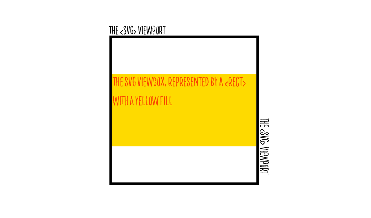
For example, suppose we have a square svg (aspect ratio 1:1) and a viewBox that has a different aspect ratio (2:1). The easiest and fastest way to visualize the viewBox coordinate system in the svg is to create a <rect> that starts at the coordinate system’s origin and has a width and height value of 100%.
<svg width="300px" height="300px" viewBox="0 0 500 250">
    <!-- This rect is the same size of the viewBox -->
    <rect x="0" y="0" width="100%" height="100%" fill="#FEDA00"></rect>
</svg>
The result of the above code is shown in the image below. The yellow rectangle represent the size and position of the viewBox within the svg viewport.
object-fit values to an image to be fitted in a box with a different aspect ratio.
Now, using preserveAspectRatio, you can change the position of the viewBox as well as its size (or scale) within the viewport similar to the same way we could change the position and scale of our image in the previous section using object-fit and object-position.
A preserveAspectRatio value is made up of two keywords, one of them represents the scale viewBox and has one of two values: meet or slice.
meet has the same effect as object-fit: contain; (or background-size: contain;) and slice has the same effect as object-fit: cover; (or background-size: cover;). The former will preserve the aspect ratio of the viewBox and fit it inside the viewport so that it’s entirely visible. This is the default behavior. Whereas slice will scale the viewBox up, while preserving its aspect ratio, so that it covers the entire viewport area, even if it means cutting some of the content off (hence the “slicing” effect).
The other keyword in preserveAspectRatio represents and controls the position of the viewBox within the viewport. It has 19 values, including none which tells the browser to scale the viewBox to fill the viewport area without preserving its aspect ratio, and is similar in effect to object-fit: fill;.
The default value for the preserveAspectRatio is xMidYMid meet, which is the value the browser uses even if you completely omit the attribute from the <svg>.
The following snippet using preserveAspectRatio="xMinYMin meet will change the position of the viewBox in the previous example such that the yellow rectangle’s top edge is aligned with the viewport’s top edge, and its left edge is aligned with the left edge of the viewport, while keeping the whole rectangle contained within the viewport and preserving its aspect ratio. xMinYMin is equivalent to 0% 0% or left top values in background-position.
<svg width="300px" height="300px" viewBox="0 0 500 250" preserveAspectRatio="xMinYMin meet">
    <!-- This rect is the same size of the viewBox -->
    <rect x="0" y="0" width="100%" height="100%" fill="#FEDA00"></rect>
</svg>preserveAspectRatio values to one of background-position values. I highly recommend checking it out.
Now, to get back to the objective of this article. If you replace the <rect> element with an image (such as a photograph) and you match the aspect ratio of that image with that of the viewBox, the browser’s default behavior will be to position the viewBox (and consequently also the image) so that it is fully contained and centered within the viewport (assuming again that the viewport’s aspect ratio is different from that of the viewBox and the image).
The following Codepen shows that in action. We have a 1:1 aspect ratio SVG, and an image with dimensions 579px by 375px. I’m using the same as the one I used in the CSS demo in the previous section again, and I’m keeping the default preserveAspectRatio. Try changing the value of preserveAspectRatio to see how the changes affect the position and scale of the image within the SVG.
To get the effect of object-fit: cover;, for example, you need only change meet into slice — the image will remain centered by default with xMidYMid.
See the Pen b47336d56a318d056218aa57e8889f3a by Sara Soueidan (@SaraSoueidan) on CodePen.
Pretty much any combination of values of object-fit and object-position can be replicated using preserveAspectRatio on viewBox. And what’s best is that this technique will work in any and all browsers that support SVG, which means that it will work in Internet Explorer all the way back to IE9. IE8 does not support SVG so you’d have to provide a different solution for it if you need to support it.
One more thing: making the SVG solution more accessible.
One thing that the SVG solution is missing at this point is an alternative to the alt attribute, because an image should always have that. If the image is just decoration, the alt attribute can be left empty, but it should never be omitted.
To make the SVG snippet accessible, you can add the SVG alternative to alt: the <title> element, first thing in the SVG, before your <image> declaration. So, doing that in the example above, the code would look like this:
<svg width="300px" height="300px" viewBox="0 0 579 375" preserveAspectRatio="xMidYMid meet">

	<title id="title">Painter’s Hands</title>

  <image xlink:href="https://s3-us-west-2.amazonaws.com/s.cdpn.io/9674/photo-1501366062246-723b4d3e4eb6.jpg" x="0" y="0" width="100%" height="100%"></image>

</svg>
Last but not least, to enhance the accessibility of SVG further, add a couple of attributes on the <svg> element to describe the role of the <svg> as well as re-enforce the relationship between the <svg> and the <title> element, so that the latter is recognised by screen readers as the accessible name for the SVG content (—our image, in this case).
<svg width="300px" height="300px" viewBox="0 0 579 375"
		preserveAspectRatio="xMidYMid meet"
		aria-labelledby="title" aria-role="img">

	<title id="title">Painter’s Hands</title>

  <image xlink:href="https://s3-us-west-2.amazonaws.com/s.cdpn.io/9674/photo-1501366062246-723b4d3e4eb6.jpg" x="0" y="0" width="100%" height="100%"></image>

</svg>
And just like that, you now have a perfectly accessible SVG alternative to a CSS object-fit declaration.
Summary & Recap
You can crop and scale any image using CSS object-fit and object-position. However, these properties are only supported in the latest version of ME Edge as well as all other modern browsers.
If you need to crop and scale an image in Internet Explorer and provide support back to IE9, you can do that by wrapping the image in an <svg>, and using the viewBox and preserveAspectRatio attributes to do what object-fit and object-position do.
The snippet can replace an object-fit declaration:
<svg width="x" height="y"
     viewBox="0 0 imgX imgY"
     preserveAspectRatio="<align> <meetOrSlice>”
     aria-labelledby="title" aria-role="img">

     <title id="title"> img alt here &ly;/title>

    <image xlink:href="..." width="100%" height=“100%”>
    </image>

</svg>
where imgX and imgY are the dimensions of the image you want to crop and scale, and <align> and <meetOrslice> are the two keywords that determine the scale and position of the image within the SVG wrapper.
And that’s it. A simple SVG tip to provide better cross-browser support for a less-supported CSS feature.
I hope you like this tip and find it useful. Thank you for reading!
Footnotes
-
A replaced element is an element whose dimensions and content are defined outside the scope of CSS. For example, a bitmap image has an intrinsic width and an intrinsic height specified in absolute units, and from which the intrinsic ratio can be determined. Dudley Storey puts it nicely when he says that ‘another way of thinking of replaced elements is “any tag that has its content replaced by an outside source”.
<img>and<video>are obvious examples’. ↵ -
If the origin of the
viewBoxis changed, the origin of therectshould be changed to match that, otherwise the rectangle can no longer be used as a visualization of the current user coordinate system in use. ↵