Design for reading: tips for optimizing content for Reader modes and reading apps
Our content will not always look the way we expect it or want it to. Many apps, tools, and environments that people use to browse the Web strip our content of our CSS and apply their own styles to it. And unless we always keep that in mind, we risk creating incomplete or even broken experiences for users of those technologies or tools.
You might be reading this very blog post in a reading app right now, or maybe even listening to it being read out loud to you. In either case, the visual style enhancements I have applied to the content don’t really matter much anymore. My CSS isn’t enhancing your experience. My content—the HTML markup—though, defines your experience and can either make it or break it.
Reader modes and Forced Color modes are two common environments where content is typically stripped of our CSS. So a question I think we should constantly be asking ourselves is: Is our content still understandable without CSS? Or are we relying too much on visual styles to put ideas across? Does the HTML layer alone provide a decent and sufficient experience to our users? Is our CSS truly the enhancement it is meant to be, or are we relying too much on our own preferences rather than our users’ to communicate our ideas?
The more I consume content in reading apps, the more I am reminded of the importance and the power of progressive enhancement as a strategy to create resilient and malleable experiences that work for everyone, regardless of how they choose to consume our content. The more we think about the Web in layers, the more robust experiences we can design.
Designing for reading, there are a few things we can learn and do to improve our users’ reading experience (and other users’ experiences as well!):
1. If your idea requires CSS to visualize, provide a markup-only alternative.
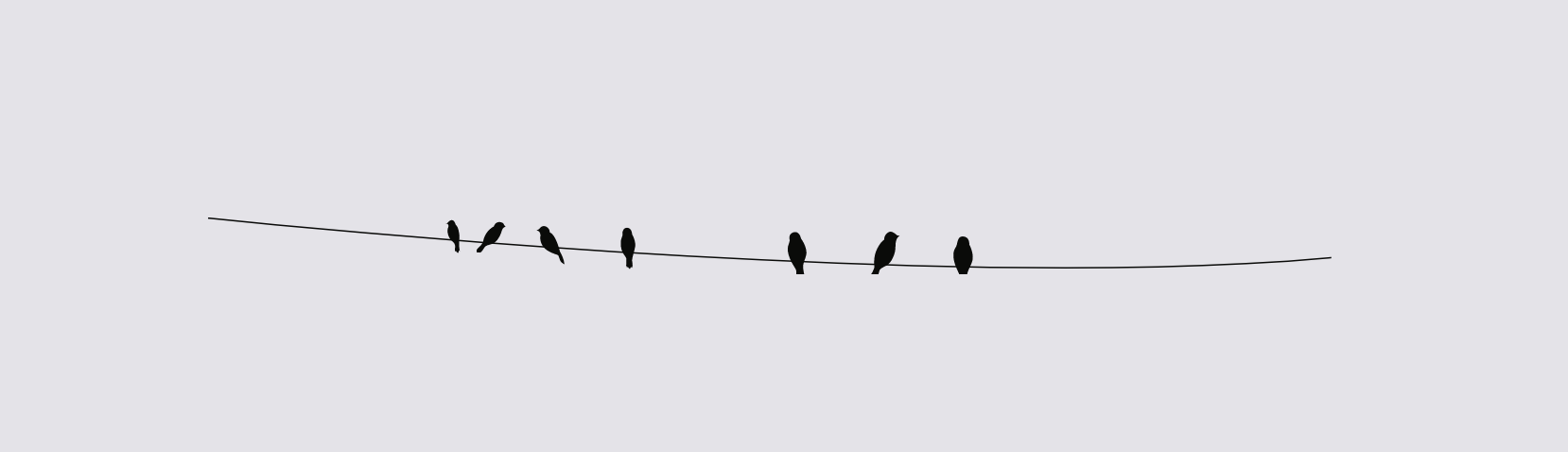
In my previous article about creating creative yet accessible horizontal rules, I discussed how I created the birds-on-a-wire horizontal rule style that I use on this Web site.
After the article’s introduction was a horizontal rule, and a paragraph that read:
If you’re a frequent reader of this blog, then you’ve most likely already seen what a horizontal rule looks like on here. In fact, if you haven’t seen it before, then you might have just done that. The birds-on-a-wire illustration above this very paragraph is a styled
<hr>element.
The horizontal rule above that specific paragraph was sort of as a “live demo” for the ideas and code discussed in the article. That horizontal rule is styled in my style sheet to look like a bunch of cute birds on a wire.
Knowing that some readers will be reading the article in an RSS app or even their favorite browser’s Reader mode, I provided an alternative or “fallback” piece of content that would only show up for said users when my own CSS is stripped away.
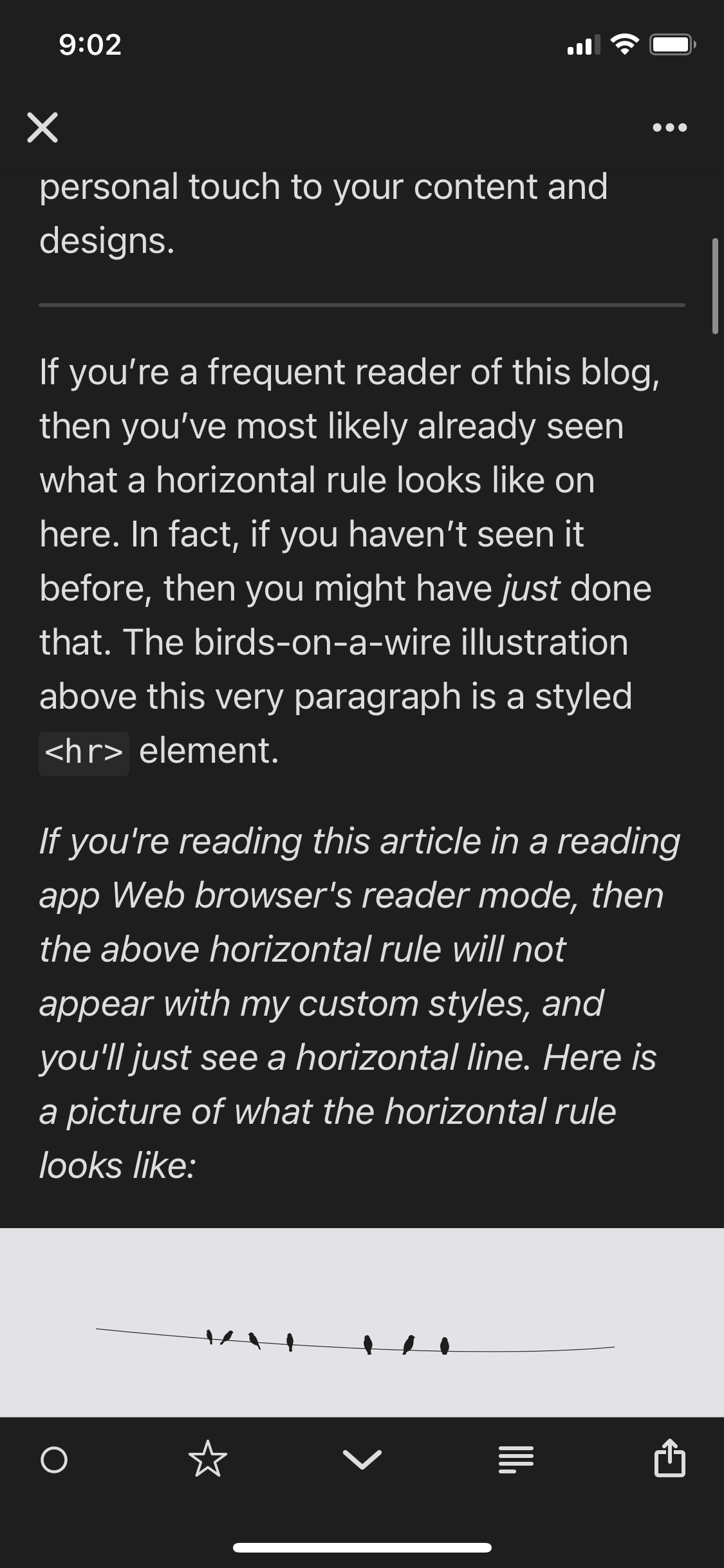
In Reeder app, horizontal rules are displayed as plain horizontal lines, so my “live demo” would not be accessible to them. As such, I’ve provided alternative text that reads: "If you're reading this article in a reading app or a Web browser's reader mode, then the above horizontal rule will not appear with my custom styles applied, and you'll just see a horizontal line. Here is a picture of what the horizontal rule looks like".
The paragraph is followed by an image of the birds-on-a-wire horizontal rule style.
Notice how in the screenshot the reader-only piece of text appears in an Italic font style. Using the emphasis HTML element I am able to visually distinguish that part of the article from the surrounding text in the reading app.
Yes, my readers could easily just click through the article’s title and check the horizontal rule styles on my Web site, but they shouldn’t have to. They shouldn’t have to switch contexts just to check out a visual style that I can easily provide them with inside their preferred reading environment.
Today, inside my global utilities style sheet, I have a reader-mode-only utility class (that I will probably rename later to something more generic). I use that class to provide alternative content to my readers that would otherwise require my CSS to be understood. That content would always be present by default when my visual styles are not. And when the content is accessed or viewed in an environment where my CSS is used, the reader-mode-only content is hidden with a simple display: none;.
The idea here is to improve the user experience. This technique should never be used to shove unwanted content (such as ads, ugh!) down our reader’s throats. I know we’d ideally want people to come visit our sites, but we should respect their choices, especially since our design choices might be questionable—are we presenting too many distractions on the page? are the fonts we’re using unreadable? is the text contrast sufficient? There might be many reasons why our readers might prefer reading our content in Reader modes. Instead of questioning our user’s preferences, we should reconsider our design decisions.
Or not! Many people—myself included!—use RSS because it’s a very convenient way to stay up to date with content. The fact that our readers are subscribed to our blogs is but a greater incentive to make sure we provide them with the quality content and experience that they are expecting from us. And if you do have unwanted elements showing up for them when they shouldn’t, make sure you “clean them up”. More on that in the third section.
2. HTML is for content. CSS is for visual styles. Keep content where it belongs: in the markup.
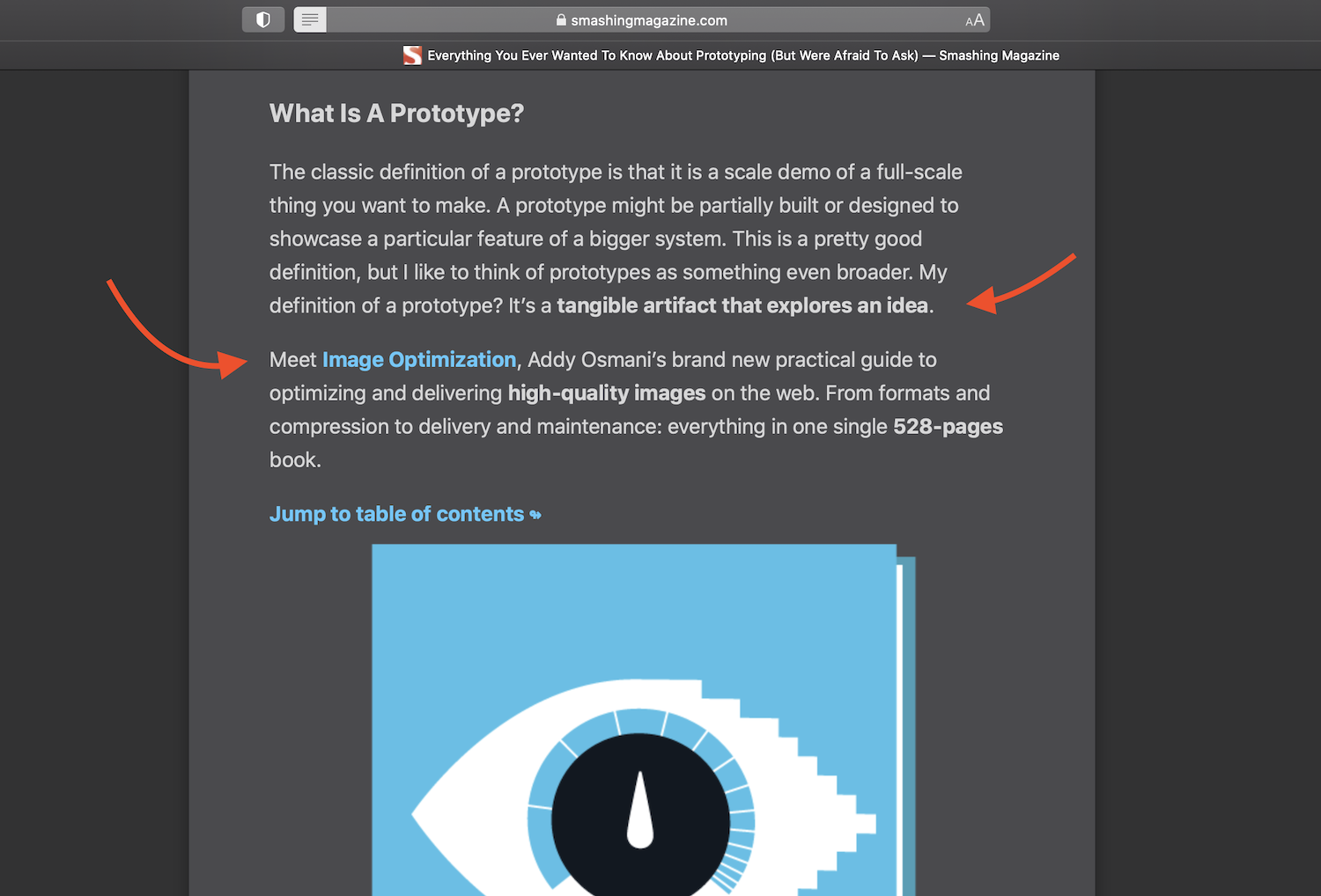
I was reading through a Smashing Magazine article in Reeder app when I reached what seemed like a sudden change of topic in the middle of the article. What read as part of the article was actually not. What I’m referring to is Smashing Magazine’s custom “ads” (or content callouts) that appear in the middle of each of their articles.
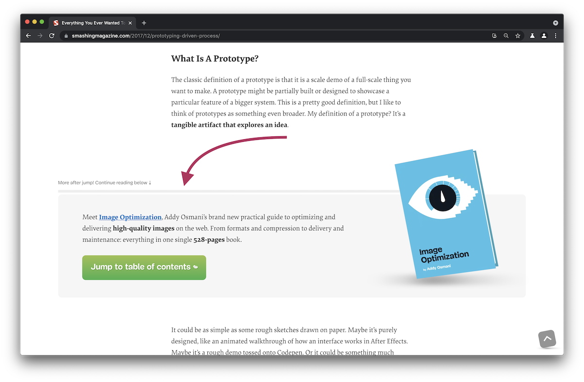
These custom ads/callouts that highlight Smashing products typically appear in the middle of an article. With Smashing’s CSS applied, this section stands out from the rest of the article, and is preceded with heads-up text that says More after jump! Continue reading below! ↓
. These styles make the callout section distinguishable from the rest of the article, so you can easily skip over that section and continue reading the article without your focus being affected much.
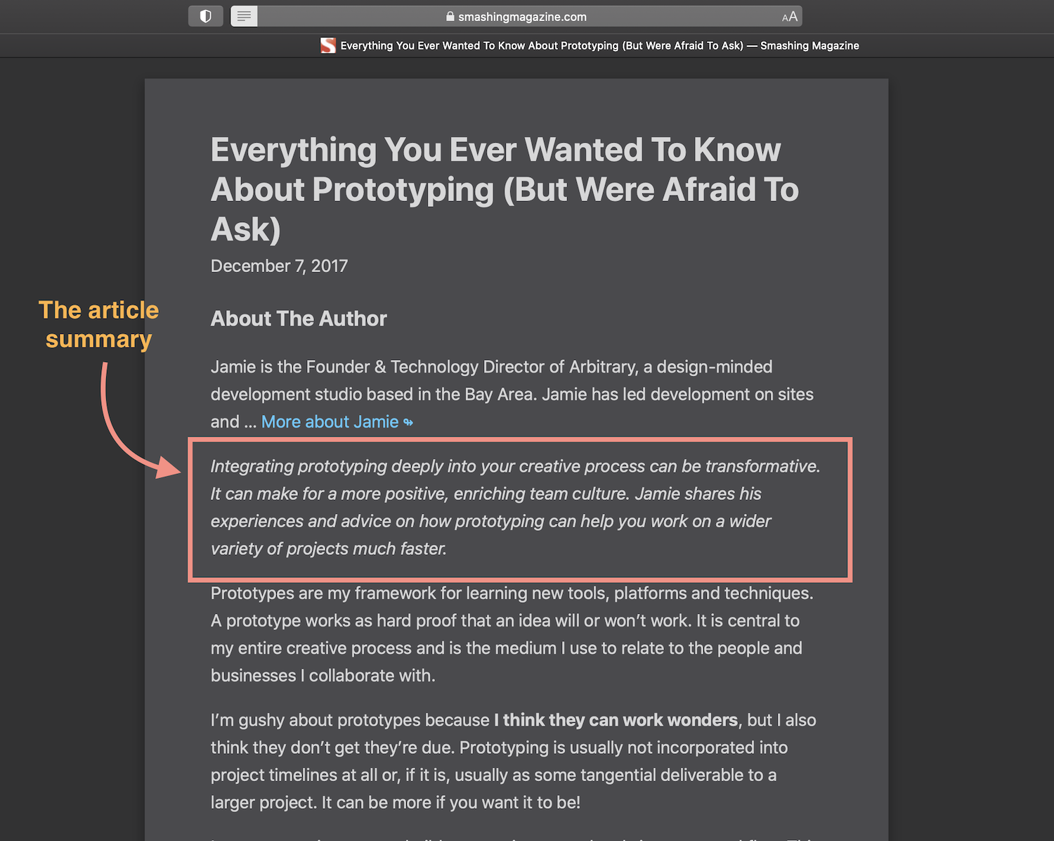
In Safari Reader Mode, however, the experience is not as subtle.
The heads-up text that precedes the callout section is not real text. It’s pseudo-content—literally fake content—created and added to the callout section via CSS using a ::before pseudo-element.
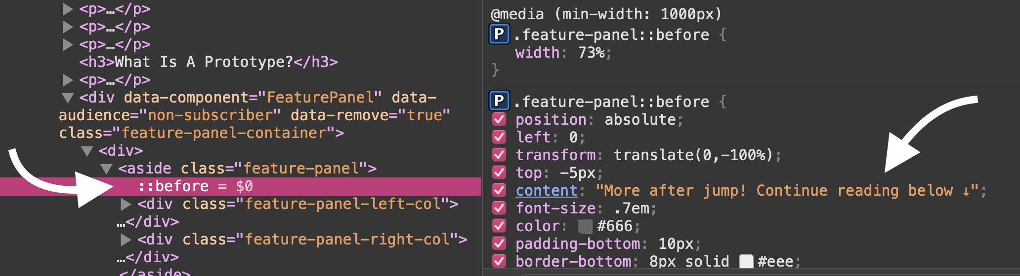
And since Reader Mode strips the content of CSS, that piece of text is not rendered, and the callout section no longer looks like a callout section. Instead, it just appears in the middle of the content as part of the content and interrupts the reading flow.
It's worth noting that I noticed this issue while browsing and reading Smashing articles in Reeder app more than a year ago. But the callout section no longer shows up in Reeder app. I'm not sure why that is. That's why I am using Safari Reader mode to demonstrate the issue.
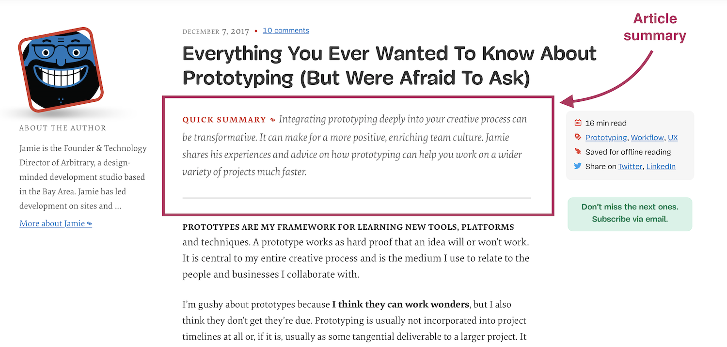
Similarly, the Summary section at the beginning of the article has a “Quick Summary” label that is also generated in CSS. Below the summary is what looks like a horizontal rule separating it from the rest of the content, but that rule is actually just a bottom border style applied to it in CSS. Both the label and the summary disappear in Reader Mode and reading apps.
em element) to suggest that it should be.)In order to ensure readers always get a proper reading experience, provide real content in HTML, and leave CSS pseudo-elements for decorational content that is not required for the core reading experience.
You may have noticed something else happening in the last screenshot: instead of starting with the core content of it, the article starts with the (truncated) author bio. The bio clearly does not belong there, and yet there it is.
Furthermore, the callout section—which is essentially an ad section—also does not belong in a distraction-free reading environment. The main reason people use reading apps and Reader modes is to “declutter” the UI so they can have a “quieter” and more focused reading experience. We can do better to improve their experiences even further with just a tiny bit of HTML sparkle. ✨
3. Keep the core experience clutter- and distraction-free: Hide non-core content by default and show it with CSS when it’s OK to do so.
The reason the author bio and callout sections are displayed even in Reader Mode is because they are markup up as part of the main <article>.
Reader Mode is meant to strip away all parts of a document and only present an article’s text and basic images in a clean and uncluttered format, to improve the user’s reading experience. In order to do that, Reader looks for content within an <article> tag, and displays it.
(Note that if Safari does’t find content represented within the proper HTML elements, the Reader Mode button doesn’t even show up at all.)
“It’s important to ensure that Reader draws out the key parts of your web page by using semantic markup to reinforce the meaning and purpose of elements in the document […] we indicate which parts of the page are the most important by wrapping it in an
articletag. Specifically, enclosing these header elements inside thearticleensure that they all appear in Reader”
– https://developer.apple.com/videos/play/wwdc2018/239/
If you View-Source on Smashing Magazine articles, you’ll find that the author bio and the callout section are both included in the main <article> wrapper. And that’s why they show up in Reader Mode.
I've noticed some inconsistencies in the way Reader Mode displays article content, even within the context of the same Web site. For example, not all content inside an article is displayed in Reader Mode. For example, the article meta information doesn't show up even though it's part of the article. Moreover, The drop caps illustration would sometimes show up and other time it wouldn't. I'm not sure what the reason behind that is, and why some elements show up and others don't.
If you can move content such as author biographies, ads, and other pieces that are not part of the article’s core content out of the article, then do so. This will ensure that they don’t show up and clutter the user’s reading experience in Reader Mode and some reading apps.
If you can’t move the clutter out of the article, you can hide it from Reader Mode using the HTML hidden attribute.
The hidden attribute is the HTML equivalent of CSS’s display: none. You can use it to hide content when CSS is not available. It comes in handy in a lot of scenarios which I will detail in another article. But for now, suffice it to say that by hiding the non-core pieces of content with the hidden attribute, you are making sure that they are hidden even in environments where your CSS doesn’t work and they shouldn’t be present.
Since the hidden attribute has a very low specificity, you can override it in your CSS using a simple display: block/flex/grid/etc.. So, when your reader is accessing and reading your content on, say, your Web site, you can display those elements and style them in a way that does not negatively affect their reading experience.
Flexbox is used to lay out the contents of the Smashing callout section. So the hidden attribute can be applied to the section in the HTML, and it can be overridden in the CSS with a display: flex.
Here is a video recording of me first applying the hidden attribute to the callout section in Safari’s Reader Mode. You can see that the section is removed as soon as the attribute is applied. When the CSS is enabled, I re-apply the hidden attribute, thus hiding the section once again. Then, I apply a display: flex to the section in the CSS panel, which overrides the hidden attribute and shows the section again with the necessary styling applied to it.
By leveraging the nature and weakness of the hidden attribute—by using it the way it was meant to be used—we can drastically improve our user’s reading experience in their preferred reading environments.
Outro
We have a tendency to always make an assumption about how our readers are reading our content—probably in the browser, with our fancy styles applied to it. But if we make a habit out of thinking about the Web in layers and CSS as an enhancement on top of the content layer, then we can start optimizing and enhancing our users’ reading experiences regardless of their context.
Thinking about the different ways in which users access the Web only shines light on the importance of a progressively enhanced approach to building for the Web. The more we think about the Web in layers and try to improve the experience of one layer before moving to the next, the more resilient experiences we can create. That’s what the essence of progressive enhancement is about.
HTML is powerful as it is. And if marked up right, it forms a solid foundation for a more inclusive and resilient Web. CSS is a fantastic tool that enables us to further enhance an experience on top of HTML, so long as our design decisions don’t break HTML’s inherent semantics and accessibility.
The hidden atribute is one of HTML’s underrated features. I’ll dive more into it and demonstrate more practical use cases for it in an upcoming article. Stay tuned. And thank you for reading.