The CSS caret-* properties and custom caret accessibility
What do you usually think about when you think about focus indicators? Probably outlines? Maybe borders and background color changes, too? That’s what I would normally think about.
When we talk about focus indicators, the discussion usually revolves around outlines, borders, and maybe background color changes, because these styles for focus indicators are universal—you can modify these properties on all focusable elements in a similar manner. You may even design one universal outline that would apply to all the focusable elements on a page and call it a day.
But there’s another, more context-specific focus indicator that is not as widely included in the discussion: the caret.
When you tab your way through a page to a text input field, the browser, by default, usually shows two focus indicators:
- an outline around the text field,
- and a caret.
The caret is the blinking vertical line that appears at the “insertion point” of an editable element such as an input field or a contenteditable area.
This caret—the one that appears in editable text areas—is specifically referred to as the insertion caret in the CSS specification. It serves as a visual indicator that basically says: “You are here. This is your current text insertion position.”.
Like other focus indicators, the caret should meet minimum accessibility requirements to ensure that it is usable and that it serves its intended purpose.
The caret also serves another purpose: it may indicate a keyboard user’s current position within non-editable areas of text, in a mode of keyboard navigation called “caret browsing”.
In this mode of browsing, the caret is often referred to as the “navigation caret”, and it serves a similar purpose to the mouse cursor, but for keyboard users. And we all know how important the visibility of the mouse cursor is, right?
When I first heard about the new CSS caret-* properties from Manuel Rego’s article, I was a little cautious about the implications of using them, but I was also mostly intrigued and somewhat excited about the possibility of using these properties to improve the user experience for keyboard users navigating websites using a caret.
However, as I dug deeper into the CSS specification, user preferences in operating systems, browser support, and accessibility guidelines, I soon learned that there is a lot to consider before using these properties… so much that it made me question whether I would personally ever use them at all.
In this article, I’m going to share with you everything I learned about caret browsing, caret styling using CSS, and accessibility considerations to keep in mind should you ever want to apply custom styles to the caret.
So, let’d dive in.
What is caret browsing?
When you navigate pages using a keyboard, you typically press the tab key to move your focus from one interactive element on the page to the next. But navigating one interactive element at a time does not give you precise control over where your position is within the page.
What if you want to move your position to a specific piece of text on the page to copy it, for instance? You can’t do that using the tab key. You’re going to need a more precise keyboard navigation method—one that is similar to navigation within, say, a MS Word document or a text editor, for example.
This keyboard navigation method exists in most browsers today, and it is known as “caret browsing” (or “caret navigation”).
Caret browsing is an accessibility feature. And it is a hidden gem
for navigating without a mouse. It is provided by browsers, and enables a kind of keyboard navigation where the caret, also commonly referred to as the text cursor, is used to navigate the page.
The Microsoft Edge blog provides my favorite description of caret browsing:
Imagine your web browser as a text editor, much like Microsoft Word. Here, you can use your mouse cursor to start typing or selecting text. Caret browsing essentially gives you the same capability on web pages.
A blinking cursor known as the caret appears on the webpage when you activate caret browsing. This makes it possible to move the caret around using the arrow keys on your keyboard, navigating text as you would in a document.
[…] This feature can be particularly handy when you need to research, gather information, or work on web-based projects.
So caret browsing is essentially keyboard navigation using a caret as an indicator of your current position on the page.
Caret browsing is available in MS Edge, in Chrome, and in Firefox.
Enable and test caret navigation in your browser
To enable caret browsing, press the F7 key on your keyboard.
If it’s your first time enabling caret browsing, a dialog will appear asking you if you want to enable caret browsing.
When you enable caret browsing, the caret—a blinking text cursor—will appear on the page, indicating your current position. You can then start to use your keyboard Arrow keys to navigate the text content on the page. You can also use the caret to select and follow links: when the caret is over a link, press Enter.
To disable or turn off caret browsing, press the F7 key again.
The default caret styles applied by browsers
By default, the caret inherits the color of the text it is positioned in, whether that’s in an editable or a non-editable text area.
In the video from the previous section, the caret color changes from black to blue when the caret is on a link because the link’s text color is blue.
These default styles for carets are defined in the CSS Basic User Interface Module, which states that browsers should use currentColor as the default (auto) caret color.
Operating systems (OS) offer users options to customize the caret
Like other user interface elements (e.g. mouse cursors), operating systems offer settings for adjusting caret styles to make it more accessible to the user. These settings may vary across operating systems.
On macOS
macOS offers one setting for adjusting the text cursor: Prefer Non-Blinking Cursor. You can find that setting in macOS Settings under Accessibility > Motion.
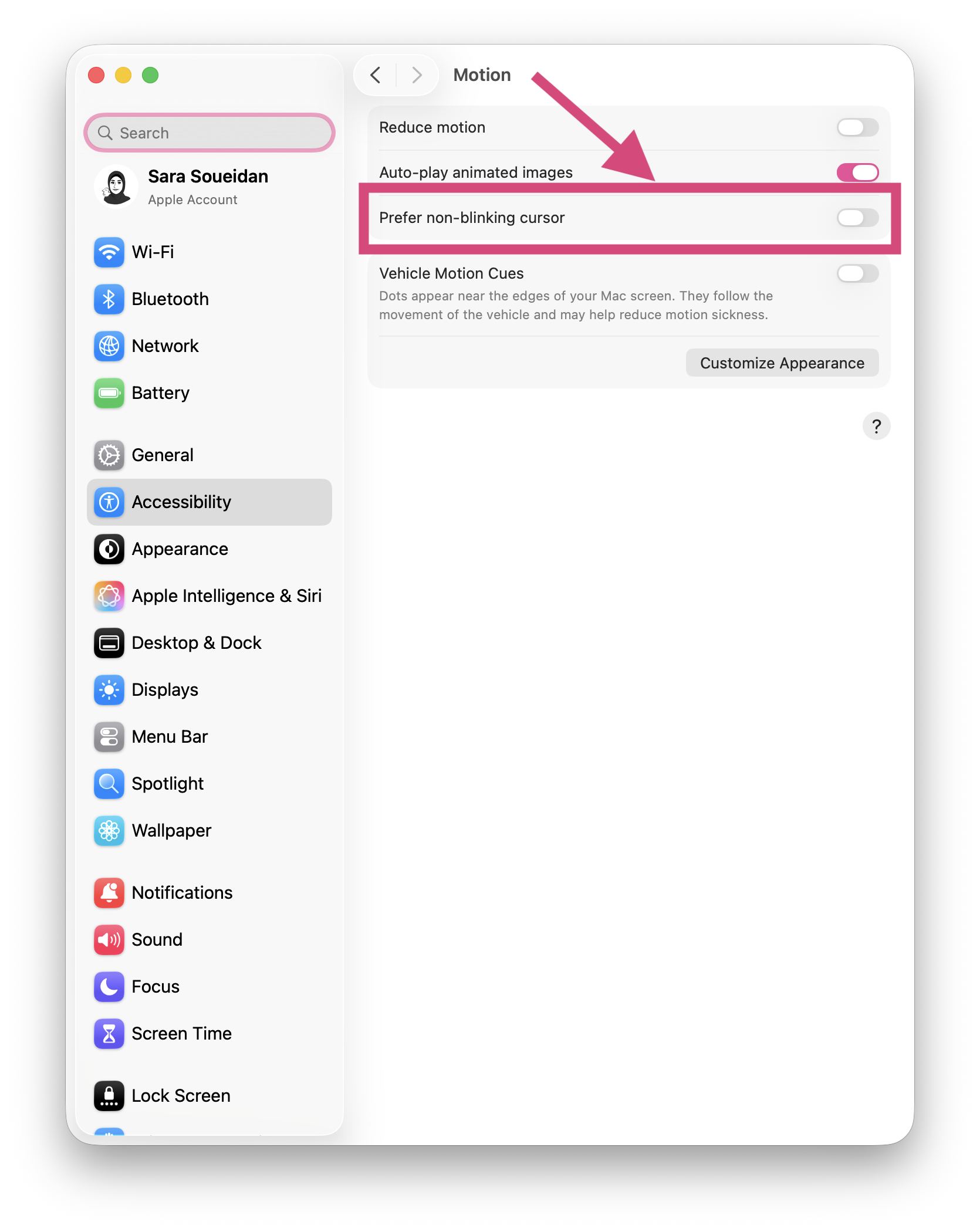
The text cursor blinks by default. Enbaling Prefer Non-Blinking Cursor stops it from blinking.
The Prefer Non-Blinking Cursor option is honored by Safari, Chrome, Firefox, and Chromium Edge and is applied to both the insertion caret and the navigation caret. So if the user wants the caret to stop blinking, it will stop blinking everywhere, which is what you would expect from a system-level setting.
On Windows OS
Windows OS offers more advanced customization options to make the caret even more accessible.
At the time of writing, browsers do not apply these customizations to the navigation caret.
In Windows OS settings, the caret is referred to as the text cursor. So to modify its settings, go to: Windows > Settings > Accessibility > Text Cursor.
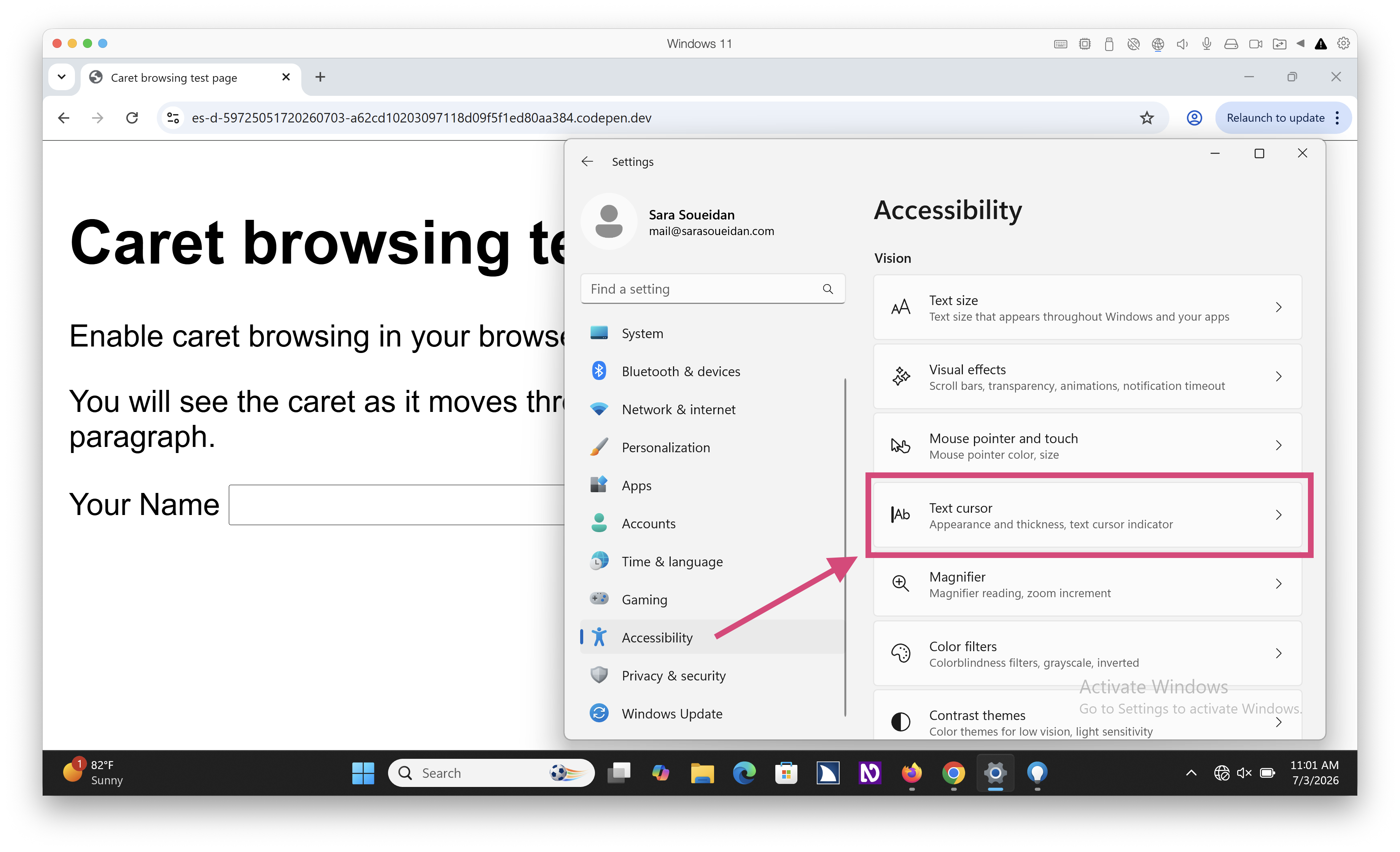
In the Text Cursor settings you will see options to:
- enable and customize a “text cursor indicator”;
- modify the text cursor’s thickness;
- and set the blink rate of the cursor.
When you enable the text cursor indicator option, Windows adds what looks like air balloons to each end of the caret, which makes it more visible and allows it to visually stand out in a sea of text.
You can customize the color of the indicator (the balloons) and choose a color that is more visible to you.
In this video I enable the text cursor indicator option in Windows settings, and demonstrate a couple of the different color options available. The indicator is shown for all insertion carets in Windows OS and in the browser.
This option is particularly useful for when input fields receive keyboard focus and that don't have any other visible focus indicators. The text cursor indicator makes it easier to spot where your keyboard focus is at. For example, when I pressed command+R, which fires up the "Run" Windows dialog (in my virtual machine), it automatically sets focus to the field inside the dialog (at the bottom left of the screen). No other focus indicator is shown on the field.
You can also adjust the thickness of the text cursor to make it even more visible.
At the time of writing, browsers do not honor the cursor thickness setting on insertion carets. If you modify the thickness of the caret in the OS settings, the caret thickness remains unchanged on your web pages.
And finally, you can modify the cursor’s blink rate. A user may lower the blinkk rate down to zero, which effectively stops the caret from blinking.
At the time of writing, browsers also do not honor the cursor blink rate setting on insertion carets.
And as we mentioned ealier, browsers do no honor any of these Windows OS settings on the navigation caret.
Modifying the default caret styles in CSS
The CSS Basic User Interface Module specification defines three properties that enable us to style carets: caret-color, caret-animation, and caret-shape, along with the shorthand caret property.
According to the specification, these properties are meant to apply to the insertion caret, but not to “other user interface mechanisms with a similar appearance”, like the navigation caret, though user agents may choose to take them into account. Whether to do so and to what extent is up to the user agent.
So browsers that support these CSS properties will decide whether or not to apply your caret styles to the navigation caret.
The caret-color property sets the color of the caret
The caret-color property has been around for years now and is used to specify the color of the caret.
As we mentioned earlier, browsers will use currentColor as the default caret color if you don’t override that with your own color.
At the time of writing, all modern supporting browsers use the color specified in the caret-color property on both the insertion caret and the navigation caret.
Here is a screen recording showing the caret color change as I change its value in the browser devtools.
The caret-shape property specifies the shape of the caret
The caret is typically shown as a thin (typically a one-pixel-wide) vertical line (or bar). You can modify that default shape of the caret using the caret-shape property. You can choose between three shapes:
bar: a thin bar placed at the insertion point. This is the default caret shape in most browsers and operating systems.block: a rectangle overlapping the next visible character. To make the text underneath the caret more visible, the current Chromium implementation adds transparency to the block caret.underscore: a thin line under the next visible character following the insertion point.
Here is a screen recording showing all three caret shapes in action:
The first input field demonstrates the default auto value, which is effectively bar on most browsers and operating systems. The second field demonstrates the bar value. The third field demonstrates the block value. And the fourth field demonstrates the underscore value.
Notice how the block shape has a reduced transparency, so the caret color is a shade of grey instead of being a true black like the current text color. This is the current Chromium implementation.
At the time of writing, caret-shape support is limited to Chromium browsers behind a flag. You will need to enable the experimental web platform features flag to try it out.
Here is a live demo of the above screen recording for you to try it out:
At the time of writing, browsers apply the caret-shape property to the insertion caret, but not to the navigation caret.
Animating the caret with caret-animation
The caret-animation property enables you to animate the other caret properties.
To animate a caret, you’ll select the element or container where the caret is shown, and then:
- Set
caret-animationtomanual. By setting the caret animation to manual you’re effectively telling the browser to stop the default blinking animation on the caret because you are going to take control of animating the caret by applying your own CSS keyframe animations. - Define the animation using a CSS
@keyframeanimation and apply it to the element.
Here’s an example that animates the color of the caret between pink and green, creating a custom color-transition effect:
input[type=text] {
    caret-animation: manual;
    animation: color-transition 1s linear infinite;
}

@keyframes color-transition {
	0% {
		caret-color: #9C0C60;
	}
	50% {
		caret-color: #175928;
	}
}
And a live demo:
Because the caret-color property is applied to the navigation caret, so is the animation.
Note that I chose two colors that have a high contrast with the white background to make sure that the caret remains visible. You may need to zoom in to see the color animate on the caret because of its small surface area.
You can also animate the shape of the caret. Manuel Rego provides a live demonstration that you can check out.
At the time of writing, support for the caret-animation property is limited to Chromium browsers.
As we’ve learned so far, caret styles can be modified by the user on the OS-level, and by us, CSS authors, on the CSS level.
Browsers decide which preferences and author styles are applied to the caret. They will apply some styles to the insertion caret only, while others are applied to the insertion caret and to the navigation caret.
The caret is an important user interface element. Without it, keyboard users wouldn’t be able to pinpoint their exact location on the page.
In both of its forms (insertion or navigation), the caret is effectively as important as the mouse cursor is for mouse users.
Technically, the insertion caret is a focus indicator. So, like other focus indicators, there are WCAG criteria that determine mininum accessibility requirements to ensure that the insertion caret is accessible.
Accessibility requirements for the insertion caret
The WCAG criteria that are relevant to styling the insertion caret are:
- Success Criterion (SC) 1.4.11 Non-Text Contrast (Level AA)
- Success Criterion 2.4.7 Focus Visible (Level AA)
- Success Criterion 2.3.1 Three Flashes or Below Threshold (Level A) (for the animation)
The insertion caret is a focus indicator but you will generally not have to worry about making it conform to SC 2.4.13 Focus Appearance (Level AAA) because it cannot meet the criterion because of its small surface area.
Even if you make the caret shape a block, the block is still not “at least as large as the area of a 2 CSS pixel thick perimeter of the unfocused component or sub-component”, which is the minimum required area of a focus indicator as per SC 2.4.13.
Using the insertion caret to indicate focus will not cause a failure of Focus Appearance. But if you’re aiming for Level AAA WCAG conformance, then the insertion caret alone will not meet its requirements. You will need to show another focus indicator that does. To do that, follow the guidelines for designing other forms of focus indicators that I outlined in the guide to creating WCAG-conformant focus indicators.
Visibility
Success Criterion 2.4.7 Focus Visible (Level AA) states that:
Any keyboard operable user interface has a mode of operation where the keyboard focus indicator is visible.
The “keyboard focus indicator” can be any focus indicator that lets user know where their focus is. It can be an outline, a border, a background color, or a caret.
This success criterion mandates that at least one focus indicator is shown.
If you’ve read my guide to WCAG-conformant focus indicators, you may remember that:
- The default focus indicator provided by browsers automatically passes because it is exempt from this criterion (even if the default focus indicator has low contrast)
- As soon as youn decide to override the default focus indicator and provide your own custom styles, you must ensure that the focused element has at least one focus indicator that meets the minimum contrast ratio against adjacent colors that is defined in SC 1.4.11 Non-Text Contrast.
According to Focus Visible’s Understanding document, sufficient techniques for passing this criterion include browser-provided methods for indicating focus, and the insertion caret is listed as one of those methods. So if you don’t change the default caret styles, then strictly speaking you increase your chances of passing SC 2.4.7 Focus Visible, even when you haven’t provided another clearly visible focus indicator.
Then you’ll want to look into contrast.
Contrast
SC 1.4.11 Non-Text Contrast (Level AA) states that:
The visual presentation of the following have a contrast ratio of at least 3:1 against adjacent color(s):
User Interface Components Visual information required to identify user interface components and states, except for inactive components or where the appearance of the component is determined by the user agent and not modified by the author;
[…]
The minute you decide to modify the color of the caret with caret-color, you must ensure that your focused element passes this criterion, either by:
- Ensuring the
caret-colorvalue has a contrast of at least 3:1 against adjacent color(s). - Or ensuring that there is another focus indicator that passes the success criterion. That can be custom focus indicator, or the default browser outline for the element.
The Understanding document provides a table that contains several examples of user interface components that pass the criterion’s requirement.
One of these examples is an input field that has a low-contrast outline in the focused state:
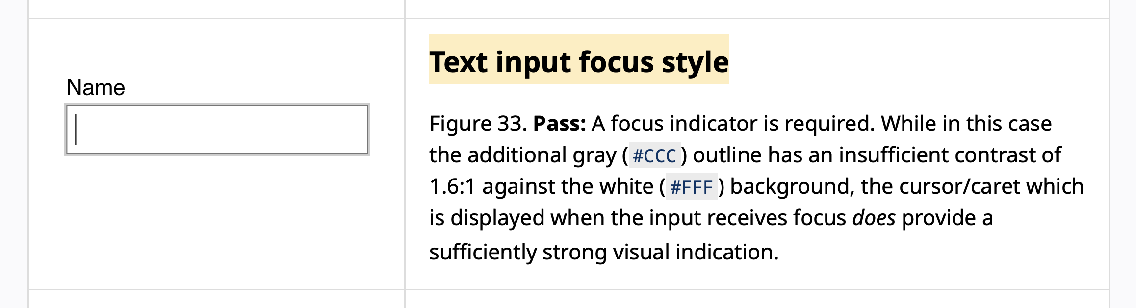
That input in the example passes Non-Text Contrast because it has a caret that “does provide a sufficiently strong visual indication”.
The caret in this example has a sufficiently strong contrast against the input’s background color. This is why it is considered as an indicator with sufficiently strong visual indication.
If the caret color had insufficient contrast against the background, and there is no other focus indicator with sufficient contrast, the component fails Non-Text Contrast in the focused state.
So, if you haven’t provided another passing focus indicator, your caret-color value must have at least 3:1 contrast against the background.
Animation
Success Criterion 2.3.1 Three Flashes or Below Threshold (Level A) states that:
Web pages do not contain anything that flashes more than three times in any one second period, or the flash is below the general flash and red flash thresholds.
Form the SC 2.3.1 Understanding document (emphasis mine):
The terms “blinking” and “flashing” can sometimes refer to the same content.
- “Blinking” refers to content that causes a distraction problem. Blinking can be allowed for a short time as long as it stops (or can be stopped)
- “Flashing” refers to content that can trigger a seizure (if it is more than 3 per second and large and bright enough). This cannot be allowed even for a second or it could cause a seizure. And turning the flash off is also not an option since the seizure could occur faster than most users could turn it off.
- Blinking usually does not occur at speeds of 3 per second or more, but it can. If blinking occurs faster than 3 per second, it would also be considered a flash.
Now, not all flashing or blinking content will automatically fail this criterion.
The Understanding document includes a list of sufficient techniques that you can follow to meet this criterion.
Technique “G176: Keeping the flashing area small enough” provides a way to pass the success criterion for things that flash, but are small.
If you have something that flashes more than 3 times in a one second period (so G19 can’t be used), but the area that is flashing is less than 25% of 10 degrees of visual field (which represents the central area of vision in the eye), then it would automatically pass.
The Technique page then goes on to explain how to translate the “10 degrees of visual field” to CSS pixels so that you can apply and test it in your work. Check the technique details out for all the nitty gritty details if you have any kind of flashing content in your work.
So whether or not a blinking caret meets this criterion depends on the size of the caret and how much space it takes in a user’s visual field.
As Adrian Roselli notes in his article about custom carets, a blinking caret “can impact a zoomed user if an author creates a more rapid animation, particularly if the caret shape is a block (taking up more of their field of view).”
So probably avoid any rapid blinking animations on the caret.
And if you apply any kind of custom animation on the caret, wrap your animation in a prefers-reduced-motion: no-preference query so that the animation only occurs when the user hasn’t expressed a preference for stopping animations.
@media (prefers-reduced-motion: no-preference) {
    /* any possible animation goes here */
}
With that said…
Remember when we said earlier that a user can stop the caret from blinking using OS-level settings (on both macOS and Windows)?
There’s currently no way in CSS for us to check whether the user has caret-specific preferences enabled or not.
Users may have animations enabled on their system, while also expressing a preference to stop the caret from blinking. Maybe they don’t mind the UI animations here and there, but they want a non-blinking caret specifically when they are navigating with keyboard because a blinking caret is more difficult to pinpoint on a page when it is lost in large blocks of text.
If you apply an animation to your caret, users must be able to stop this animation. And prefers-reduced-motion won’t cut it in this case.
The CSS specification states that:
UAs that do not have an editable user stylesheet should provide a setting to disable blinking, flashing, and animated carets. UAs that do have an editable user stylesheet may want to provide this setting as well. See [WCAG] Guideline 2.2 and Guideline 2.3 for details.
Browsers don’t currently provide that setting.
So, if you asolutely have to, or if you feel the need to animate the caret:
- Avoid a rapid flashing animation;
- And maybe provide an option somewhere on your website for the user to disable your custom caret animation.
Accessibility requirements for the navigation caret
The navigation caret is closely related to focus indicators but it is not a focus indicator, so it does not fall under any of the focus-related WCAG success criteria like the insertion caret does.
However, the navigation caret does fall under general non-text color contrast requirements specified by SC 1.4.11 Non-Text Contrast.
As we mentioned in a previous section, the caret inherits the color of its surrounding text by default.
If the text has sufficient minimum contrast all over your website, then so will the caret.
If you use the caret-color property to modify the color of the caret, you must ensure that the color you choose has at least 3:1 contrast against the background.
Remember that the caret-color property affects both the insertion caret and the navigation caret. This means that the color you choose must have 3:1 contrast against the background of your text fields and contenteditable areas, as well as against any other backgrounds where the navigation caret is shown.
If you have more than one background color on the page, you may need to adjust the color of the caret for the different areas of the page, because one color may not have sufficient contrast against all background colors on the page.
Or, alternatively, you may scope your styles so the caret-color property is only applied to the insertion caret:
/* Select only the components or elements
   where the insertion caret is shown and
   apply the caret color to those elements only */
textarea,
[contenteditable="true"],
textarea,
input[type="text"],
input[type="password"],
... {
    caret-color: #9C0C60;
}
Here is a demo page where a custom caret color is only applied to the input field. The navigation caret color defaults to the auto value and inherits the text color:
I have caret browsing enabled in all browsrs by default. Frankly, I would appreciate a more visible navigation caret.
One way I would make the navigation caret more visible is to give it a custom color that has sufficient contrast with the background and with the text. This would make the caret stand out more on the page.
Something else that would make it more visible is increasing its surface area by making it thicker.
However, as we’ve mentioned earlier, browsers don’t apply the caret-shape property to the navigation caret. They also don’t honor OS-level user preferences on the navigation caret. And without a way for the user to adjust the caret size, our CSS styles could make the caret less usable for users who prefer their own caret width.
This brings us to the final and arguably most important part of this article…
User needs come first—by standards and by law.
The Web platform is meant to be built following a set of design principles. One of these design principles is the Priority of Constituencies, which unambigiously puts user needs first (emphasis mine):
If a trade-off needs to be made, always put user needs above all.
[…]
The internet is for end users […]
User needs come before the needs of web page authors, which come before the needs of user agent implementors, which come before the needs of specification writers, which come before theoretical purity.
So when it comes to deciding which styles should “win”, user styles should always take priority over author styles, and browsers should prioritize user prefernces whenever possible.
Unfortunately, the way it stands today, browsers apply author styles to the caret, but do not honor most user preferences, and will override user preferences with author styles.
The caret thickness is an example. Your styles take precedence over CSS preferences that the browsers don’t even honor. If your caret is too thin, or even too thick, you risk making it unusable to your users. And there is currently no way to allow the user to override your caret width.
If browsers start honoring more user preferences on carets, you must test and ensure that your custom styles don’t override the preferences defined by the user. This may mean providing a custom switch of some sort that enables them to switch your custom caret styles off to allow theirs to take precendence.
Even though WCAG doesn’t specifically address or mandate this, the latest version of the European accessibility standard EN 301 549 does.
The most recent EN 301 549 update from last September (2026), v4.1.1, includes a significant rework of the clause on user preferences.
Here are the most relevant clauses from the latest version of the standard (emphasis mine):
9.7 User preferences for web pages
Where ICT is, or includes, a web page, the web page shall not block the user agent’s mode(s) of operation that present the web page according to user preference settings, or explicitly override user preference settings for documented platform accessibility features in these modes of operation, unless this is essential to the information or function of the web page.
[…]
11.7 User preferences
Where ICT is, or includes, non-web software that provides a user interface, and is not designed to be isolated from its platform, that user interface shall follow the values of the user preference settings for documented platform accessibility features unless it is essential to the function of the non-web software to not follow a user preference setting.
[…]
NOTE 3: For non-web software, the underlying platform is usually the operating system.
NOTE 4: When ICT is a user agent (such as a web browser or non-web document viewing software), this clause implies that at least one mode of operation is offered that enforces a rendering of the content that follows the values of the user preferences.
NOTE 5: This does not preclude the non-web software from having additional values for a setting as long as there is one mode where the application will follow the system settings even if more restricted.
NOTE 6: Features that might be documented as accessibility features for a platform include, but are not limited to colour filters, contrast, text size, pointer size, and text cursor
Now, I don’t find the EN 301 549 standard to be the easiest standard to read and understand. (WCAG kind of reads easy in comparison.) But the clauses pertaining to User Preferences look clear to me. User preferences must be respected and should not be overridden.
The EN 301 549 standard has been adopted by countries in and outside the EU since it came out. And it’s only a matter of time before the latest version becomes the standard for legal compliance.
Correct me if I’m wrong, but we can safely conclude that honoring user preferences for the styles and visibility of the text cursor (the caret) is going to be a conformance requirement.
Final Words
If I were to end this with one piece of advice it would be to be conservative with your caret customization.
If you have to create custom carets, give the user a choice to disable the custom styles somewhere on your website. At least until we get a proper way to detect when users have enabled their own OS-level preferences. Or until browsers provide users with some sort of easy switch to disable custom caret styles.
I recommend that you go and read Adrian Roselli’s post Custom Carets and Users: When The Caret Is No Longer a Stick (Yes, That’s a Poor Attempt at a Pun) next.
Adrian approaches this topic from a different angle that highlights the conformance risks that arise from creating custom carets. His article may convince you to leave the caret alone for now, at least until we have a standard and reliable way to enable users to make the caret work better for them.
Many thanks to Adrian for reviewing this article and providing feedback.
He also encouraged me to finish it and publish it… last year.
And thanks to Patrick Lauke for answering some of my WCAG-specific questions. Also last year. 😃
Continue Learning
If you found this article useful, then you will love my Practical Accessibility course.
I created the Practical Accesibility course for people who build for the Web. It is a great fit for you if you are a designer or a developer and you want to be technically competent at web accessibility so that you can build more accessible websites and web applications, test and find accessibility issues in existing projects, and critically evaluate code for accessibility—even if AI is doing much of the coding.
Check out Practical Accessibility →