Inclusively Hiding & Styling Checkboxes and Radio Buttons
Checkboxes and radio buttons are two common examples of interactive form elements that we desperately want to have full control over styling but we don’t. So we’ve been hacking our way around styling them by hiding said elements with CSS and visually replacing them with pseudo-elements or an SVG image — SVG, of course, being the more flexible, powerful, and accessible replacement. But an SVG image is, at the end of the day, just an image, so while it can visually replace a checkbox, it doesn’t really substitute for it — the user still needs a checkbox to interact with. So, when we attempt to hide the checkbox we want to style, we need to make sure that the checkbox remains accessible and interactive.
I’ve recently come across quite a few articles on the topic of accessibly styling checkboxes and radio buttons. All of the articles I read use one or another variation of the visually-hidden utility class which is usually used to hide content visually while keeping it screen reader-accessible. But while this technique works for some content, it’s not suitable for hiding interactive elements like radio buttons and checkboxes that have other accessibility and usability considerations. I learned this when I used the same technique myself to create my own accessible checkboxes a couple of years ago and my friend Scott O’Hara kindly pointed out during one of our chats that they weren’t entirely accessible because they weren’t discoverable by all screen reader users, particularly those navigating by touch.
So, in this article, I will cover the different techniques for hiding elements, how each of them affects the accessibility of the content, and how to properly hide checkboxes and radio buttons taking their own accessibility and usability considerations into account to make sure we aren’t leaving any users out.
Note that while I will be talking about checkboxes in this article, this technique applies to radio buttons and any other interactive form elements that you may want to restyle using an image replacement, including file inputs, for example.
Setting the foundation in the markup
Even though styling a checkbox using modern CSS features is currently possible, using SVG to create custom checkboxes remains, in my opinion, the most flexible, powerful, and accessible way.
Using SVG, we don’t style the checkbox itself — we hide the checkbox and use an SVG to create a checkbox image. So the SVG is just a visual replacement of the checkbox.
So, in order to style a checkbox with SVG, we need to add the SVG to the markup somewhere. You could, of course, use the SVG as a background image (on the checkbox label), yes; but it comes with drawbacks such as:
- you lose the ability to animate the SVG, which is one of the major benefits of using SVG to begin with, and
- you lose the ability to optimize the SVG for user-controlled environments, such as Windows High Contrast Mode, so you could end up risking the accessibility of the checkbox in those environments.
…not to mention that inlining an SVG has overall more advantages than any other embedding techniques and that you could make use of, such as animations.
I like to wrap my checkboxes inside their labels. Placing the checkbox inside the label increases the overall clickable area, which makes it more usable. I also like this approach because it makes the checkbox a more self-contained component that I can customize with CSS variables and use anywhere I need it.
Since the checkbox is going to go inside the <label>, the SVG will too.
<label for="c-checkbox" class="c-custom-checkbox">
    <input type="checkbox" id="c-checkbox" />

    <svg width="32" height="32" viewBox="-4 -4 39 39" aria-hidden="true" focusable="false">
        <!-- The background -->
        <rect class="checkbox__bg" width="35" height="35" x="-2" y="-2" stroke="currentColor" fill="none" stroke-width="3" rx="6"
            ry="6"></rect>
        <!-- The checkmark-->
        <polyline class="checkbox__checkmark" points="4,14 12,23 28,5" stroke="transparent" stroke-width="4" fill="none"></polyline>
    </svg>

    <span>The checkbox label text</span>
</label>
The checkbox label now contains the label text, the checkbox itself, as well as the SVG image that will represent our checkbox visually. So, if you think about it, we’re technically going to style the label — or a part of it.
A couple of important things to note here:
- Since the SVG is going to replace the checkbox visually, it also needs to visually convey state (checked, unchecked, disabled), as well as behavior (focus in particular, and hover if you need that).
- The SVG is used to create an image of a checkbox. The SVG image is not going to replace the checkbox semantically.
To address the first point, I placed the SVG image after the checkbox in the DOM. This will allow me to use the siblings selector in CSS to select the SVG and style and animate it when the checkbox is focused and interacted with (checked and unchecked). We’ll do that in a later section.
And since the image doesn’t replace the checkbox semantically, the checkbox needs to remain accessible. So when we hide it, we want to make sure we do so accessibly.
Hiding Content in CSS and HTML
There are several ways we can hide content in CSS and HTML, each with its own pros and cons. Knowing the upsides and downsides of each technique will help us choose the one we need when we need it.
Hiding content in CSS
There are four properties in CSS that can be used to hide content:
- Using
display: none; - Using
visibility: hidden - Using
opacity: 0 - Using
clip-path: inset(100%)
Both display: none and visibility: hidden remove the element they hide from the DOM and accessibility tree, thus making them completely inaccessible.
Back in the days when we used to use background image sprites to style checkboxes and radio buttons, we used to use display: none to hide the inputs, which removed them from the accessibility tree and therefore made them completely inaccessible to screen readers. You should never hide content using display: none or visibility: hidden if you want that content to remain accessible. We need our inputs to remain accessible to screen readers, so we not be using display: none or visibility: hidden anymore.
It’s also worth mentioning that you shouldn’t rely on background images or background colors to replace essential content (such as inputs) because background images are not accessible to screen readers, not to mention that they are most likely going to be removed when your CSS isn’t applied in user-controlled environments (such as Windows High Contrast Mode) and reader modes.
Hiding content in HTML
We can also hide content straight from the HTML using HTML attributes. There are two attributes we can use today: hidden and aria-hidden.
- The
hiddenattribute -
- is the HTML equivalent of CSS’s
display: none, - it hides the element it is applied to both visually and from assistive technologies,
- and is useful for hiding content when CSS is disabled (for example, in reader modes).
- is the HTML equivalent of CSS’s
- The
aria-hiddenattribute - determines whether an element is hidden from accessibility APIs (
aria-hidden='true') or not ('false'); - is useful for hiding decorative or duplicative content (e.g. decorative icon next to text).
- determines whether an element is hidden from accessibility APIs (
In addition to the above, we can apply multiple CSS properties within a rule set to hide an element visually while keeping it screen-reader accessible. An example of that would be providing text for assisitive technologies only that can’t be displayed visually. Accessible icon buttons are a common and good example of that. Typically, the styles are applied using a utility class:
/*******************************************************************************\
 *                                                                             *
 * Visually hide any element (mostly text) accessibly.                         *
 * Support includes IE9+                                                       *
 * Source: https://www.scottohara.me/blog/2017/04/14/inclusively-hidden.html   *
 *                                                                             *
 *******************************************************************************/

.sr-only {
    clip: rect(0 0 0 0);
    clip-path: inset(100%);
    height: 1px;
    overflow: hidden;
    position: absolute;
    white-space: nowrap;
    width: 1px;
}
This utility class shrinks an element into a 1px square, hiding any overflow, and absolutely positioning the element to remove any trace of it from the normal document flow. This utility class is ideal for providing screen reader-only text.
After going over all of the above techniques, I always ask my talk and workshop attendees how they would hide a native checkbox while ensuring it remains screen reader-accessible. Since we want to make sure the checkbox remains screen-reader accessible, we rule out all of the rules that hide it from screen readers. This left us with the two most frequent answers:
- Hide the checkbox using the
.sr-onlyclass, because it seems like the perfect solution because it hides the checkboxes visually whilst keeping it accessible to screen readers, and this is what most articles online currently use.
and - Move the checkbox off-canvas, hiding it outside of the viewport using absolute positioning. This, too, removes the checkbox from view but does not remove it from the accessibility tree.
It is true that both of these techniques hide the checkbox visually and it will still be accessible by a screen reader, but neither of these techniques are inclusive of users navigating by touch.
Hiding the checkboxes inclusively
Touch interface screen readers allow users to run their finger over the screen to hear what is directly underneath. This provides the user with a quick sense of an entire interface. — Material Design Acessibility Guidelines
Screen readers on Android touch devices give users multiple ways to navigate a screen. One of these ways is exploring by touch. Rob Dodson has a great screencast covering the basics of navigating a page using TalkBack on Android that I recommend watching for a live demo.
Exploring by touch means that a mobile screen reader can explore pages on touch screens with haptics — they literally move their finger on the page looking for interactive elements.
When you create a checkbox (or any other interactive element, for that matter), the user will expect to find that checkbox by touching the screen where they expect it to be. So the way you hide the checkbox determines whether touch screen reader users will be able to find it or not.
As you can possibly imagine now, hiding the checkbox off canvas (outside of the viewport area) will make it inaccessible to them, because they won’t find it within the viewport bounds as drag their finger around. Similarly, shrinking the checkbox to 1px will also make it very difficult to find and touch. So, while the sr-only utility class is great for visually-hiding static content (e.g. text), it should not be used to hide interactive elements.
So, how do you hide a checkbox inclusively? The answer is: hide it visually but make sure it is still ‘physically’ present where it would naturally be present so that touch users can find it with haptics.
Technically speaking this means:
- remove the checkbox from the page flow using
position: absoluteso that it doesn’t take up any unwanted space (visually), - position it (within the label) making sure it is positioned on top of the image that is visually replacing it,
- optional: set its dimensions to match those of the SVG,
- visually hide it by making it transparent with
opacity: 0,
Here is a video demo’ing the above steps.
Note that I’ve already styled the SVG to convey state in this demo, which is what I’ll cover in the next section.
The CSS that handles the positioning and hiding of the checkbox looks like this:
.c-custom-checkbox {
    /* create a postioning context for the checkbox within the label */
    position: relative;

    /* other label styles here */
}

.c-custom-checkbox input[type="checkbox"] {
    /* remove the checkbox from flow */
    position: absolute;

    /* hide it visually */
    opacity: 0;

    /* tweak size and position if needed */
    width: 1em;
    height: 1em;

    /* position it within the label, on top of the SVG */
    top: ...;
    left: ...;

    /* sometimes you may need to add z-index */
    z-index: ...;
}
So the checkbox is technically still there where it should be, it is still interactive, it is fully accessible, but it is visually hidden so it can be replaced with a more styleable alternative: the SVG.
Styling the SVG accessibly
Since we’re hiding the native checkbox, we will need to substitute for the checked and unchecked states visually, as well as the focus styles.
The SVG is placed right after the checkbox in the DOM, so we can select it using the adjacent siblings selector, and style it based on the checkbox’s state. So when the checkbox receives focus, we display the focus outline on the SVG:
/* visually show focus outline when the SVG receives focus */
.c-custom-checkbox input[type="checkbox"]:focus + svg {
    outline: 3px solid #E55360;
    outline-offset: 2px;
}

/* hide the focus styles for mouse users */
.c-custom-checkbox input[type="checkbox"]:focus:not(:focus-visible) + svg {
    outline: none;
}
The focus style can be anything you want, as long as it’s very clear and visually accessible. Similarly, you can add disabled state styles using the :disabled seletor.
To mimic checking/unchecking the checkbox in the SVG, we show/hide the checkmark inside it, and change the background color:
/* basic styles for the svg */
.c-custom-checkbox svg {
  /* set SVG dimensions in ems; i.e. relative to the font size so that it scales with the size of the text in the label */
  width: 1em;
  height: 1em;

  /* ... */

  /* apply a transition to the elements inside the svg */
  * {
    transition: all 0.1s linear;
  }
}

/* style changes inside the svg when the checkbox is checked */
.c-custom-checkbox input[type="checkbox"]:checked + svg {
  .checkbox__bg {
    fill: var(--checked-state-bg-color);
    stroke: var(--checked-state-bg-color);
  }

  .checkbox__checkmark {
    stroke: var(--checked-state-checkmark-color);
  }
}
While you’re at it, you’ll want to take it further and optimize it for Windows High Contrast Mode:
.c-custom-checkbox svg {
  @media screen and (-ms-high-contrast: active) {
    .checkbox__bg {
      stroke: windowText;
    }
  }
}

@media screen and (-ms-high-contrast: active) {
  .c-custom-checkbox input[type="checkbox"]:checked + svg {
    .checkbox__bg {
      fill: windowText;
    }

    .checkbox__checkmark {
      stroke: highlight;
    }
  }
}
One of the many benefits of using an inline SVG is that we have real elements (checkmark and square) with real borders (strokes) that we can flexibly style, so we don’t rely on background images and colors alone to create and convey state/behavior, because background images, colors, and effects like drop shadows are normally overridden in user-controlled environments. This is also why I normally recommend using a real outline versus a fake outline created using box-shadow.
And here is a live demo:
See the pen (@SaraSoueidan) on CodePen.
Adding delight using SVG animations
Using animated SVGs is one of my favorite ways of adding delight to otherwise boring user interfaces, particularly form controls. Checkboxes and radio buttons are a great example of controls that could benefit from more fun interactions. In 2013, Codrops published a collection of playful experiments using SVG path animations (a.k.a. the line drawing technique) to create more delightful checkboxes and radio buttons. But the Codrops examples were merely a proof-of-concept for animation and were not optimized to be accessible. If you want to use such animations in your UIs today, you’ll want to make sure you hide the checkboxes using the technique presented in this article.
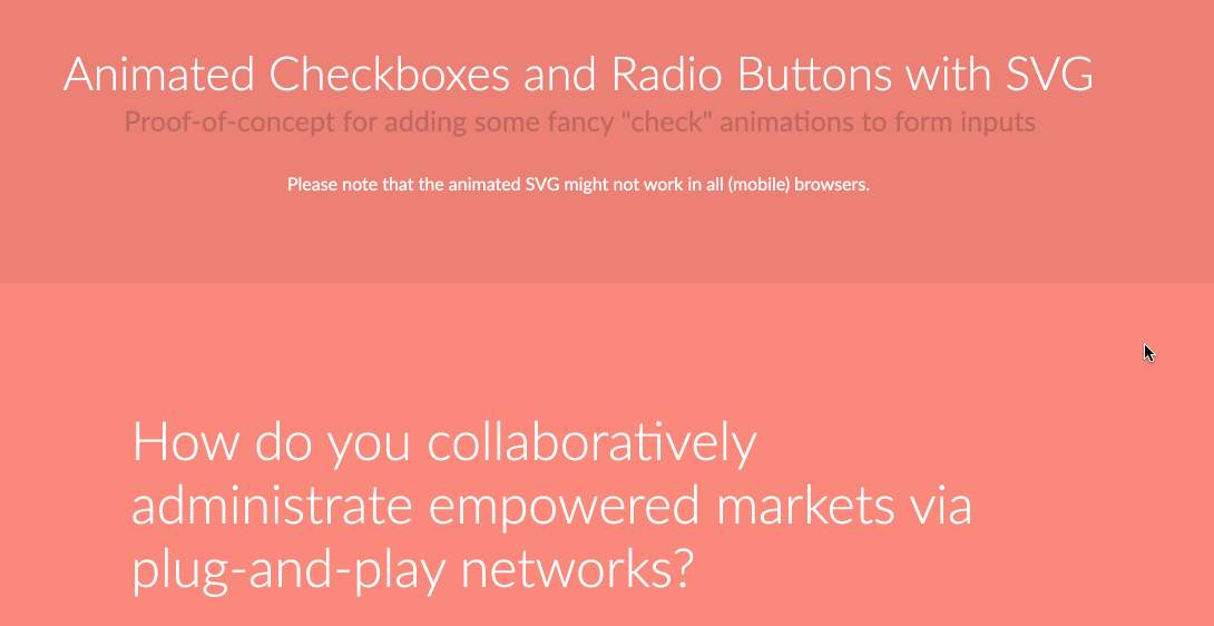
Here is a quick proof of concept of an accessible animated checkbox:
See the pen (@SaraSoueidan) on CodePen.
Wrap-up
There are several ways to hide an element in CSS and HTML. You can hide an element both visually and from screen readers, only visually, or only from screen readers.
When you hide an interactive element, make sure you choose a hiding technique that keeps it screen reader-accessible, position it on top of whatever is visually replacing it so that a user navigating by touch can find it where they expect to, and then make it transparent.